Preview image. Unlock full-res
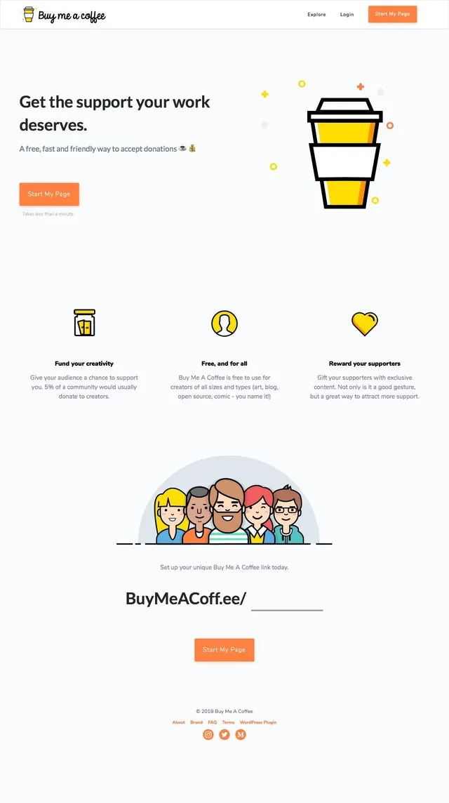
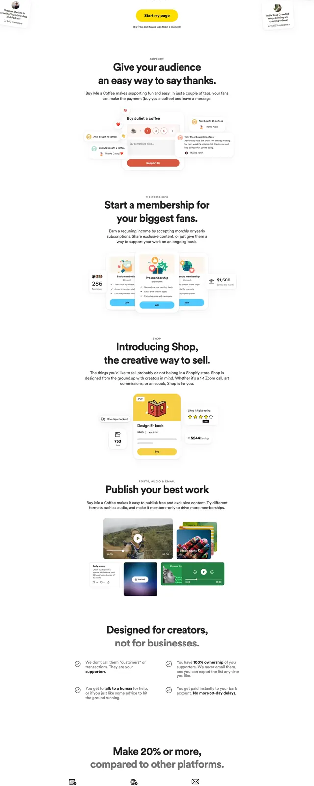
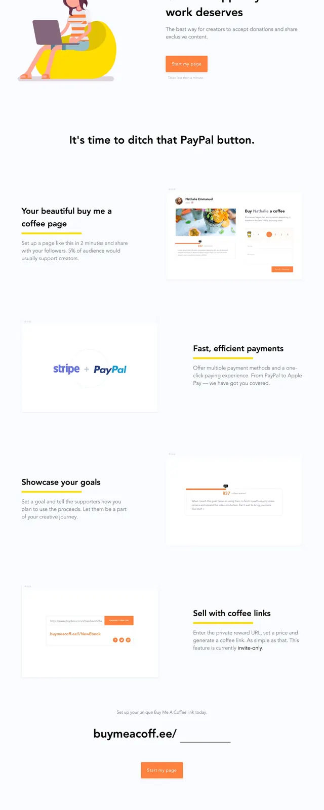
A clean creator-support landing page with a bright illustrated hero, minimal navigation, and repeated product benefit sections.
Summary
A clean creator-support landing page with a bright illustrated hero, minimal navigation, and repeated product benefit sections.
Visual description
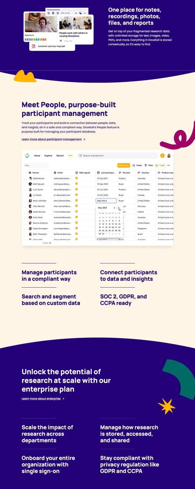
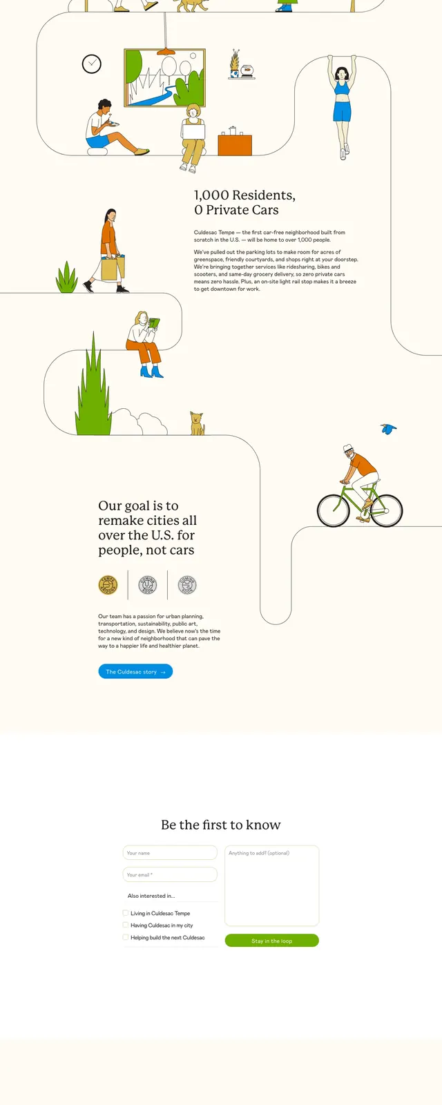
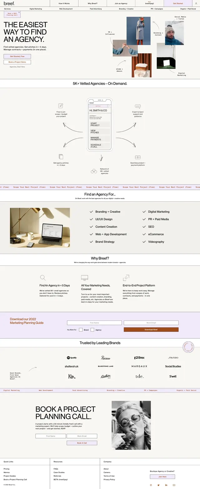
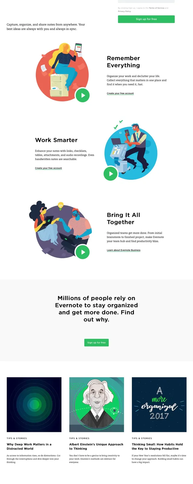
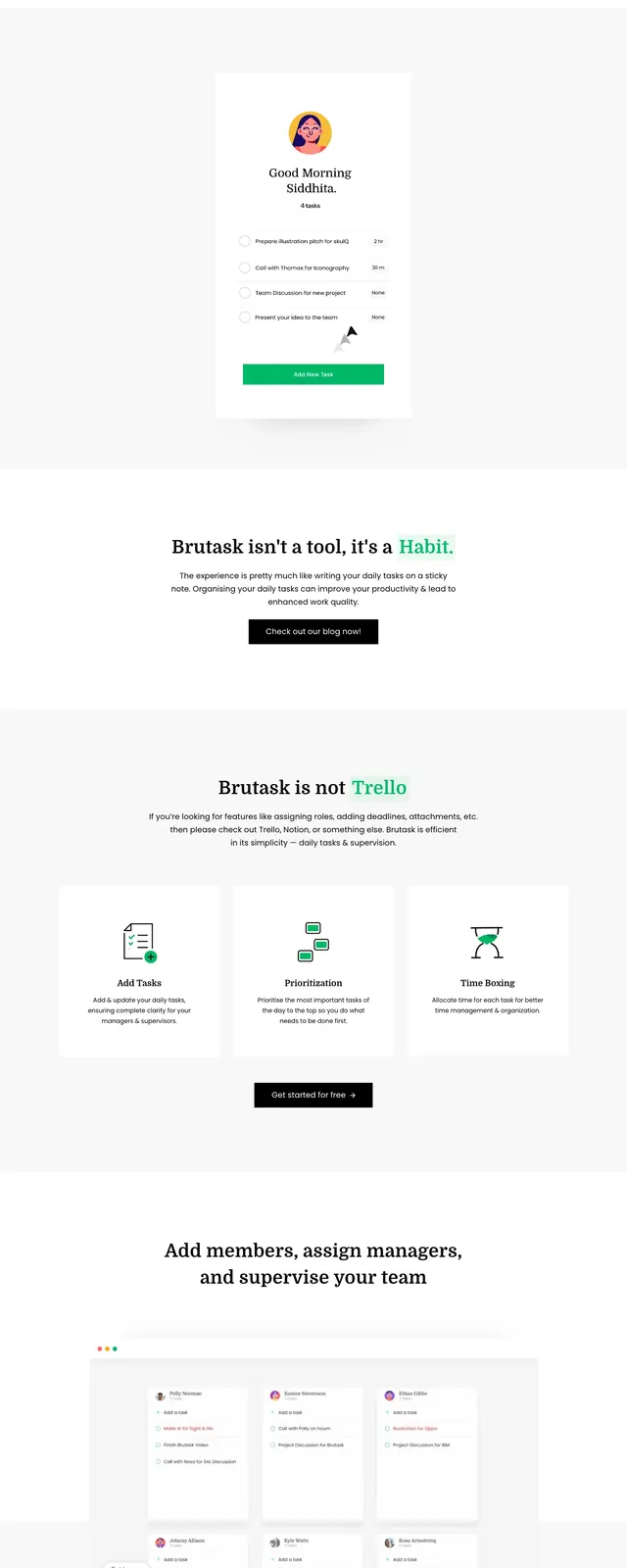
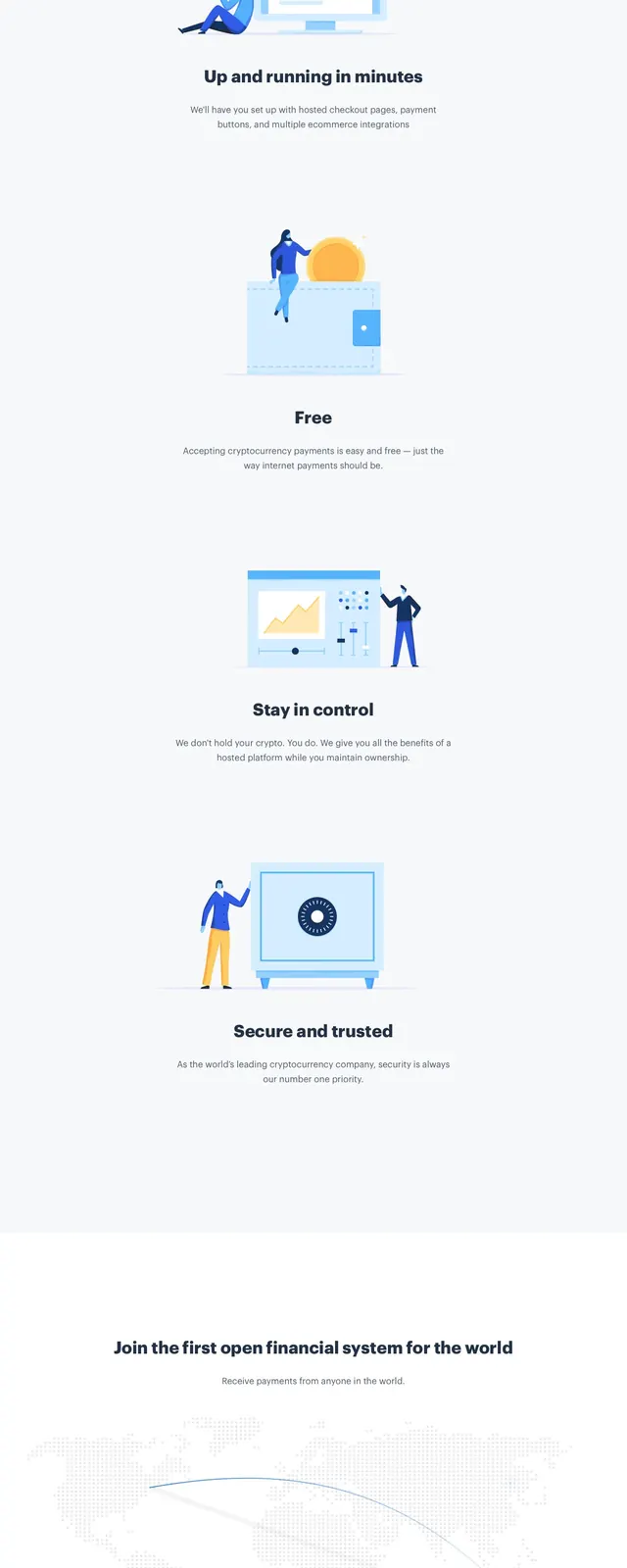
The top section uses a split layout with a large flat illustration on the left and a bold headline plus primary CTA on the right. A slim header bar contains the brand logo and simple navigation links with a highlighted action button. Lower slices show alternating feature blocks with sparse text, embedded product mockups, and a centered CTA area near the footer. The overall page uses a white background, soft gray dividers, and small orange accents for calls to action.
Key takeaway
This design relies on a very lightweight visual system: bright illustration, generous whitespace, and a single strong CTA repeated through the page. The structure is easy to scan and works well for a simple creator monetization product.
Reuse notes
Reuse the split hero pattern for any lightweight SaaS or creator tool where trust and clarity matter more than dense explanation. The orange CTA, minimal header, and alternating feature sections translate well to onboarding or fundraising product pages.