Preview image. Unlock full-res
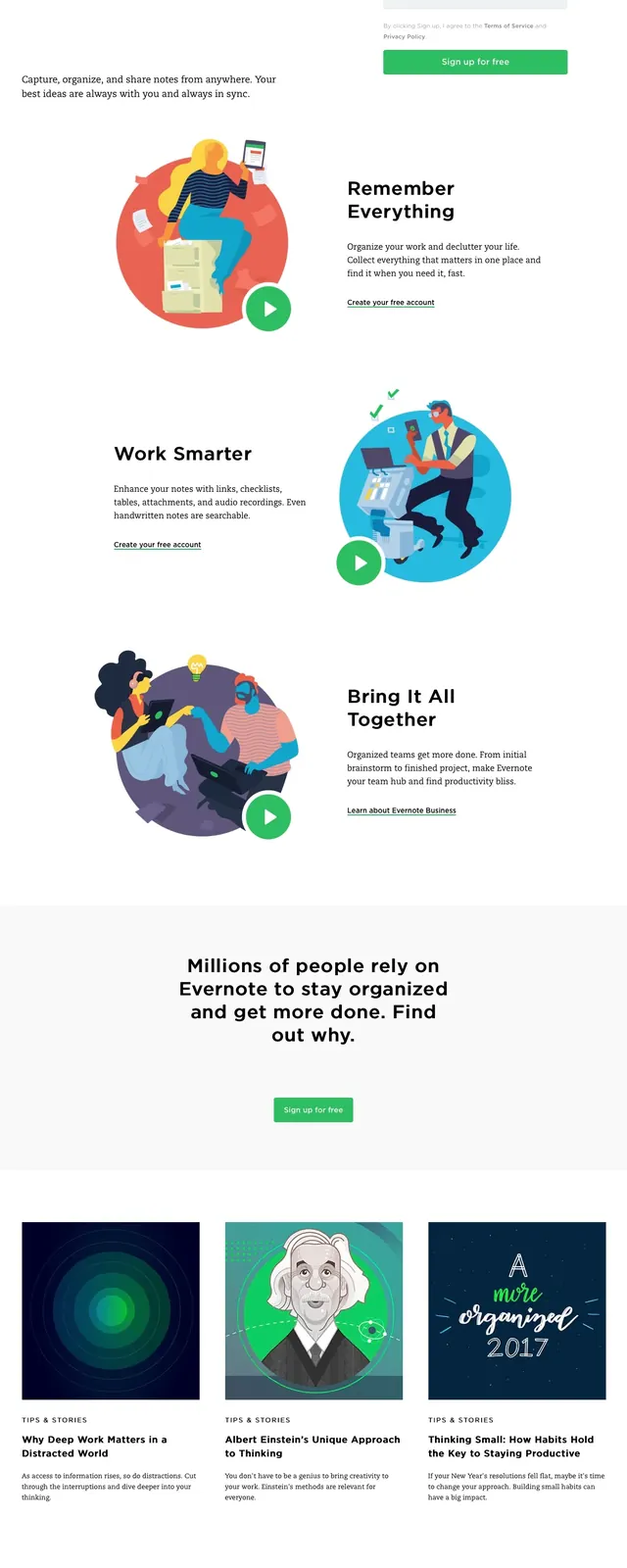
A clean Evernote marketing landing page with a split hero, signup form, illustrated feature blocks, and content cards below.
Summary
A clean Evernote marketing landing page with a split hero, signup form, illustrated feature blocks, and content cards below.
Visual description
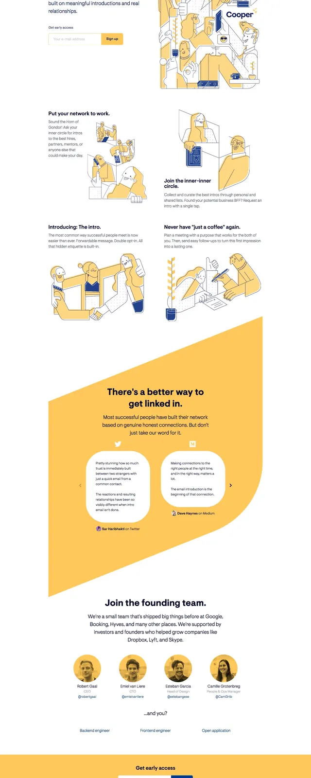
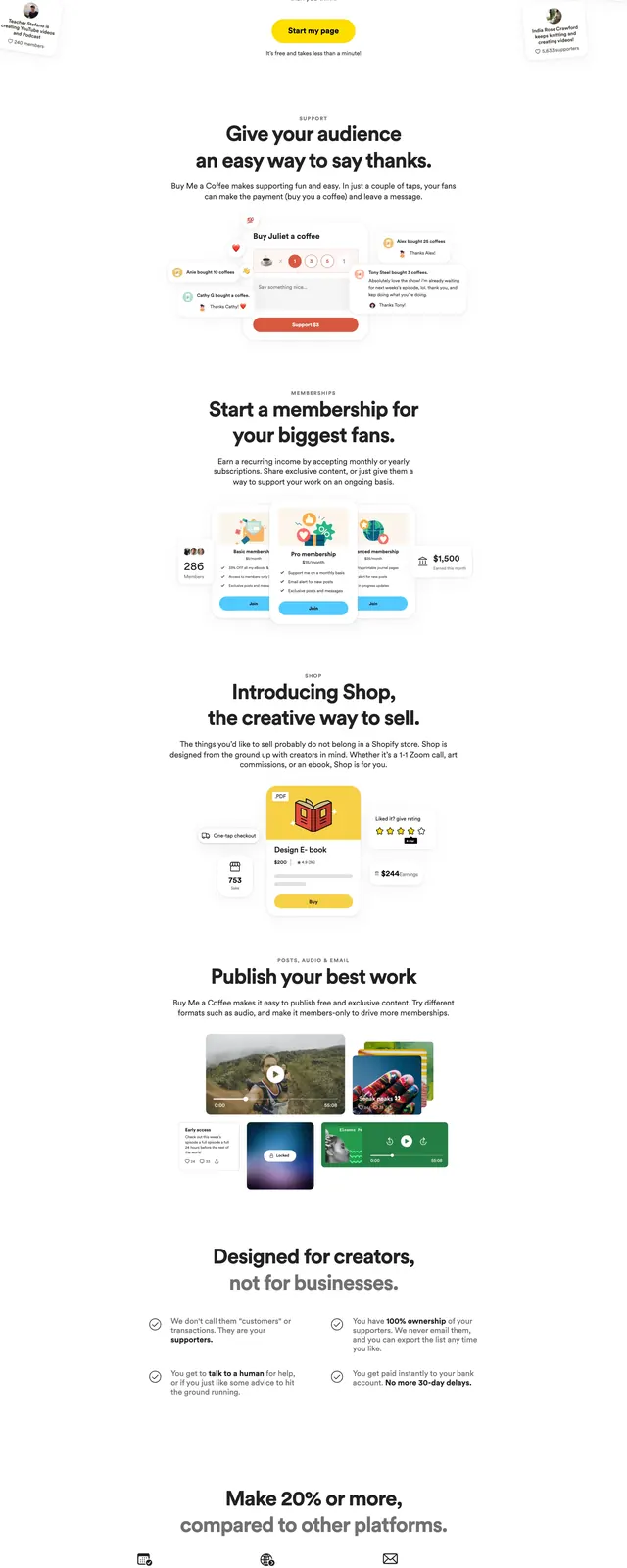
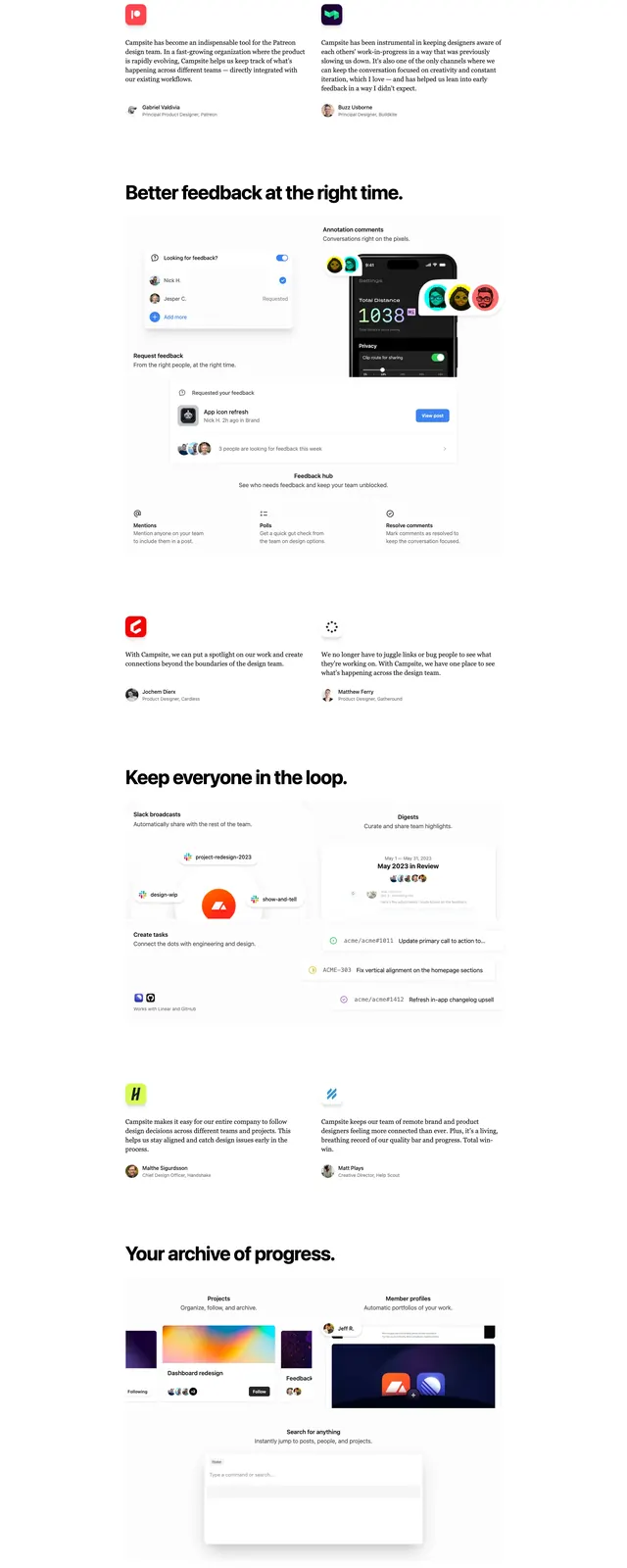
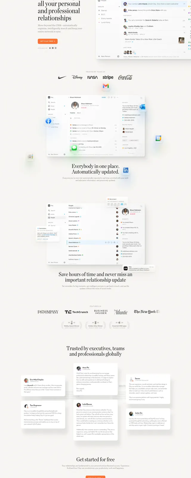
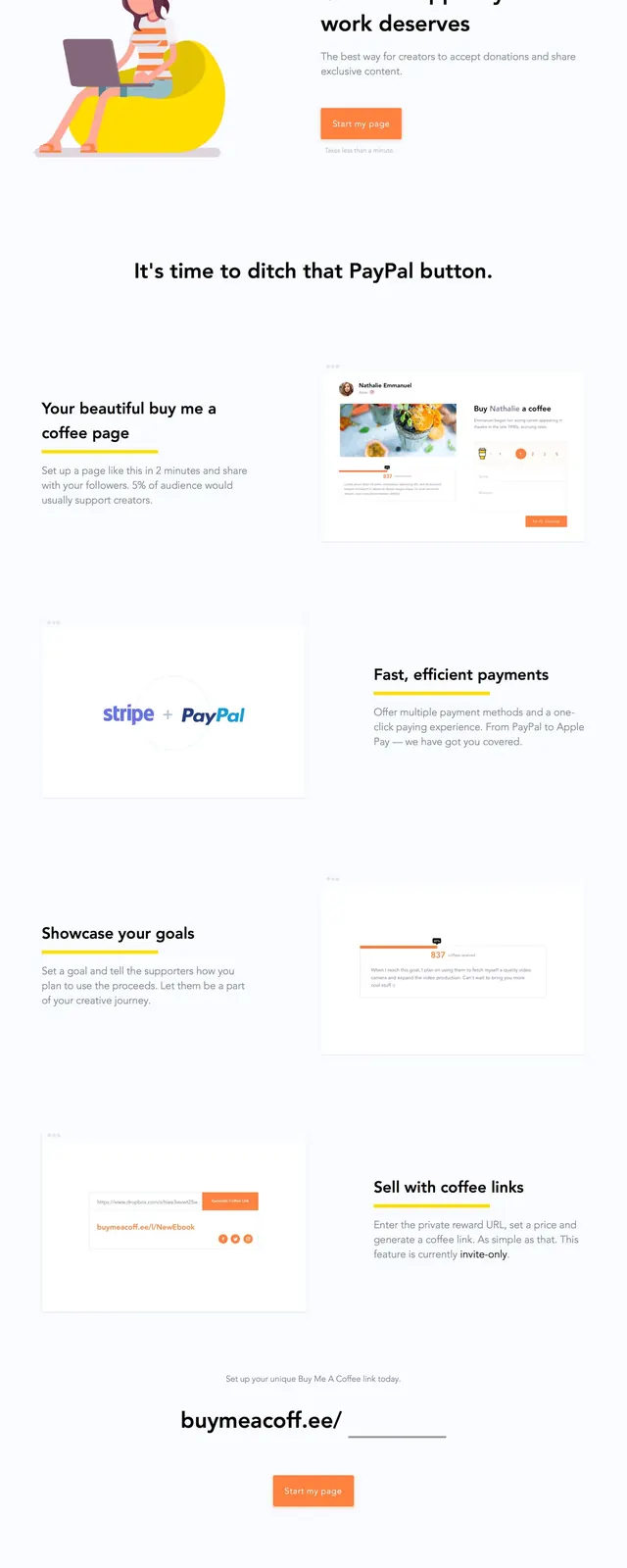
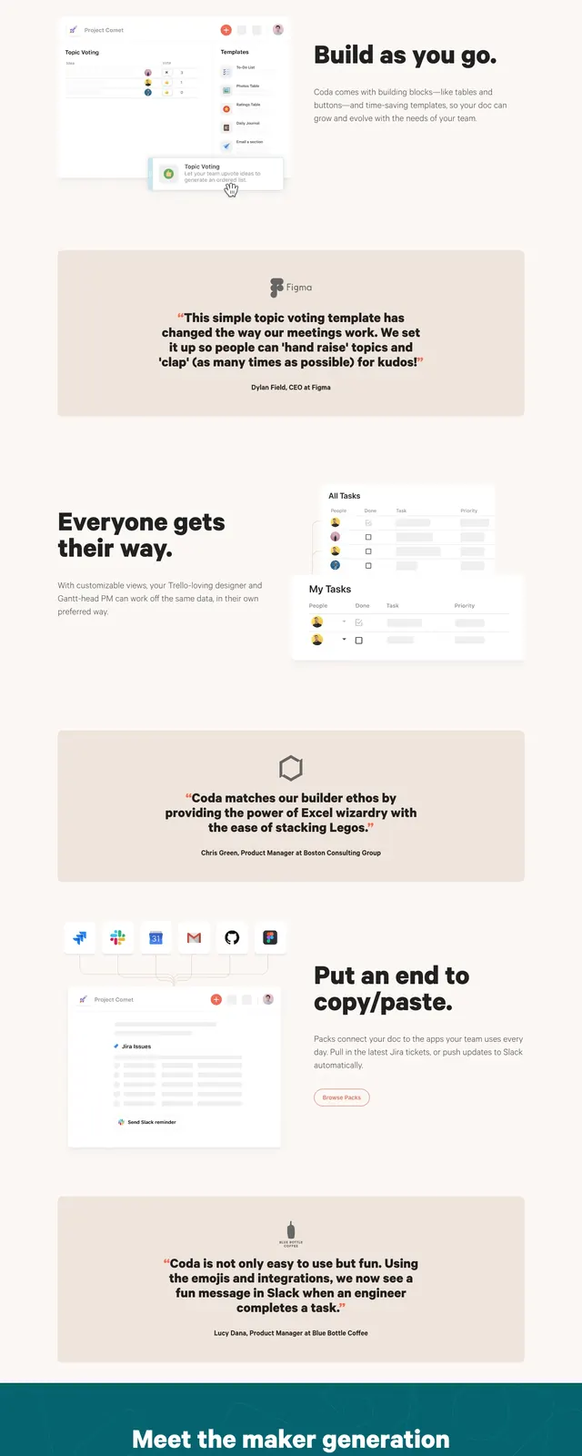
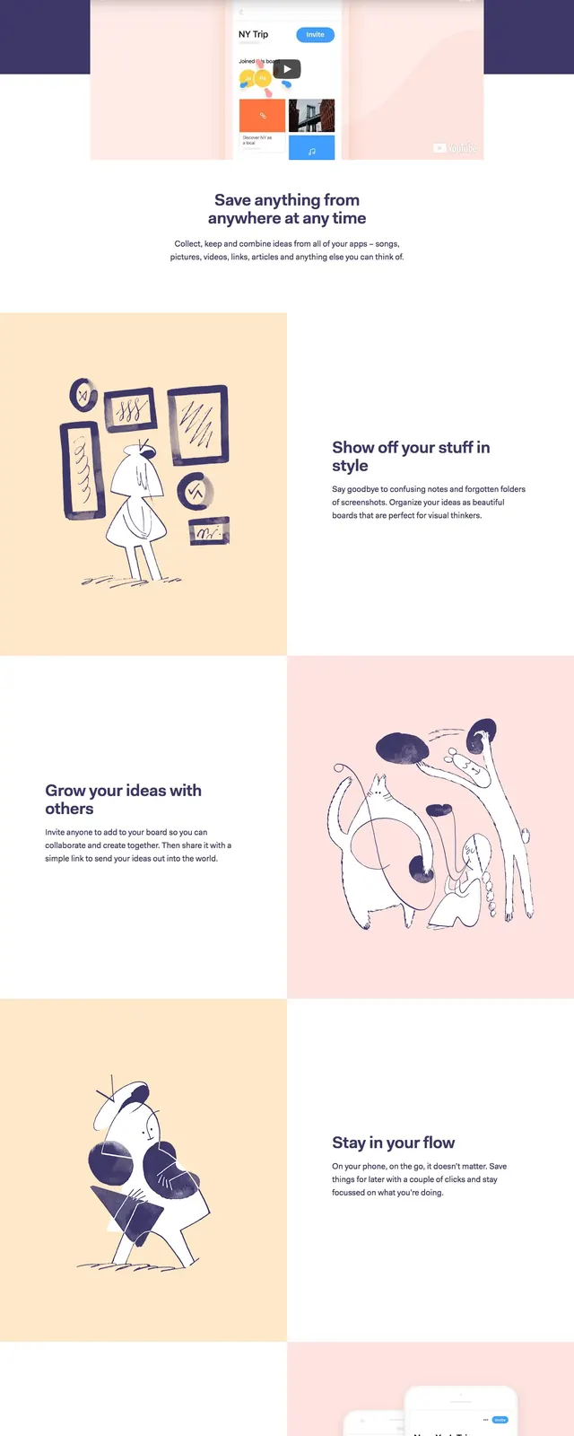
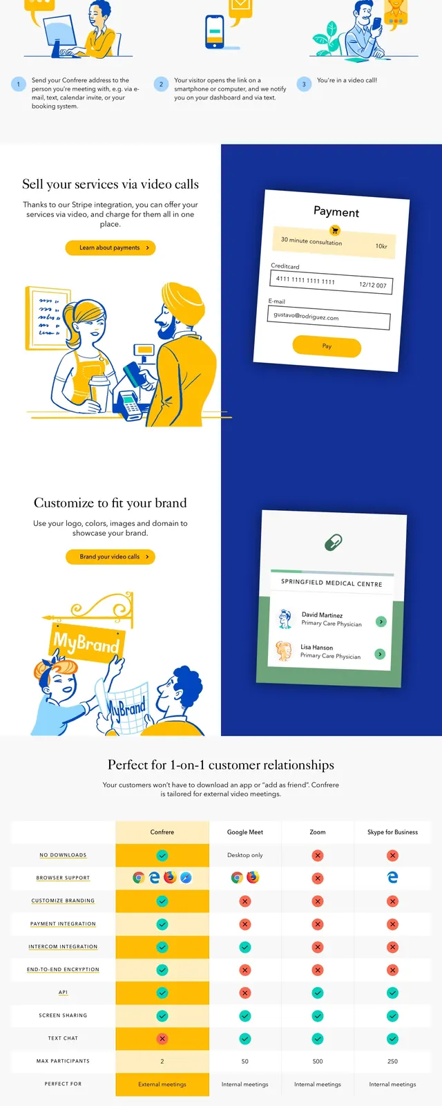
The page opens with a large left-aligned headline and short supporting copy, paired with a right-side sign-up form that includes a social sign-up button, email and password fields, and a green primary CTA. Below the hero, alternating illustration-and-text feature blocks present product benefits with small link-style CTAs. Farther down, a centered statement leads into a three-column blog/story card grid with thumbnails, labels, headlines, and excerpts, followed by a sparse footer with social icons and utility links.
Key takeaway
The design relies on generous white space, bold typography, and friendly illustrations to make a productivity product feel approachable and clear. The layout is modular and reusable, with a strong hero, benefit sections, and editorial content blocks.
Reuse notes
Use this as a template for a simple SaaS landing page with a direct conversion form in the hero and supporting feature narratives below. The illustration-led sections and card-based content grid work well for productivity, note-taking, or consumer app marketing pages.