Preview image. Unlock full-res
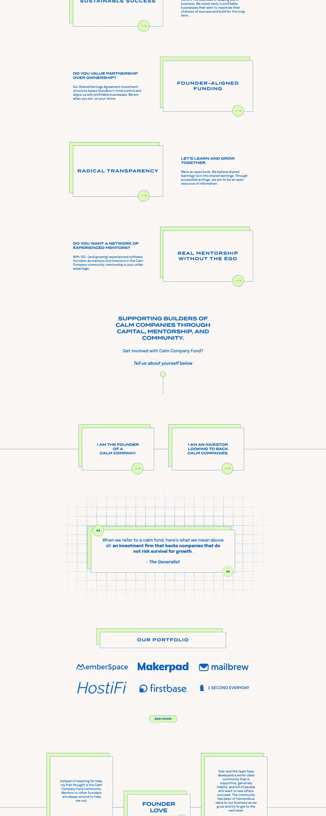
A soft, grid-based nonprofit or investment landing page with calm blue typography, pale green accents, and layered card sections.
Summary
A soft, grid-based nonprofit or investment landing page with calm blue typography, pale green accents, and layered card sections.
Visual description
The page opens with a centered hero panel featuring the Calm Company Fund name, a short subtitle, and a primary apply button framed by oversized blue bracket-like marks. The background uses a light grid motif and lots of whitespace, with thin-line connectors and small circular nodes guiding the eye down the page. Lower sections alternate between bordered content cards, short explanatory copy, testimonial blocks with profile images, and a simple email signup form near the footer. Blue text and pale lime-green accents repeat throughout, giving the page a restrained, institutional feel.
Key takeaway
Use a sparse Swiss-inspired grid, boxed content modules, and a limited blue-plus-lime palette to create a calm but structured financial or mission-driven landing page. The layered outlines and connector dots add personality without breaking the overall minimal tone.
Reuse notes
Works well for investor, nonprofit, or community-backed product sites that need trust and clarity. The stacked-card pattern and centered section breaks can be reused for storytelling, testimonials, and signup CTAs.