Preview image. Unlock full-res
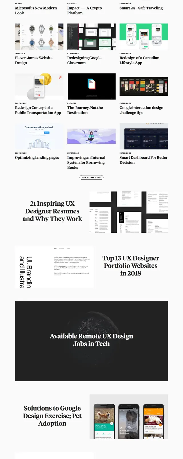
A minimalist editorial landing page for UX case studies built around oversized serif headlines, image-led cards, and a magazine-like content grid.
Summary
A minimalist editorial landing page for UX case studies built around oversized serif headlines, image-led cards, and a magazine-like content grid.
Visual description
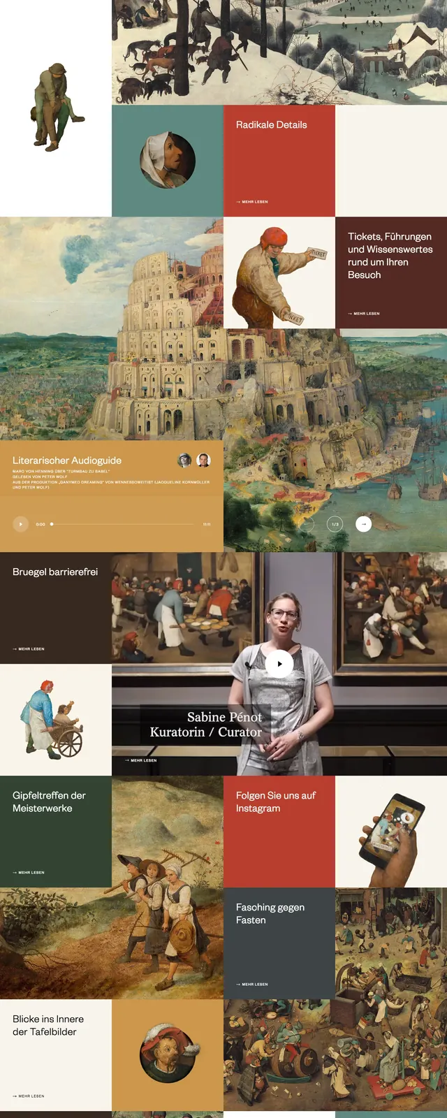
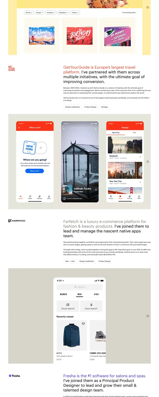
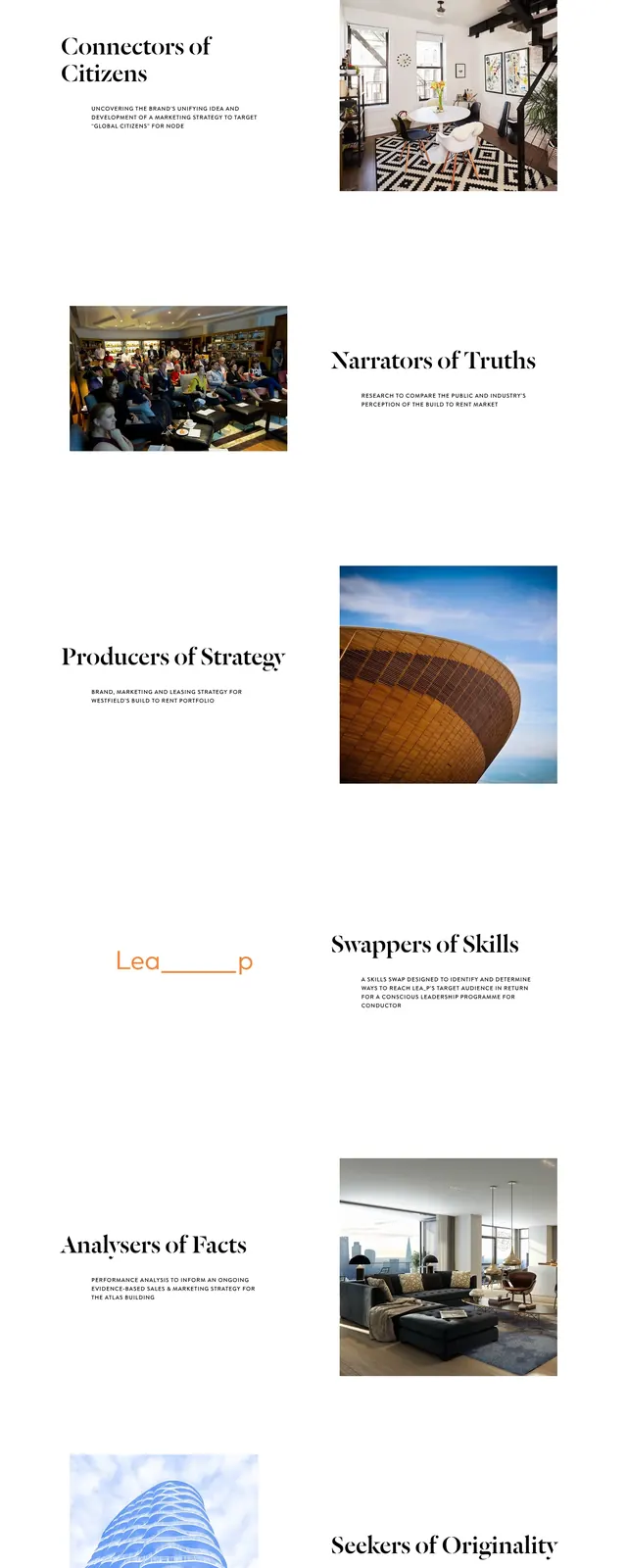
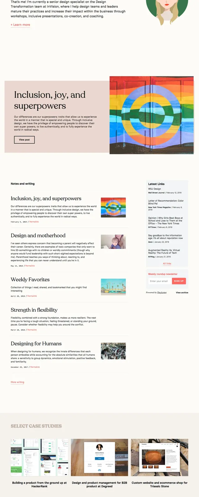
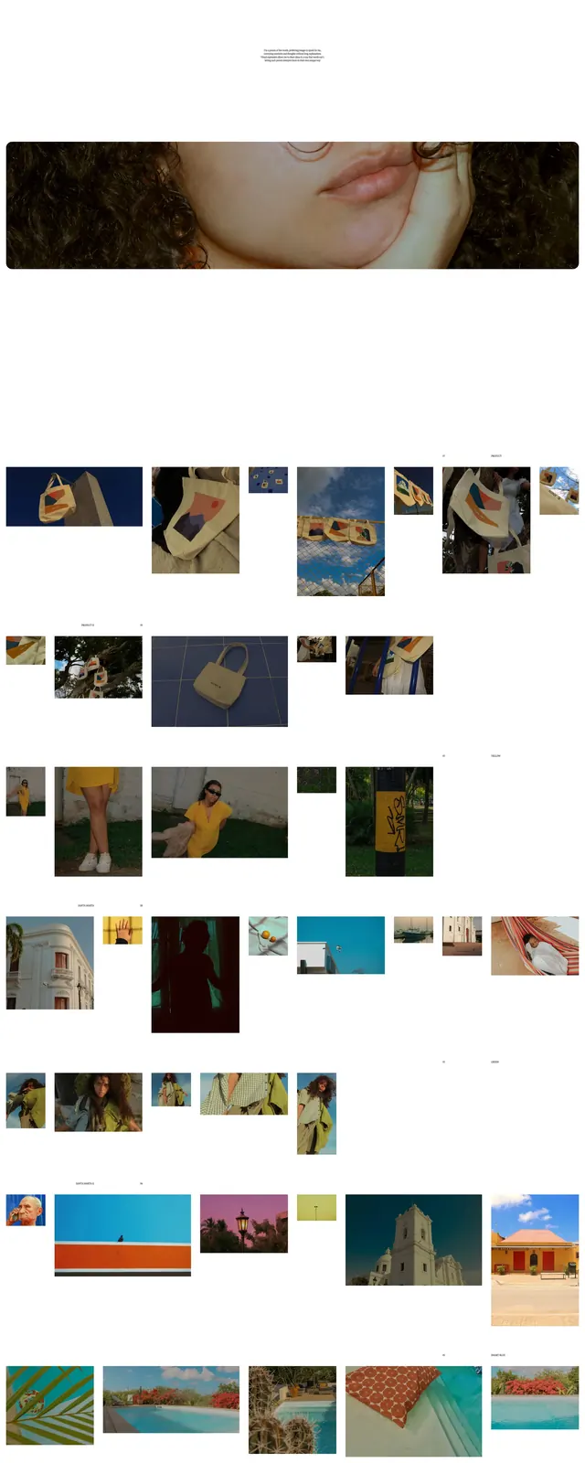
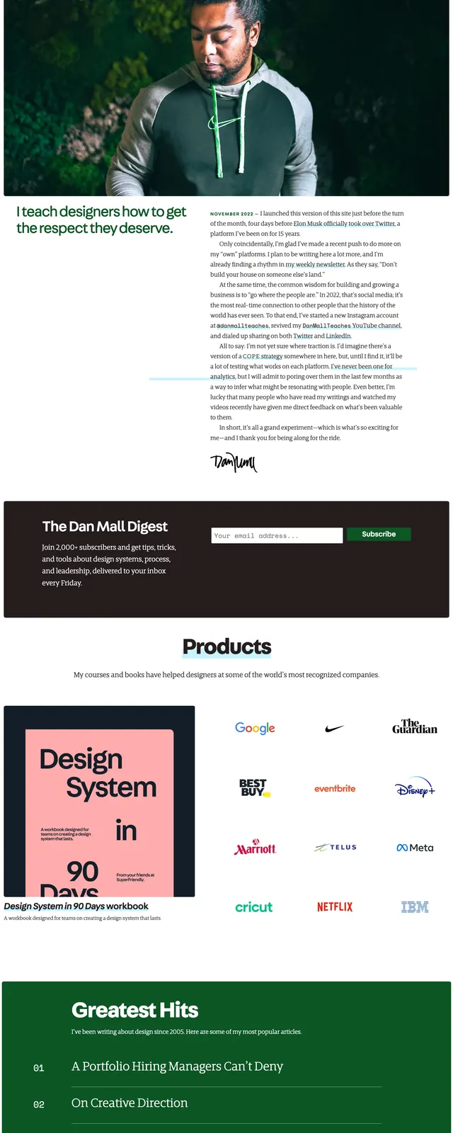
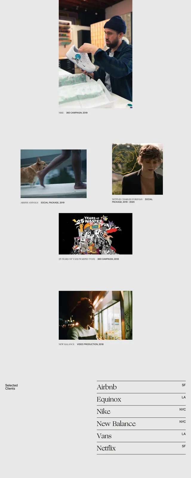
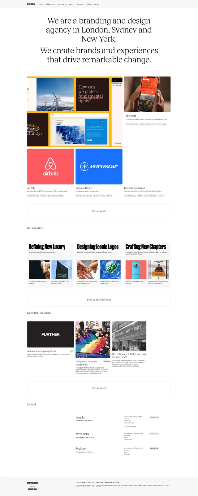
The page uses a pale off-white background with a small top navigation and a hero split between a large serif headline on the left and a portrait image on the right. Below the hero is a content-heavy grid of case study cards with thumbnail images, small category labels, and bold serif titles. Further down, large editorial article blocks alternate text and imagery, ending with a dark newsletter footer containing a short signup form and a centered message.
Key takeaway
The design relies on strong serif typography, generous whitespace, and magazine-style card hierarchy to make a content library feel curated rather than cluttered. Repeated image-and-headline pairings create rhythm without needing heavy decoration.
Reuse notes
Useful for editorial landing pages, inspiration libraries, or case-study hubs that need to feel premium and curated. The layout works best when the content itself is visually strong, since the interface stays intentionally restrained.