Preview image. Unlock full-res
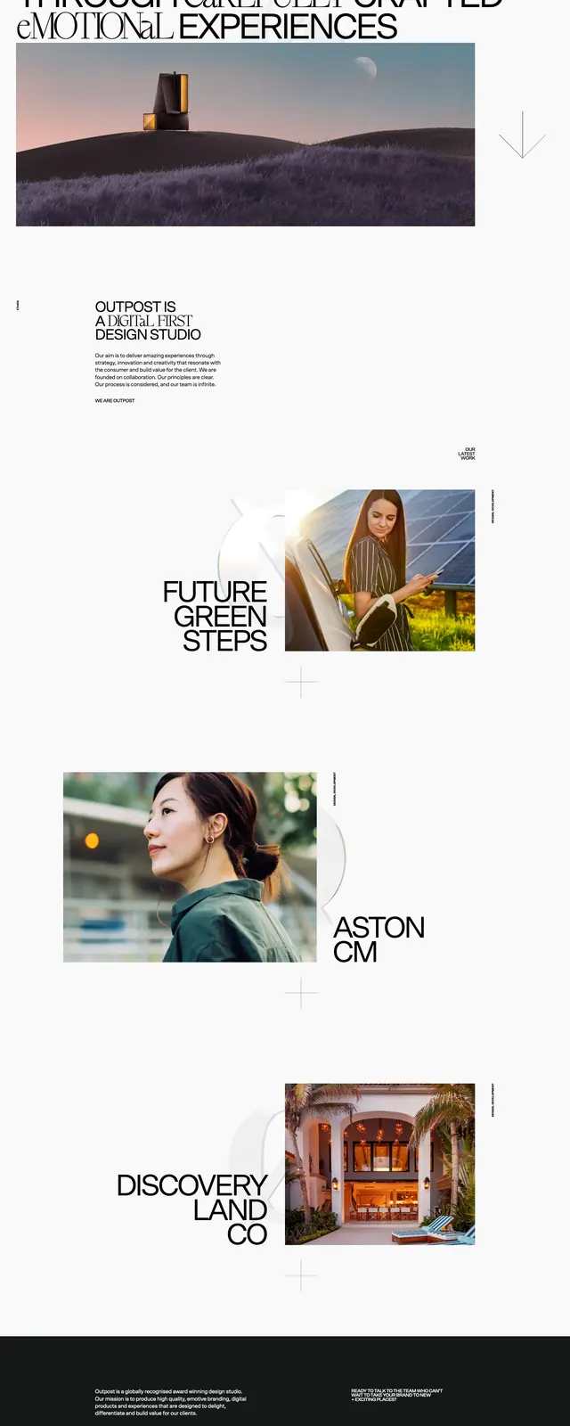
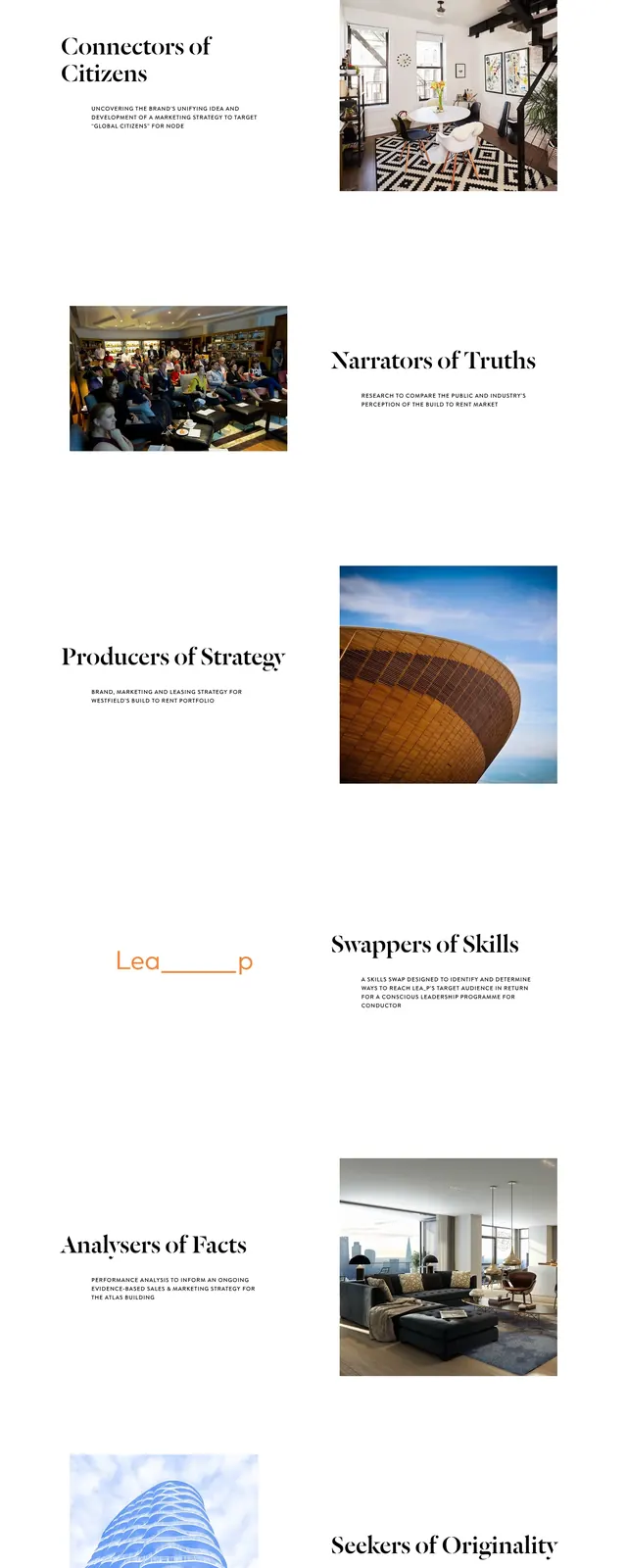
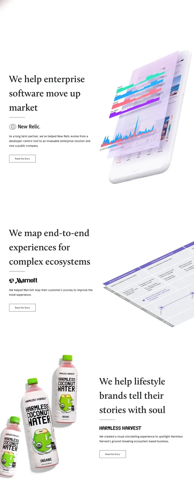
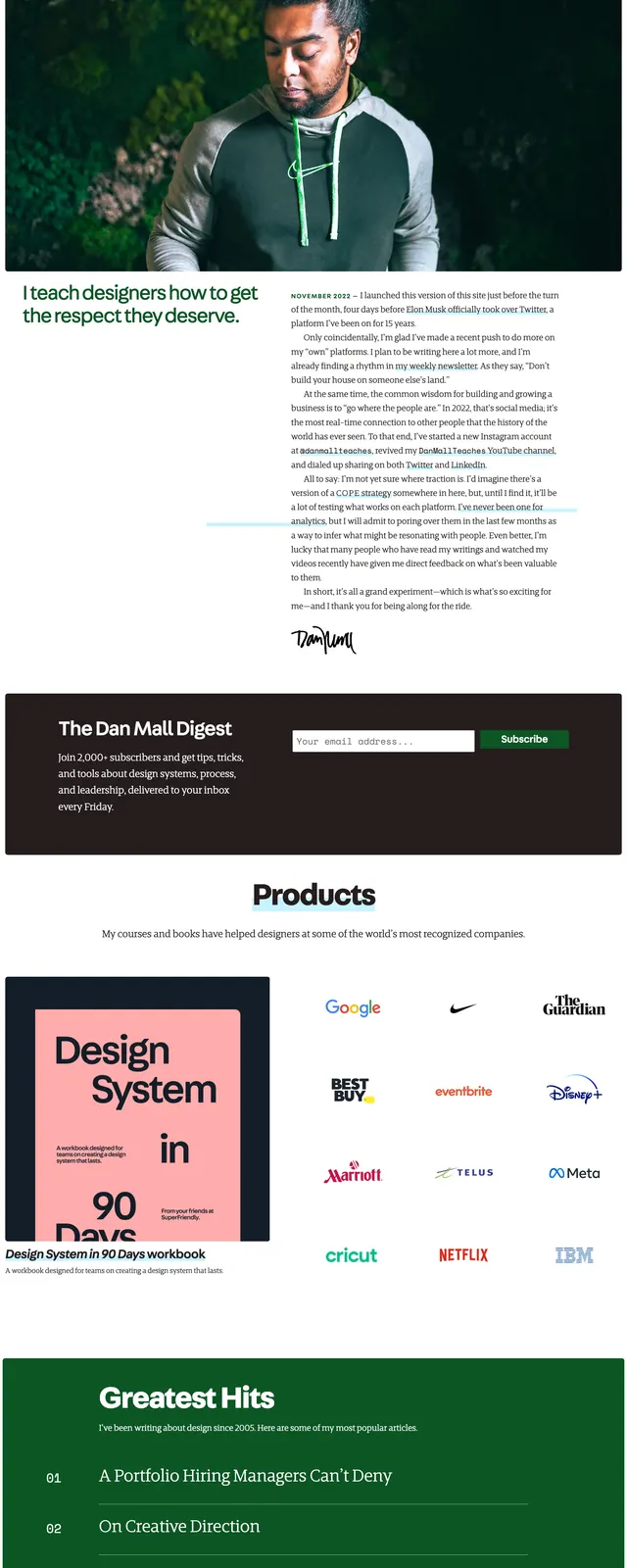
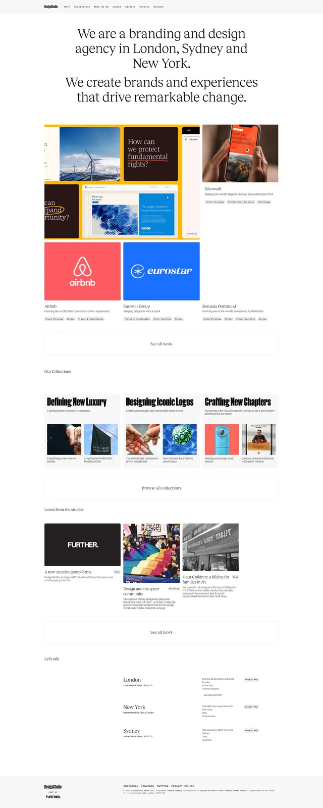
A minimalist editorial agency homepage with oversized serif messaging, portfolio grids, and a clean stacked case-study layout.
Summary
A minimalist editorial agency homepage with oversized serif messaging, portfolio grids, and a clean stacked case-study layout.
Visual description
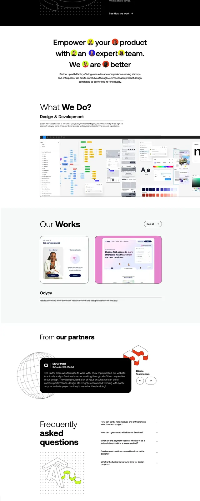
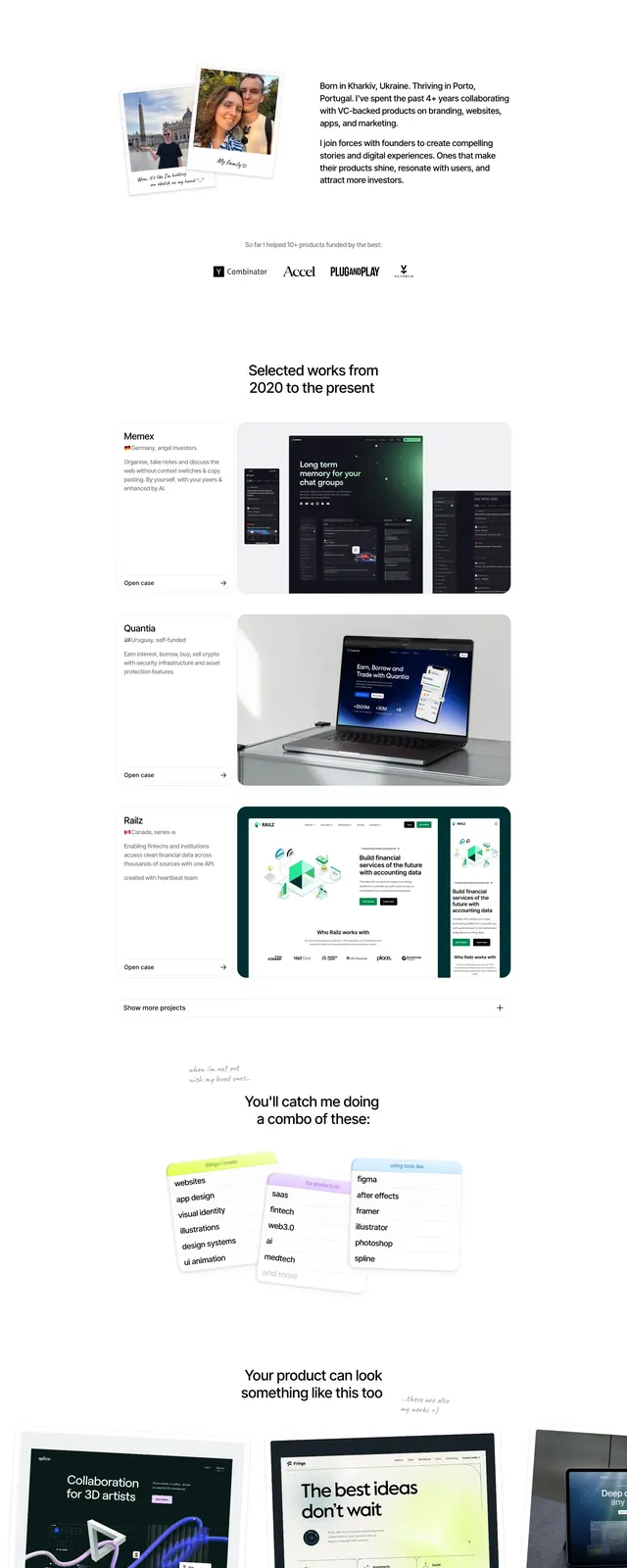
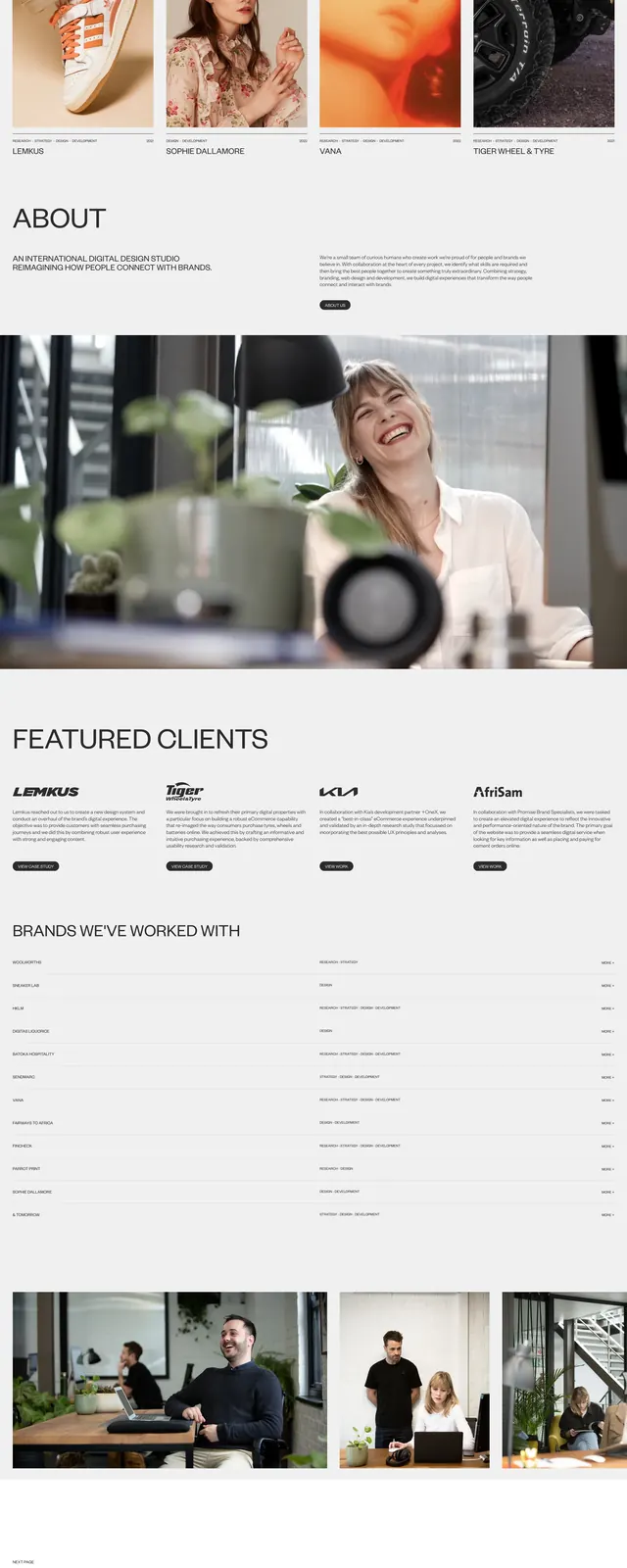
The page opens on a centered hero with a small top navigation and a large serif headline set across multiple lines on a white background. Below it are tightly arranged portfolio cards with large image thumbnails, short captions, and small label badges, followed by a prominent bordered button. Farther down, the page continues with three-column collection blocks, a news/gallery strip, and a contact section listing London, New York, and Sydney with map-style location links. The footer is small and restrained, keeping the overall composition airy and editorial.
Key takeaway
The strongest reusable move is the combination of oversized serif statements with dense, well-spaced content grids underneath. It feels premium without heavy styling because the layout, typography, and whitespace do most of the work.
Reuse notes
Use this pattern for design studios, creative agencies, and portfolio sites that need to look cultured and credible. It works best when the content has strong imagery and multiple featured projects to fill the grid system.