Preview image. Unlock full-res
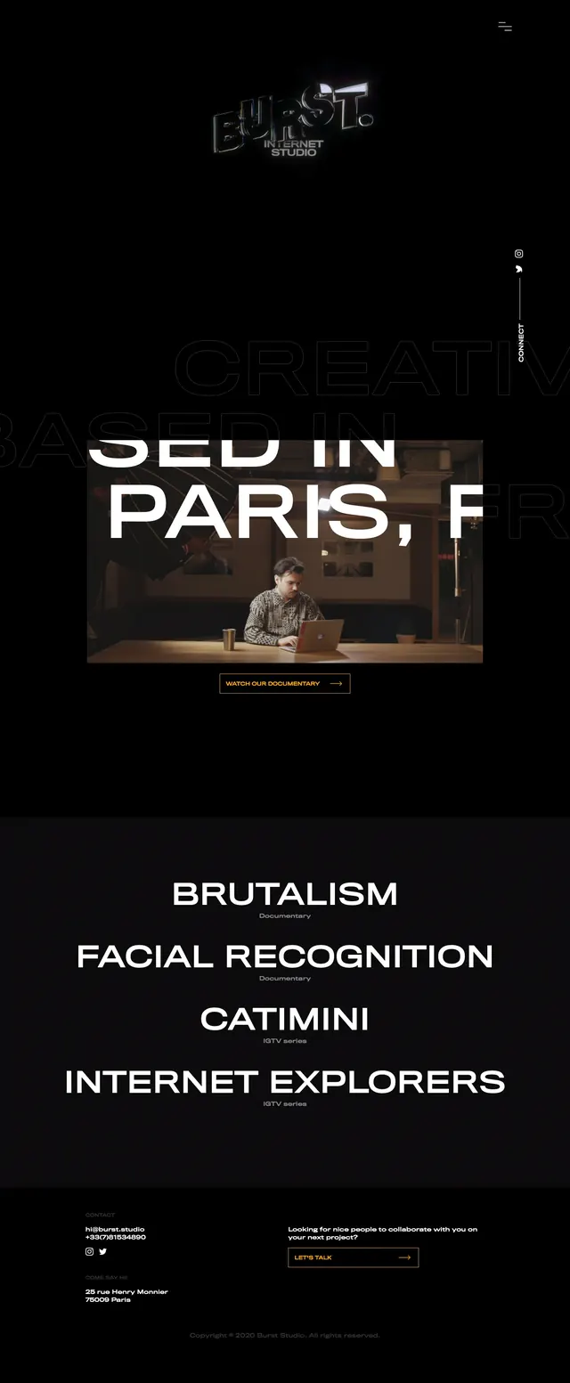
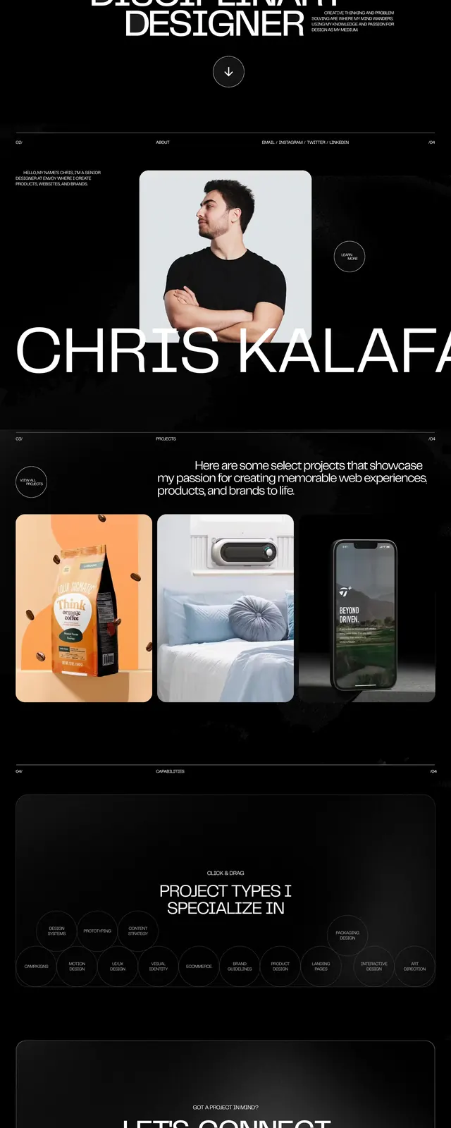
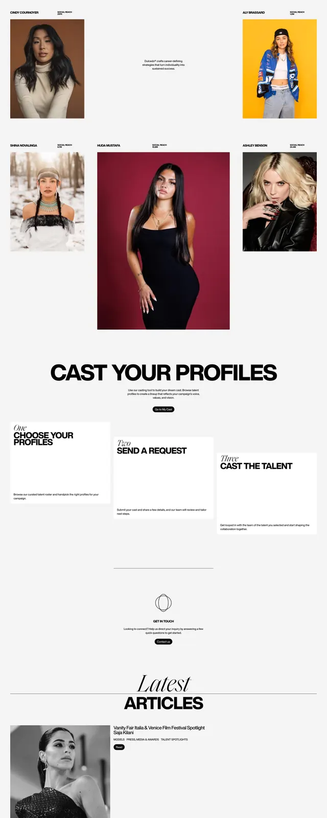
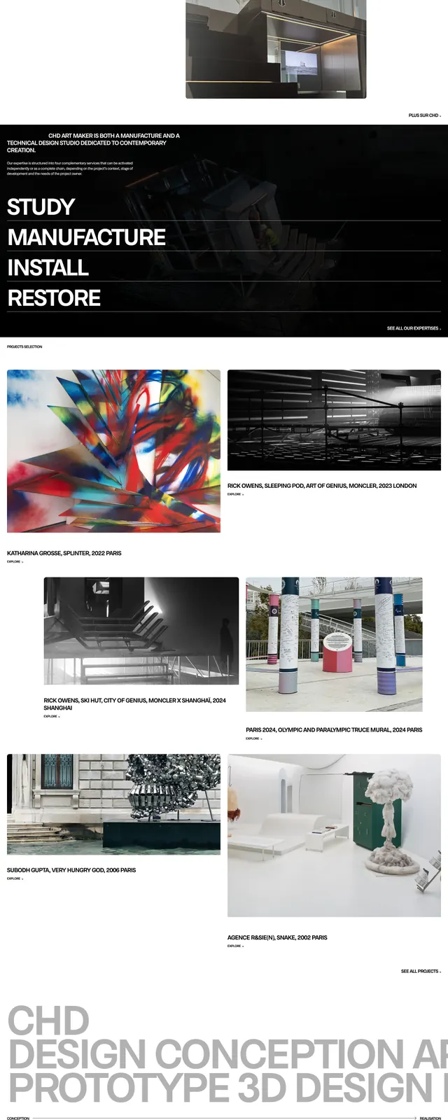
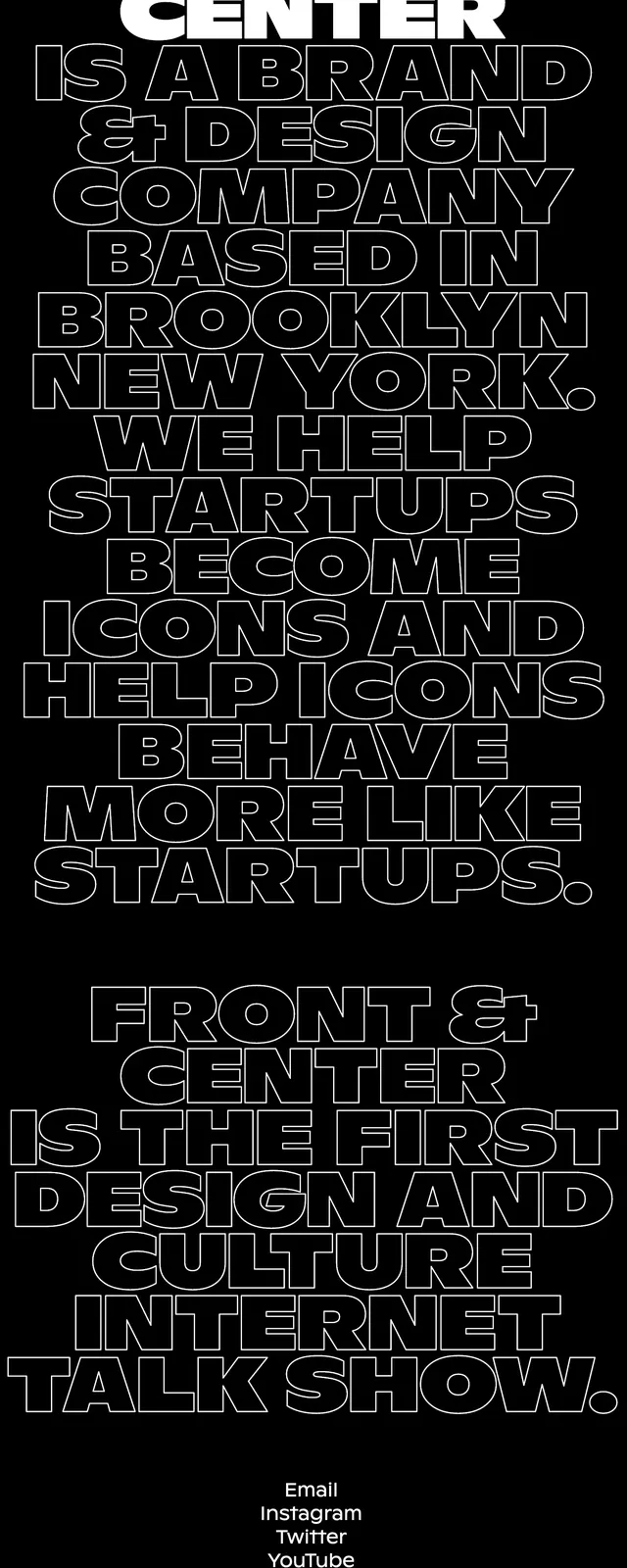
A stark black landing page built from oversized outlined typography and minimal contact details.
Summary
A stark black landing page built from oversized outlined typography and minimal contact details.
Visual description
The page uses a solid black background with very large centered all-caps headlines stacked vertically down the screen. Most of the text is rendered as white outline lettering, while the top wordmark-like line is filled solid white for emphasis. Near the bottom, a small cluster of contact links sits above a compact address block and tiny copyright text, all aligned to the center.
Key takeaway
The design relies almost entirely on scale, outline type, and tight vertical stacking to create impact without imagery. The single filled headline at the top gives the page a clear hierarchy inside an otherwise uniform typographic system.
Reuse notes
Useful for editorial agency, studio, or brand manifesto pages that need a loud typographic statement. It works best when the message itself is the visual and there is very little else to distract from the type.