Preview image. Unlock full-res
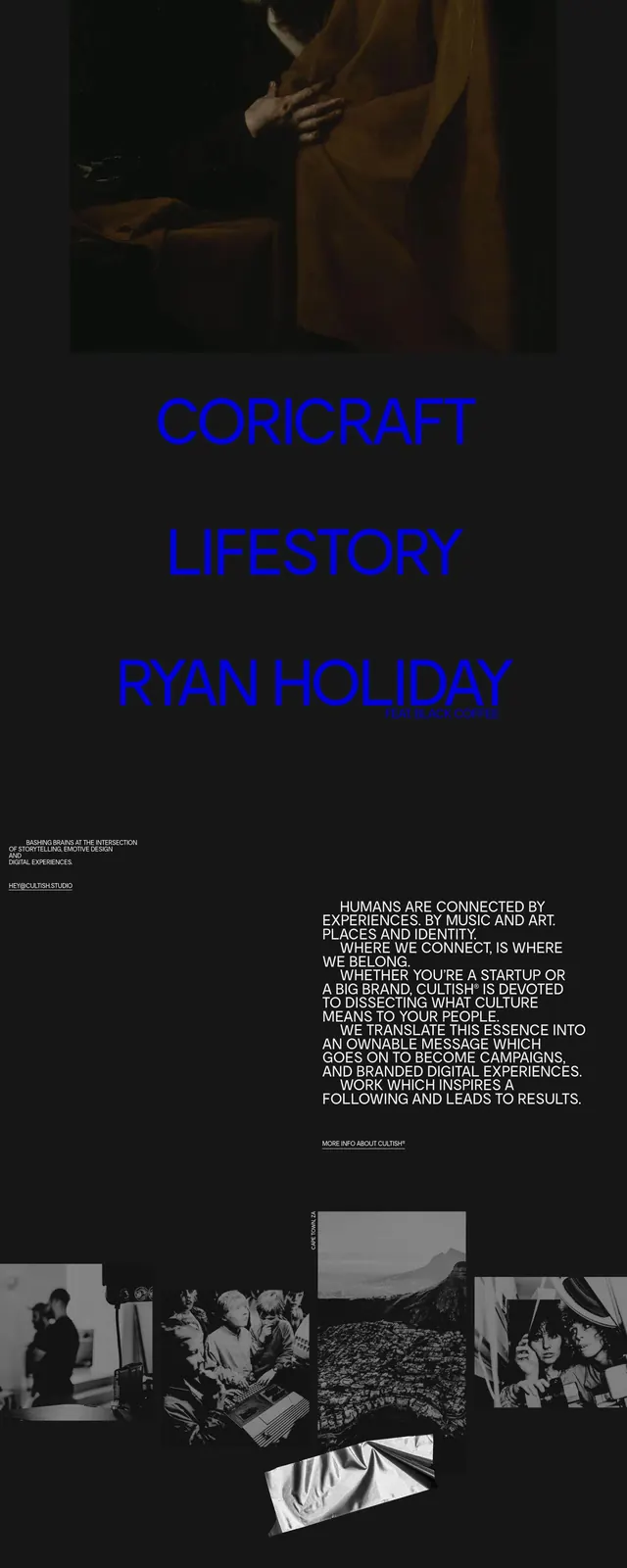
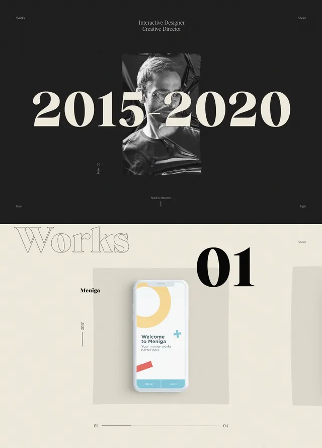
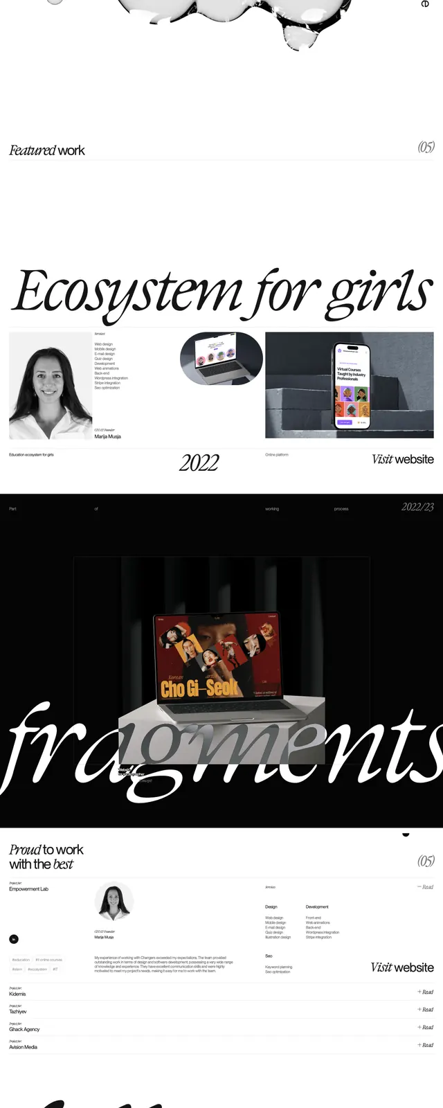
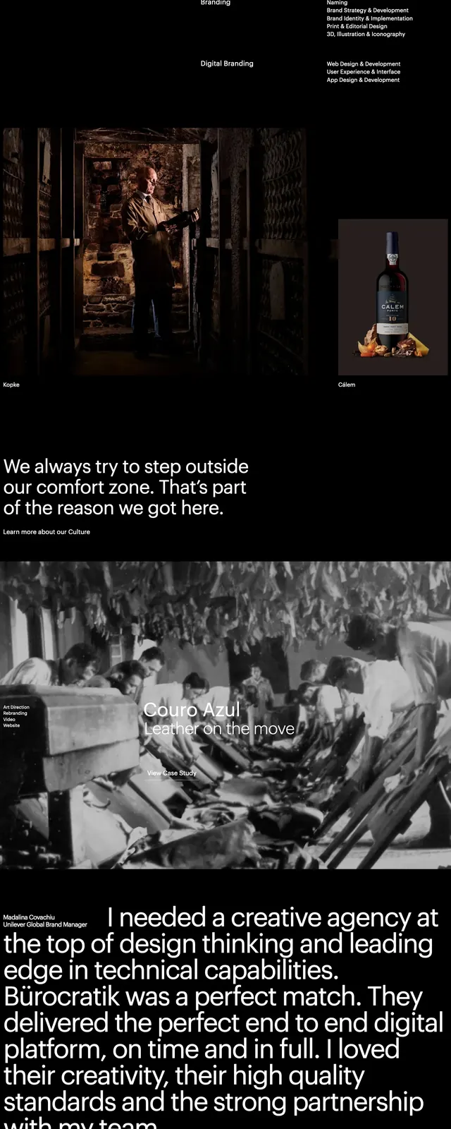
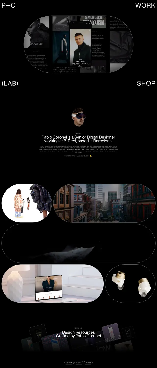
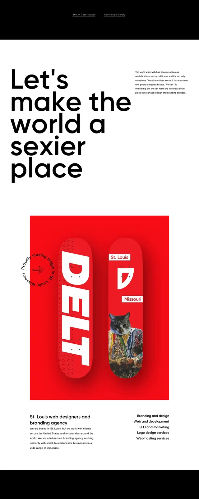
A dark, editorial agency homepage with a huge wordmark hero, dense serif copy, and stacked content sections below.
Summary
A dark, editorial agency homepage with a huge wordmark hero, dense serif copy, and stacked content sections below.
Visual description
The page opens with a full-bleed black hero featuring a huge centered “COMPANY POLICY” wordmark over a textured circular graphic. Below it, a light section uses serif body copy with small blue labels and a rounded secondary button. The page continues with image-led content blocks, including a large featured story, a two-column grid of smaller cards, a bright blue news band, and a dark footer with oversized brand text repeated at the bottom.
Key takeaway
The strongest move is the contrast between minimal black hero space and dense editorial content sections below. Repeating oversized brand text and mixing serif copy with stark imagery gives the page a distinctive studio identity.
Reuse notes
Use this pattern for creative agencies, studios, or portfolio sites that want an editorial feel with strong brand presence. It works best when you have high-quality imagery and enough content to support a magazine-like scroll experience.