Preview image. Unlock full-res
A high-contrast, fashion-editorial agency homepage with oversized serif typography, black-and-white framing, and scattered product and portfolio visuals.
Summary
A high-contrast, fashion-editorial agency homepage with oversized serif typography, black-and-white framing, and scattered product and portfolio visuals.
Visual description
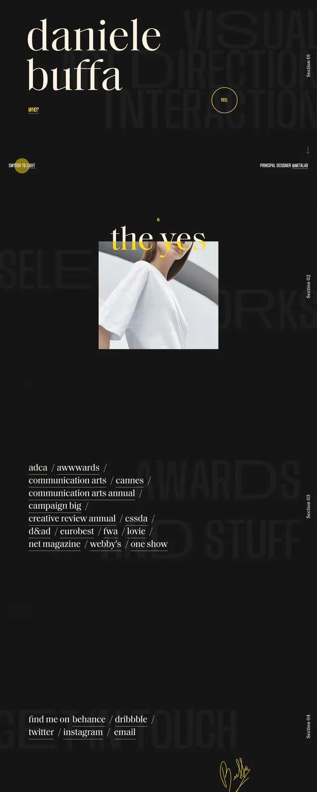
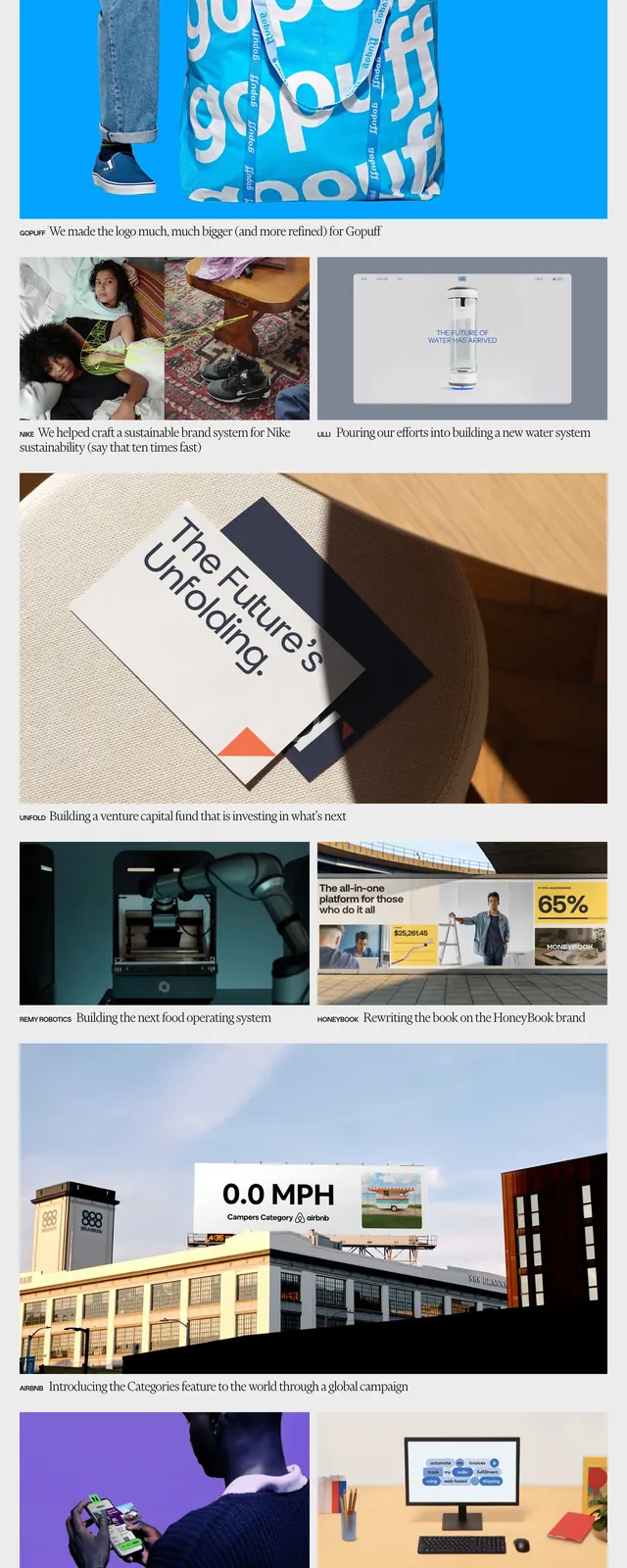
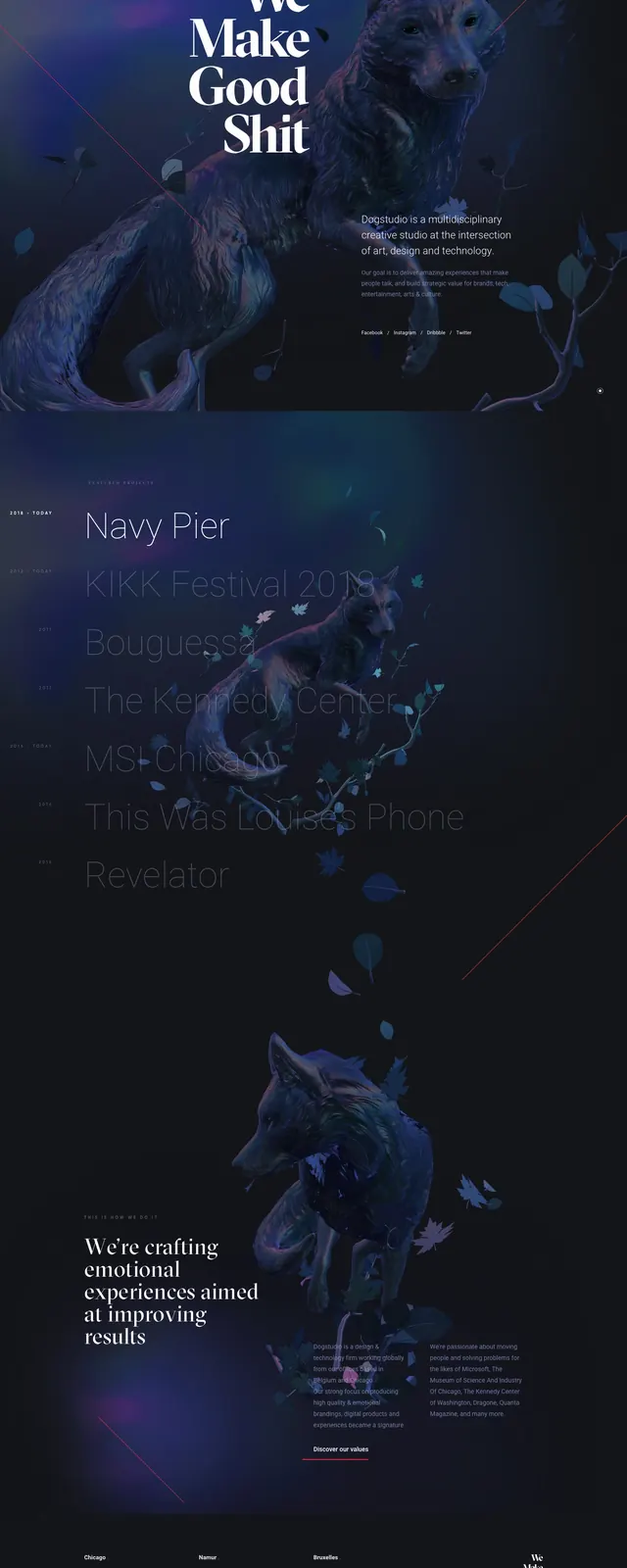
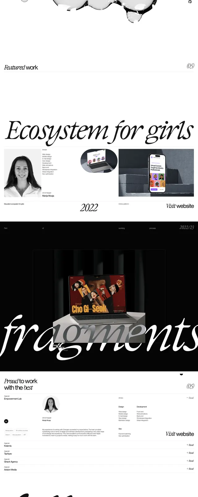
The page uses a black background with very large white serif display type spelling "Changers" across the hero. Small navigation items sit along the top edge, while an abstract 3D-like product shape and tiny supporting copy float near the upper center. Lower sections continue the same black-and-white system with a studio/about block, a portfolio strip of image cards, a large laptop mockup section, a circular contact form area, and a final footer-like contact panel with oversized numerals and a handwritten-style callout.
Key takeaway
The strongest move is the contrast between oversized elegant type and sparse, dark negative space. The page feels premium by mixing editorial typography with minimal navigation and carefully staged visual inserts.
Reuse notes
Use this pattern for fashion, creative studio, or high-end portfolio sites that need attitude more than explanation. It works best when you have strong imagery and can commit to a mostly monochrome, theatrical presentation.