Preview image. Unlock full-res
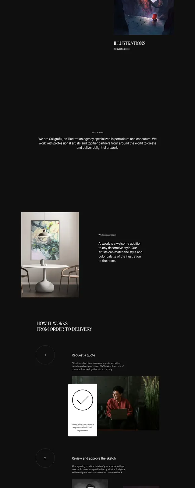
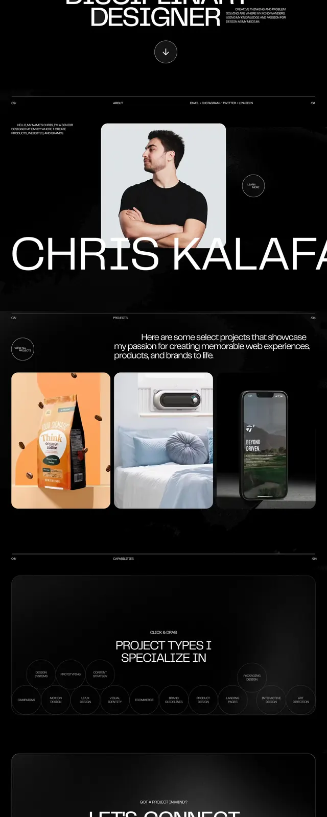
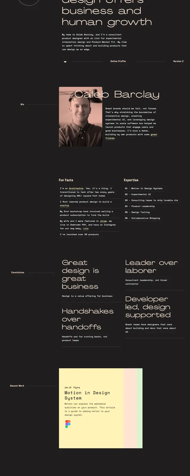
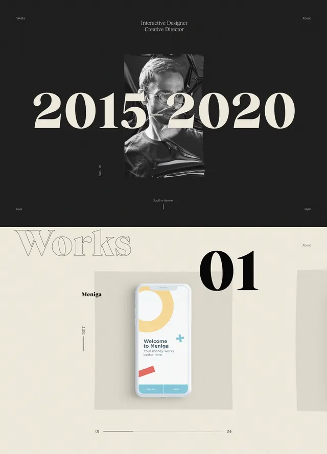
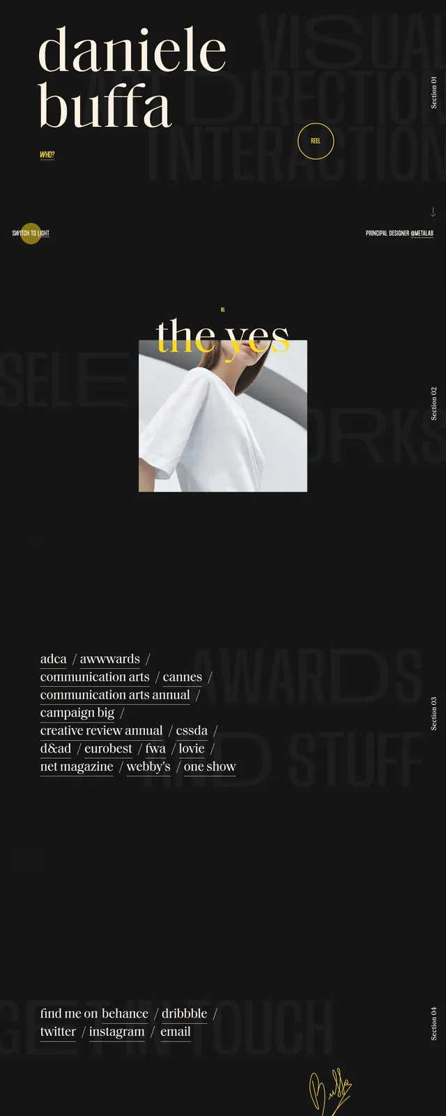
Dark editorial portfolio homepage with oversized serif typography, muted background lettering, and sparse gold accents.
Summary
Dark editorial portfolio homepage with oversized serif typography, muted background lettering, and sparse gold accents.
Visual description
The page opens on a near-black full-bleed hero with very large serif text reading “daniele buffa” on the left and faint oversized background words on the right. Small interface elements sit around the edges, including a list link, section labels, a circular reel button, a light/dark toggle, and a downward arrow. Below the hero, the page continues into stacked sections with a centered fashion image, award text in a serif list, and a footer-style contact block with social links and a signature mark.
Key takeaway
The strongest move is the contrast between refined serif typography and sparse UI chrome on a dark canvas. The faded oversized background words add depth without competing with the main name treatment.
Reuse notes
Use this pattern for personal portfolios, creative director sites, or agency intros where identity needs to feel premium and understated. It works best when the page can rely on typography, spacing, and a few metallic accent elements instead of heavy imagery or dense content.