Preview image. Unlock full-res
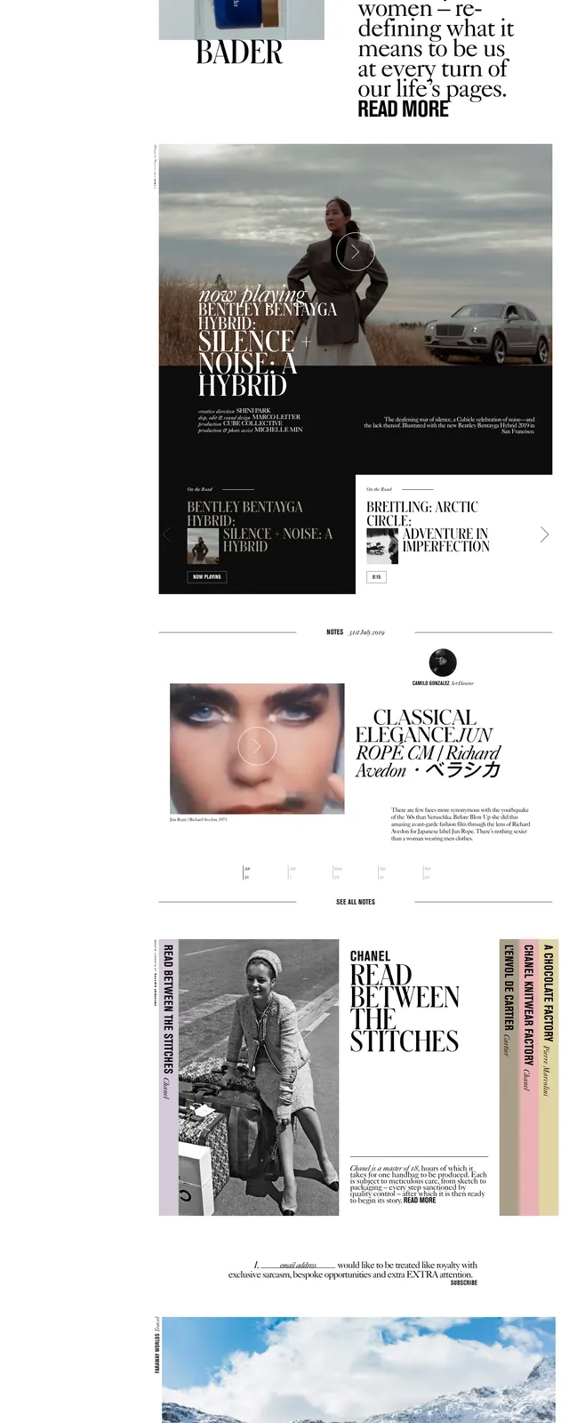
A monochrome editorial landing page for Cubiclejournal with oversized serif headlines, fashion imagery, and stacked article blocks.
Summary
A monochrome editorial landing page for Cubiclejournal with oversized serif headlines, fashion imagery, and stacked article blocks.
Visual description
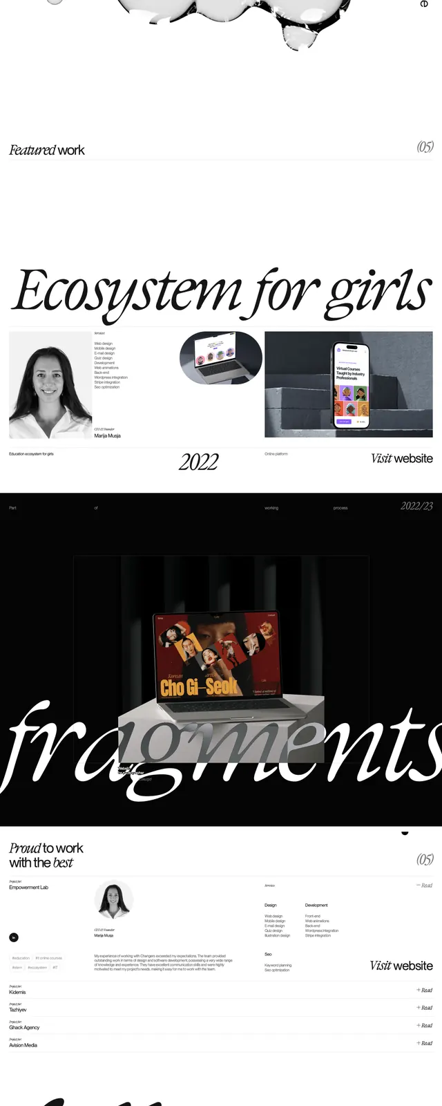
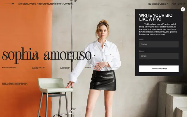
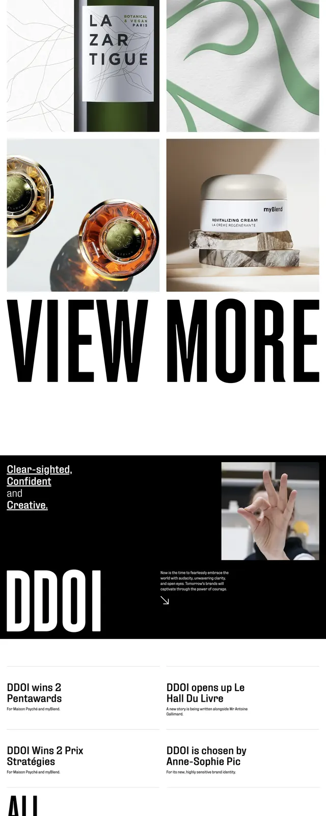
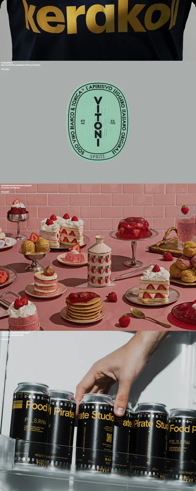
The page uses a white background with a narrow left column of stacked section links and very large serif headlines, while the main area is dominated by black-and-white fashion photography. A small centered hamburger icon and the Cubicle logo sit at the top, with multiple editorial story blocks arranged below in mixed horizontal and vertical compositions. Further down, the layout alternates between image-led feature cards, large article titles, and thin divider lines, keeping a print-magazine feel throughout.
Key takeaway
The strongest move is the print-editorial hierarchy: oversized serif type, stark monochrome imagery, and lots of negative space. The page feels curated and premium without relying on heavy UI chrome.
Reuse notes
Reuse this for fashion, culture, or magazine-style sites that need a high-end editorial tone. It works best when paired with strong photography and short, punchy headlines rather than dense product copy.