Preview image. Unlock full-res
A playful, retro full-page ecommerce landing page for Chia Pet with oversized display type, bold product promos, and a striped purple hero layout.
Summary
A playful, retro full-page ecommerce landing page for Chia Pet with oversized display type, bold product promos, and a striped purple hero layout.
Visual description
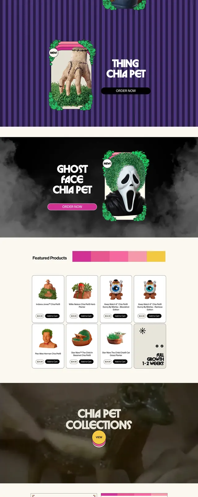
The page uses a cream header area with small pill-shaped navigation buttons, a centered logo, and a large black headline reading "CH-CH-CH-CHIA!". Below it, bright pink and yellow shipping strips lead into a purple striped hero section with a product image on the right, a large stacked title on the left, and a rounded call-to-action button. Farther down, a dark smoky promo band repeats the same split layout, followed by a featured products grid of small cards, then a simple two-column product feature area and a black footer with compact link pills.
Key takeaway
The strongest move is the exaggerated retro personality: oversized custom type, saturated accent bands, and highly branded product visuals make the commerce page feel like an ad campaign. Repeating split hero modules gives the page rhythm while keeping the layout simple.
Reuse notes
Useful for novelty retail, seasonal promotions, or brands that want a loud, nostalgic storefront with strong merchandising energy. The approach depends on highly stylized imagery and custom display type, so it works best when the brand voice can carry the whole page.