Preview image. Unlock full-res
A clean insurance landing page combines a large split hero, trust-building logos, and illustrated product and support sections with generous white space.
Summary
A clean insurance landing page combines a large split hero, trust-building logos, and illustrated product and support sections with generous white space.
Visual description
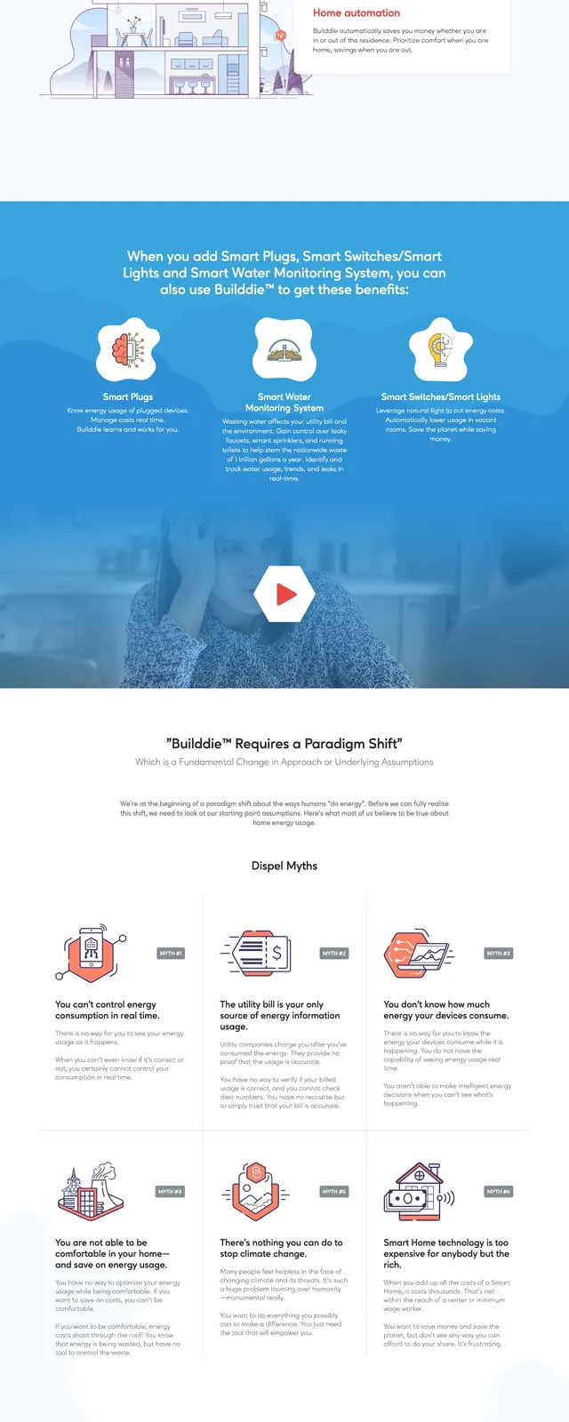
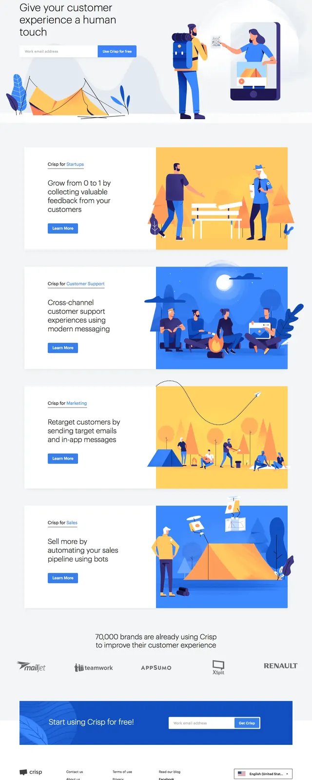
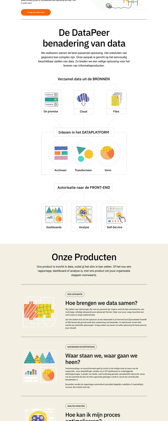
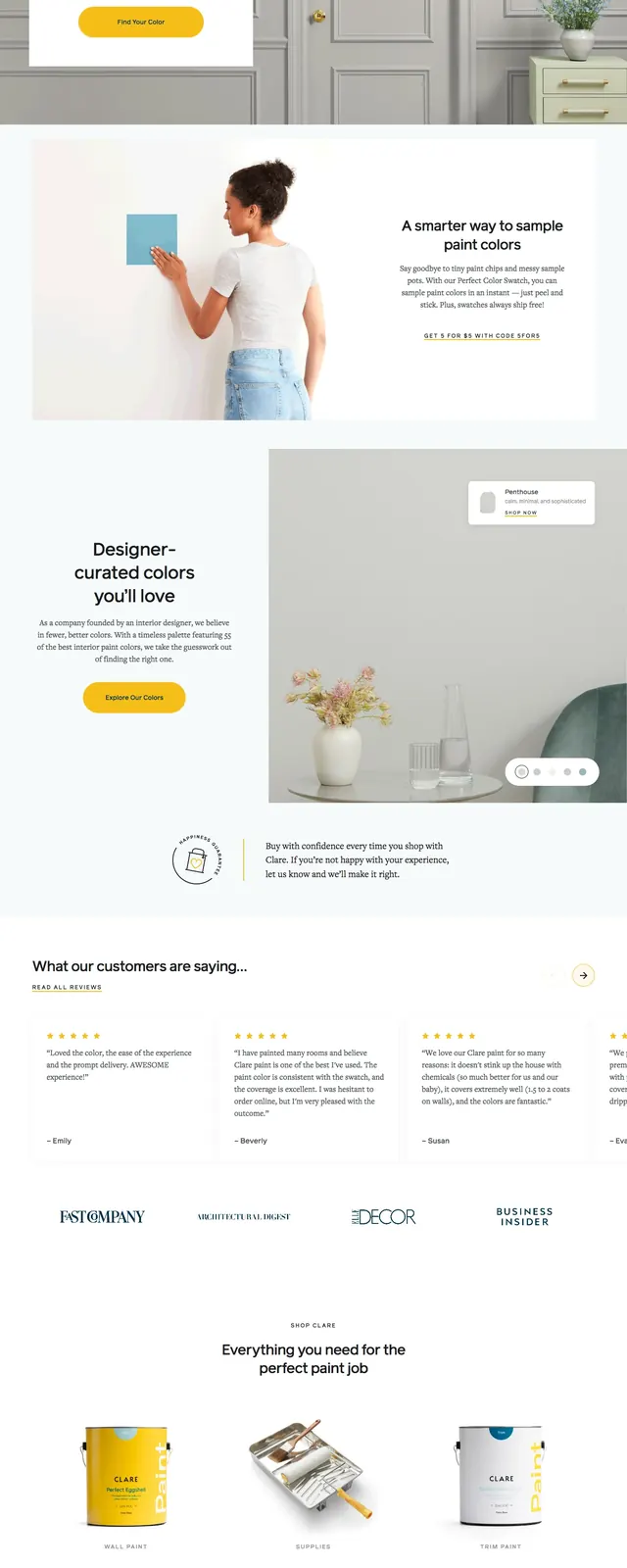
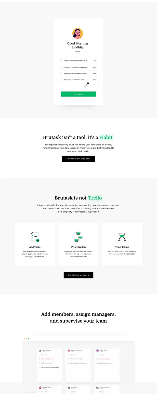
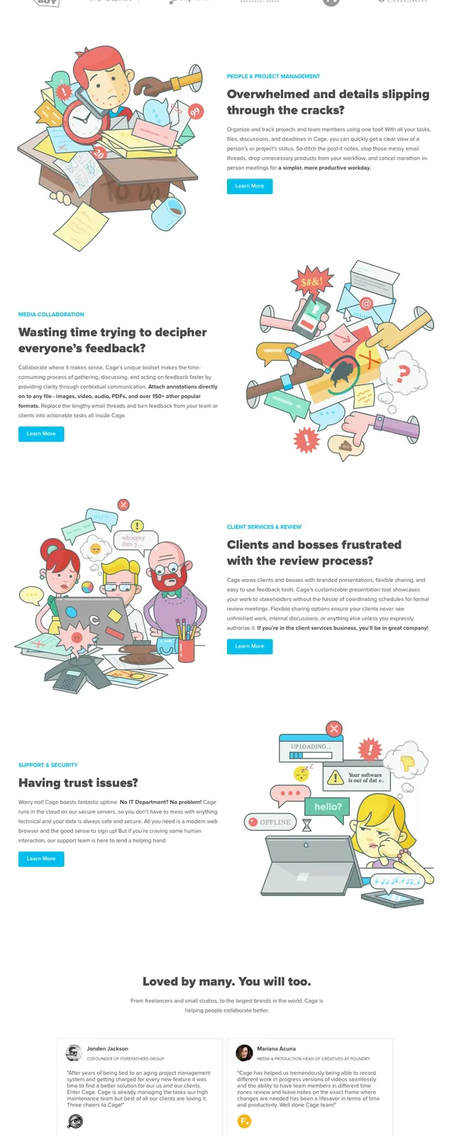
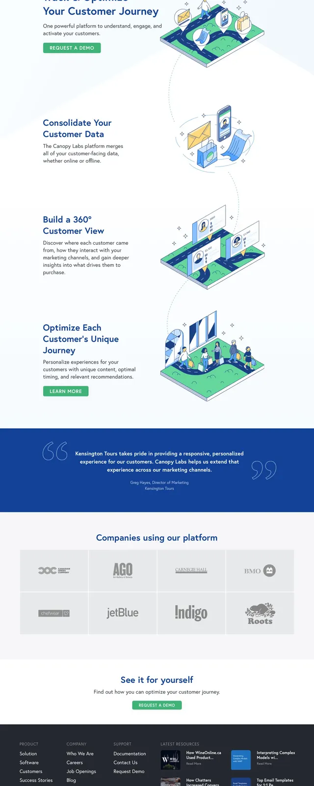
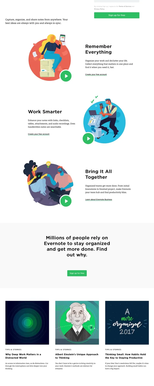
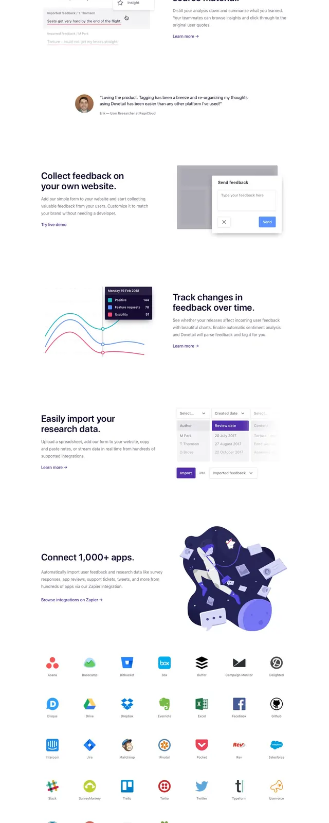
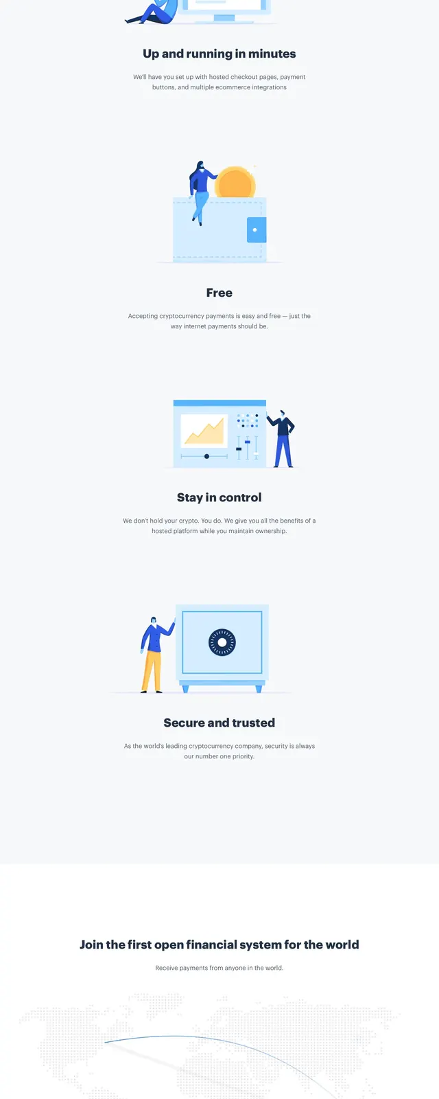
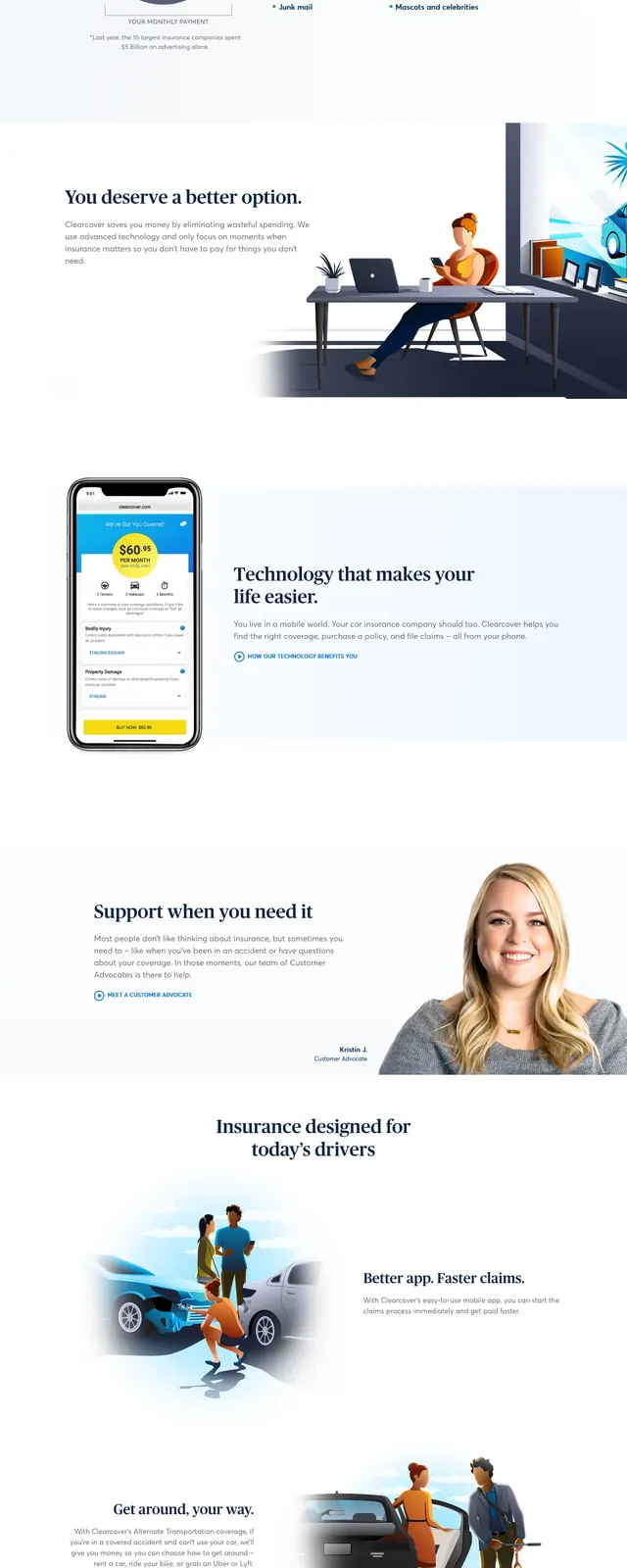
The page opens with a left-aligned headline, supporting copy, and two call-to-action buttons beside a large illustrated car-and-house scene on the right. Below the hero is a dark trust bar with media logos, followed by stacked content sections that pair a pie-chart graphic, a mobile app screenshot, and support imagery with explanatory text. The page continues with another illustrated driving scene and ends with a centered CTA block above a compact footer.
Key takeaway
The design uses a high-trust, explanation-first structure: hero persuasion, credibility logos, product proof, then reassurance through support and savings messaging. It is strong for converting a complex service into a simple, approachable offer.
Reuse notes
Reuse the split hero with a prominent illustration and two CTAs when the goal is to explain a service quickly while keeping the page approachable. The trust logo strip and alternating image-text sections are especially useful for fintech, insurance, and other high-consideration consumer products.