Preview image. Unlock full-res
A soft, minimal SaaS landing page for Coda with a split hero, product mockups, social proof, and modular feature sections.
Summary
A soft, minimal SaaS landing page for Coda with a split hero, product mockups, social proof, and modular feature sections.
Visual description
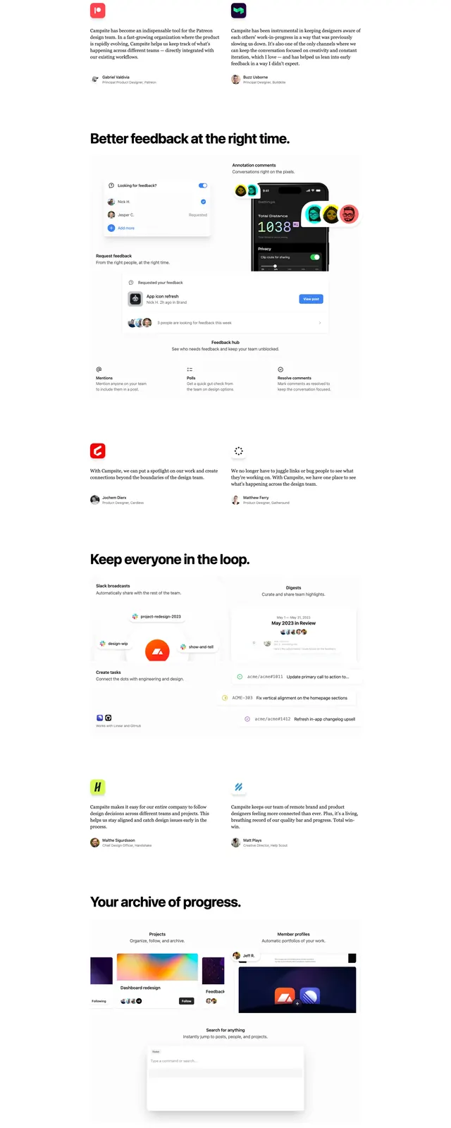
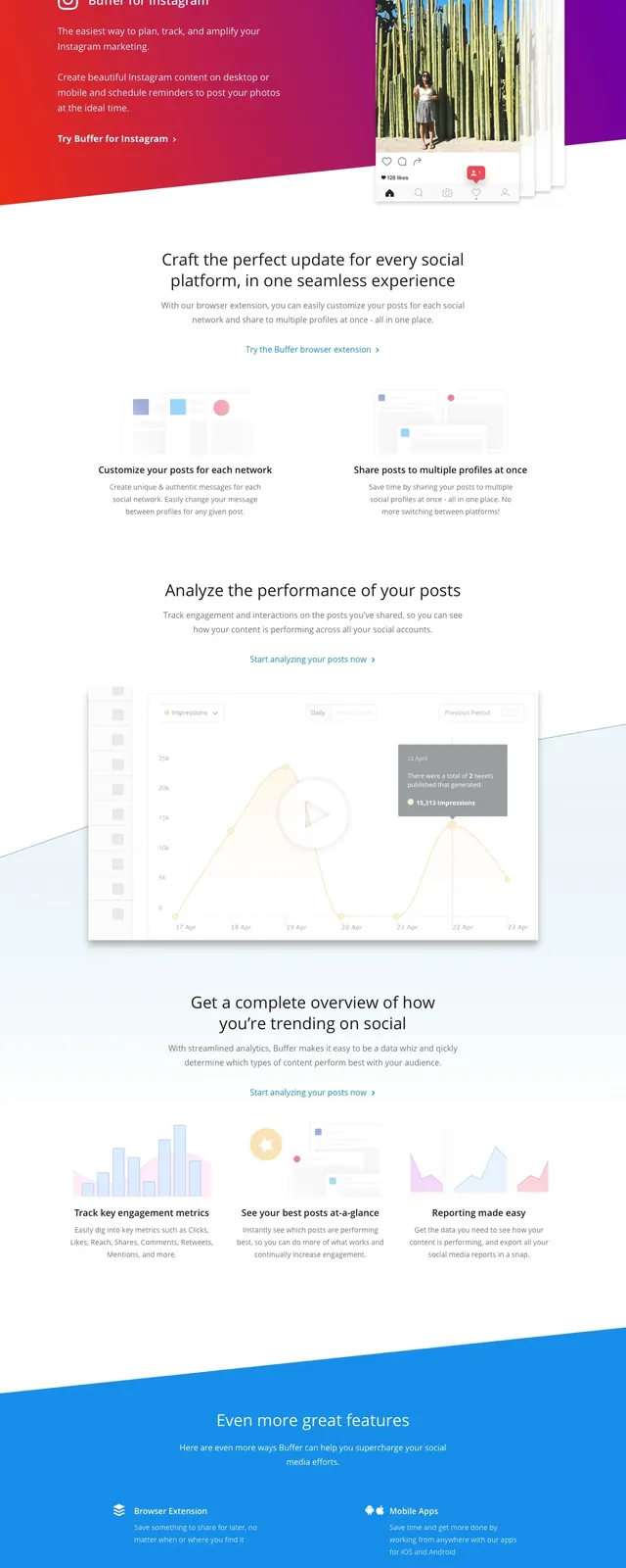
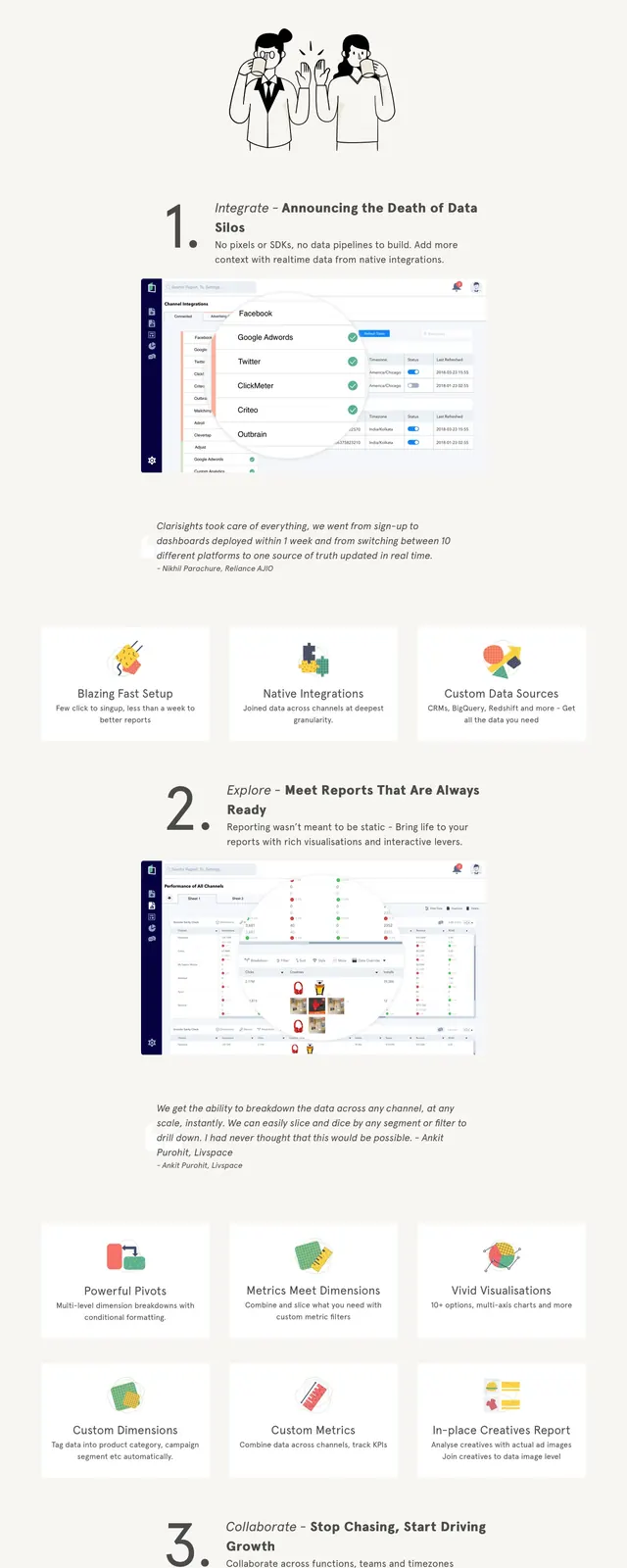
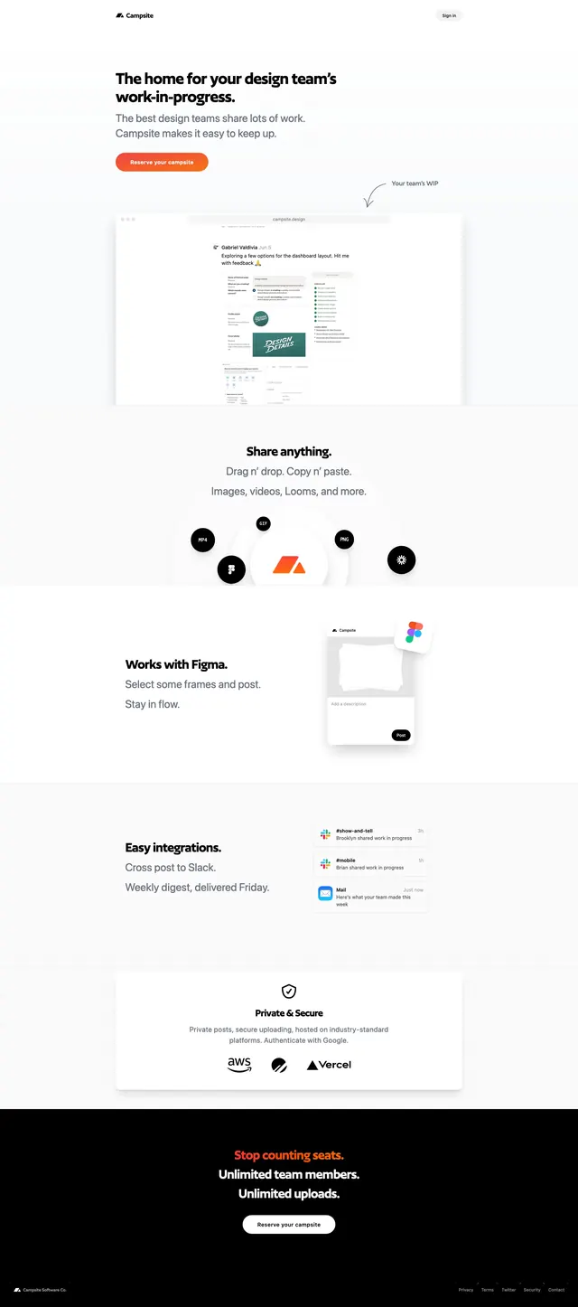
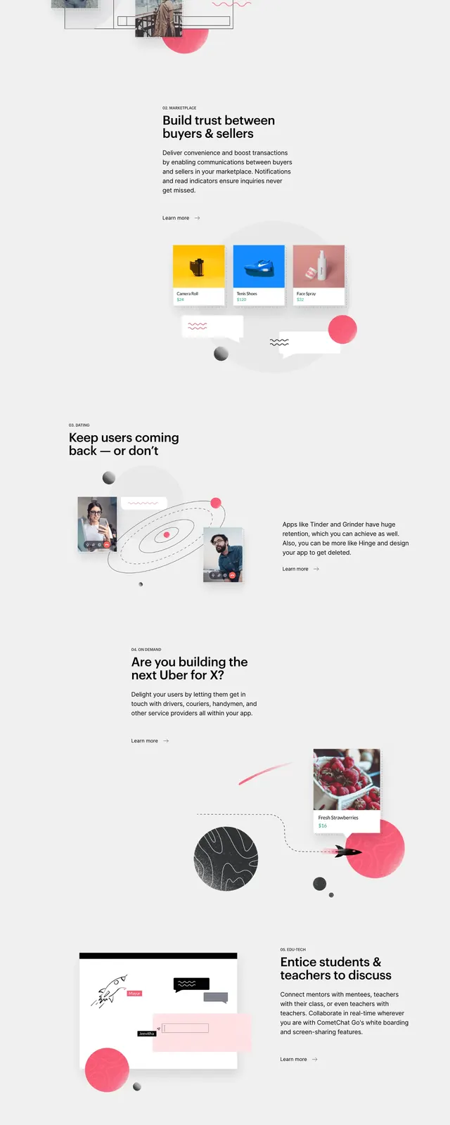
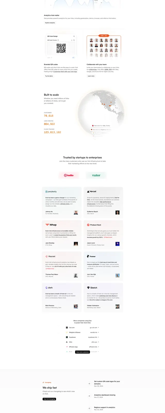
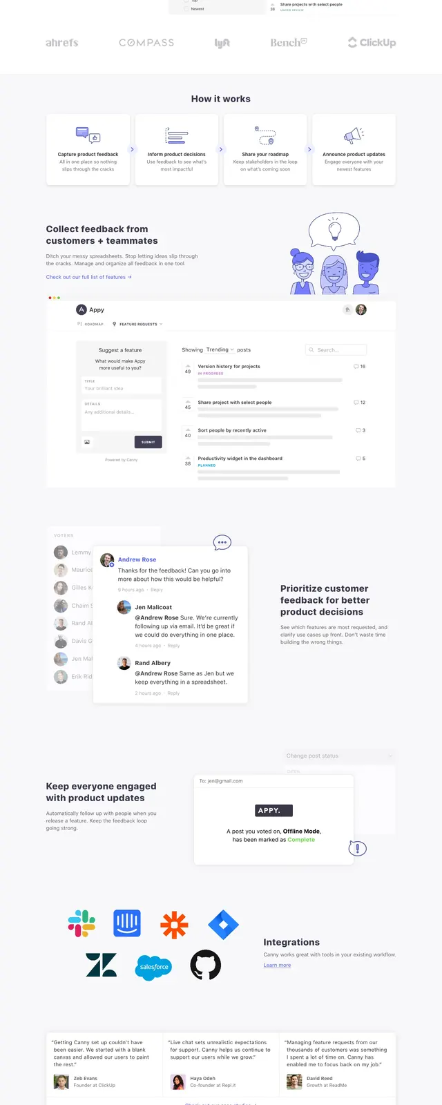
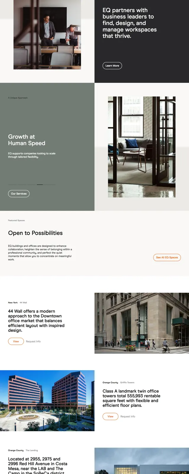
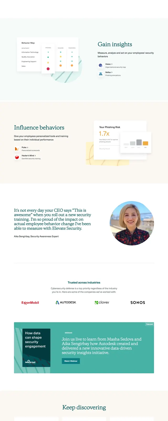
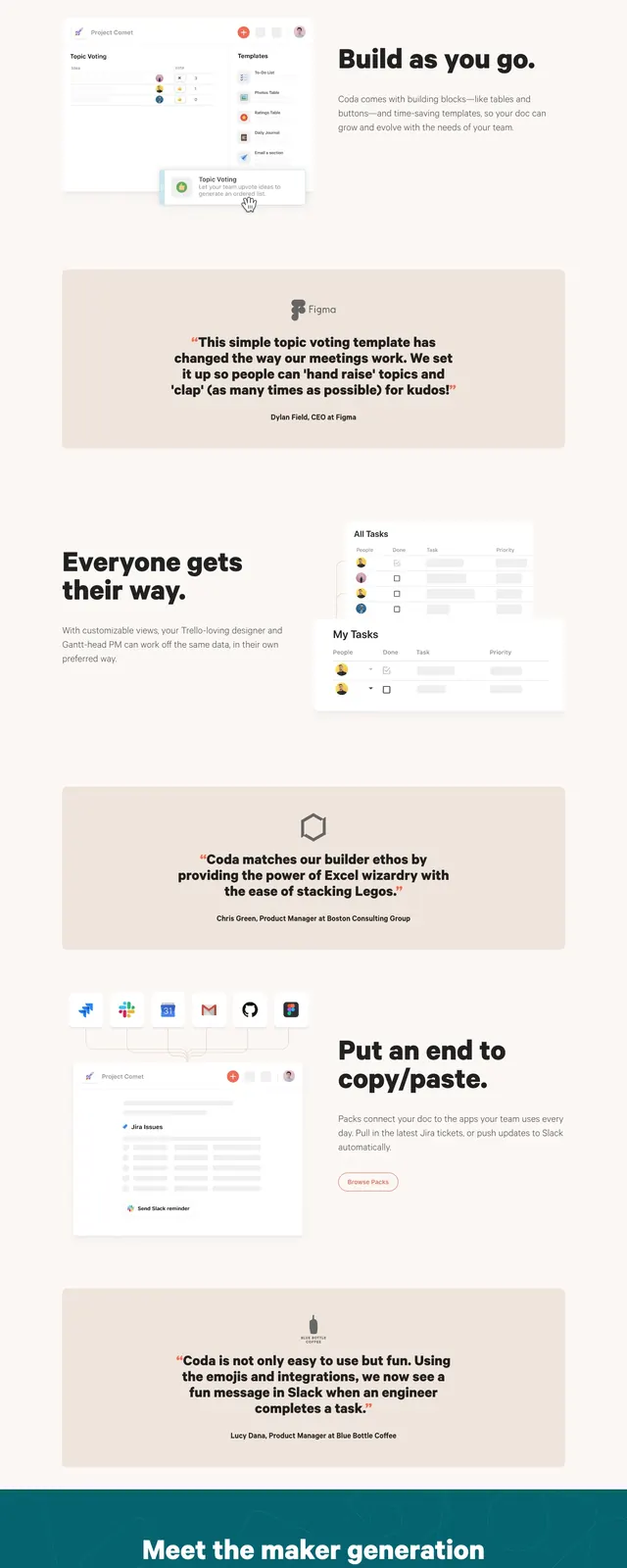
The page uses a pale cream background with warm beige section bands and a clean top navigation. The hero is split left-right, pairing a large bold headline and CTA with a product screenshot mockup. Below it are a logo strip, a testimonial/video panel, a comparison-style feature section, and a grid of simple template cards. The overall look is spacious, soft, and lightly framed with rounded cards and subtle shadows.
Key takeaway
This design leans on calm whitespace, oversized bold headlines, and modular content blocks to make a productivity product feel approachable and credible. The reusable patterns are the split hero, logo proof row, testimonial callout, and card-based template gallery.
Reuse notes
Reuse the warm neutral palette, oversized black typography, and rounded card containers to preserve the same restrained SaaS feel. The layout works well for product homepages that need a clear hero, social proof, and multiple feature entry points.