Preview image. Unlock full-res
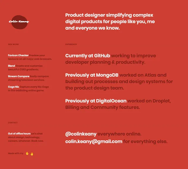
A minimal personal portfolio page on a solid red background with oversized introductory copy and a simple experience-and-contact layout.
Summary
A minimal personal portfolio page on a solid red background with oversized introductory copy and a simple experience-and-contact layout.
Visual description
The page uses a solid brick-red background with a small circular logo mark and handwritten-style signature at the upper left. A large white introduction headline sits on the upper right, while the lower half is divided into compact left-column side work notes and larger right-column experience and contact text blocks. Text is mostly white with darker red accents for emphasis, creating a sparse but high-contrast composition. No photography or product imagery is visible, and the page relies entirely on typography and spacing.
Key takeaway
The strongest move is the extreme restraint: one saturated background color, a tiny brand mark, and typography doing all the work. The split information layout keeps a personal portfolio readable while still feeling graphic.
Reuse notes
Useful for personal portfolio intros, digital CVs, or creator pages where the goal is to present identity and experience quickly. It works best when the copy is short and the brand can be expressed through type and color alone.