Preview image. Unlock full-res
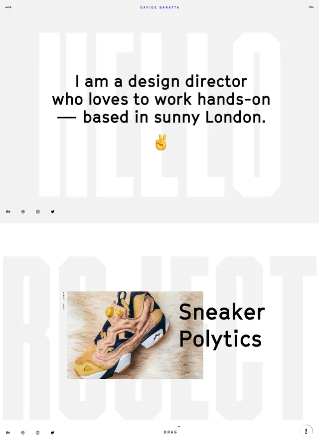
An airy, editorial landing page with oversized black headlines, sparse copy, and whimsical black-and-white illustrations on a white background.
Summary
An airy, editorial landing page with oversized black headlines, sparse copy, and whimsical black-and-white illustrations on a white background.
Visual description
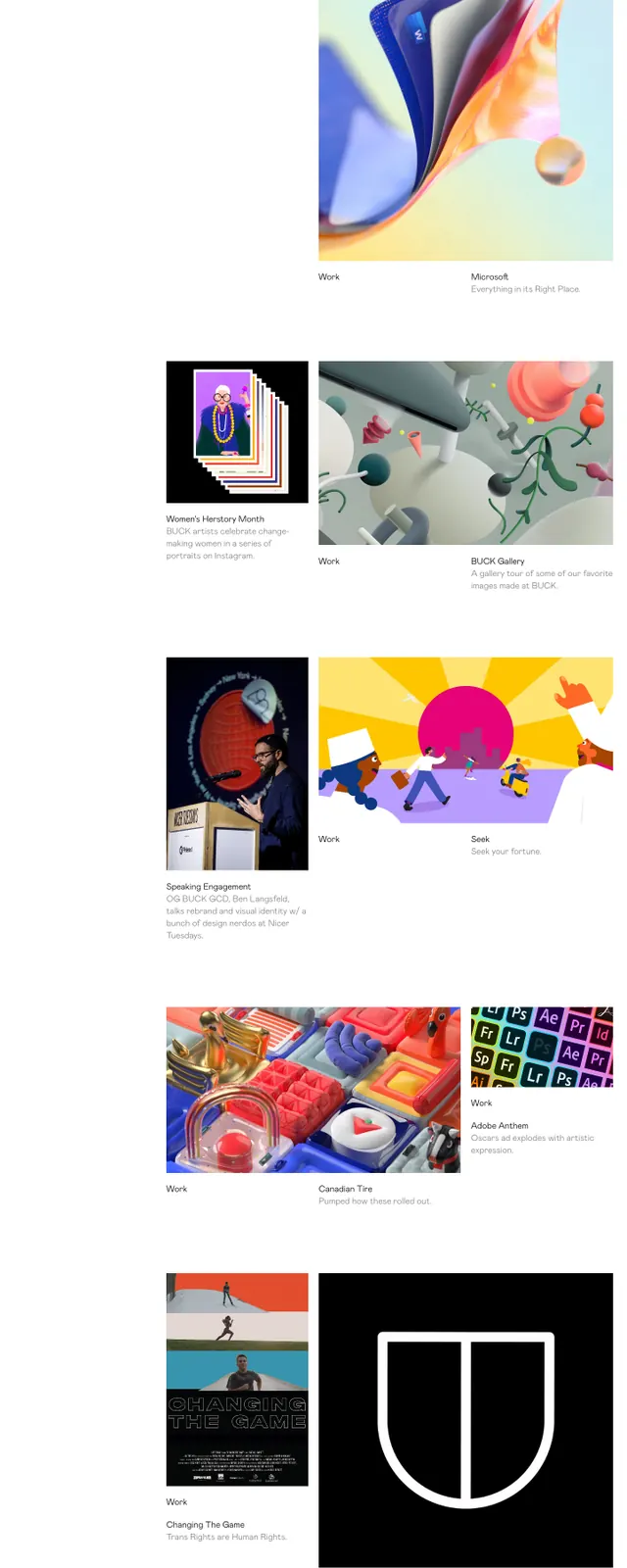
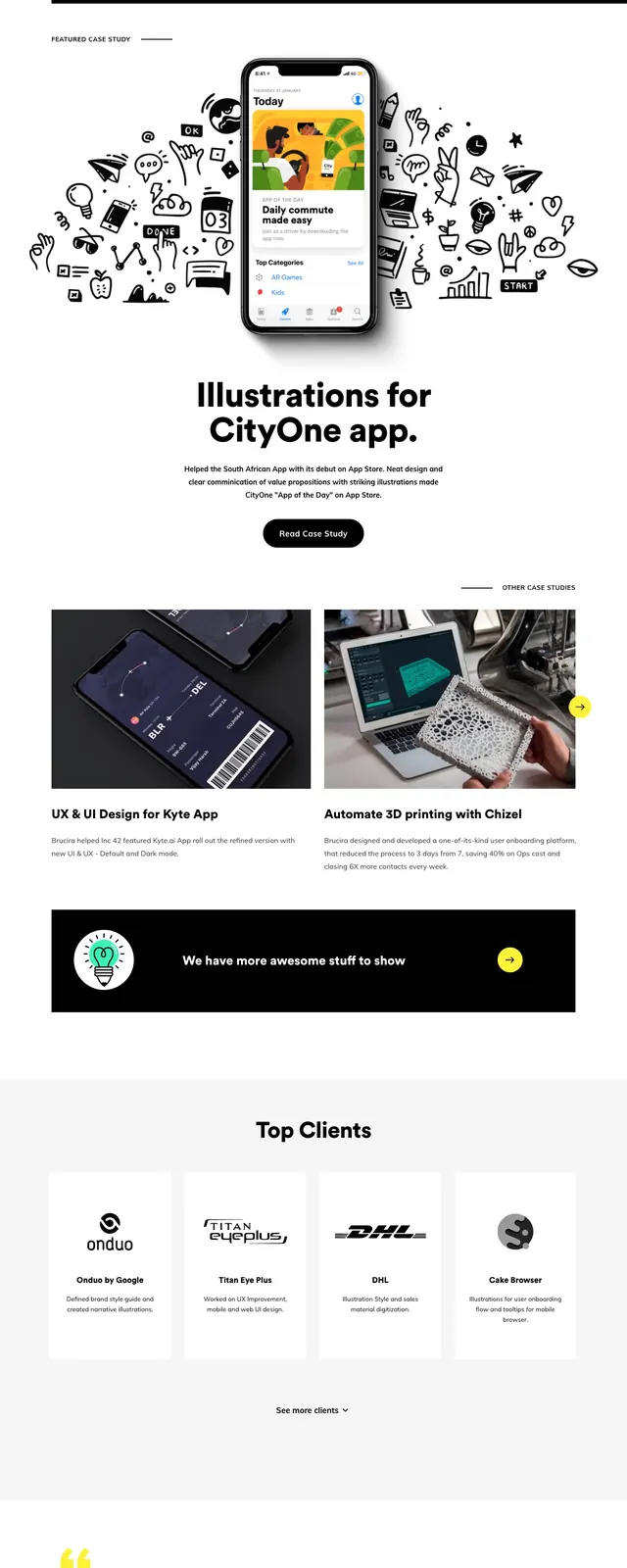
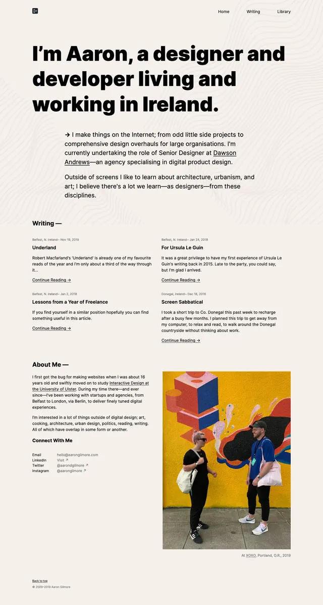
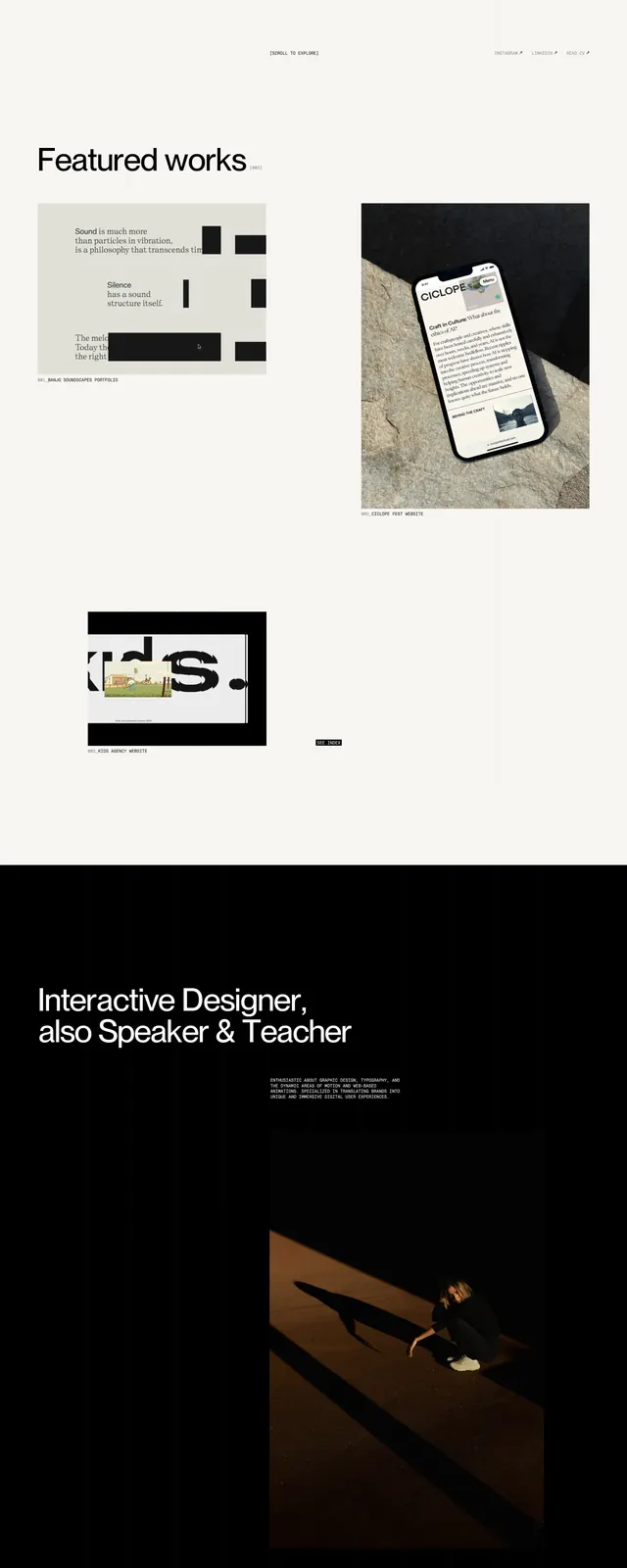
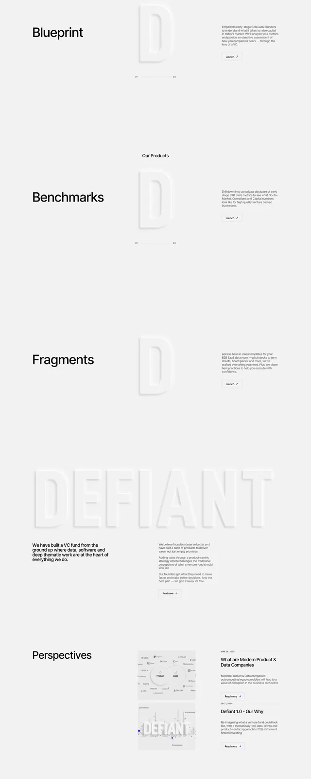
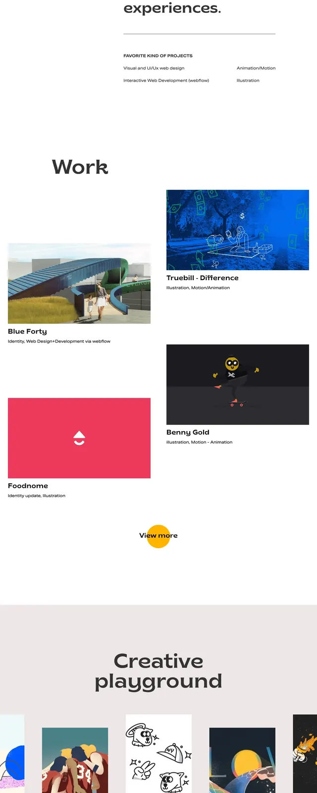
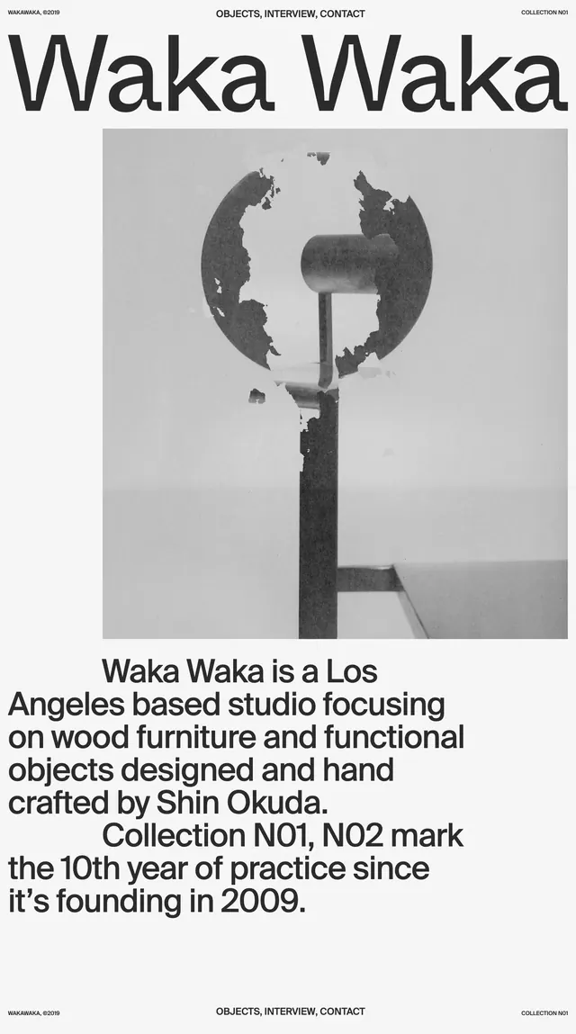
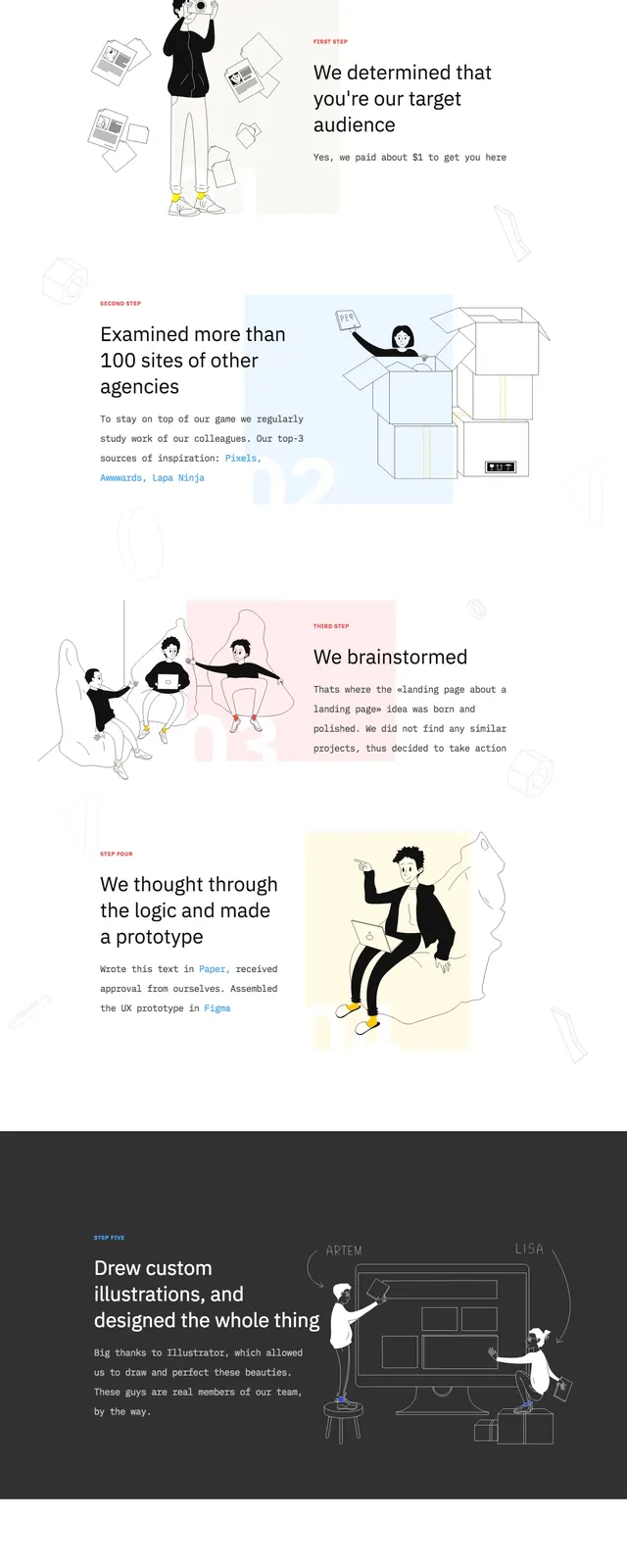
The first screen uses a very large left-aligned headline, a short supporting paragraph, and a small outlined button on a mostly empty white canvas. To the right, several floating black-and-white illustrated figures and letters create a loose collage with lots of negative space. Lower slices continue with centered section labels and alternating text-and-illustration blocks in a clean editorial rhythm. The page ends with a centered CTA-style statement, round social icons, and a final illustrated team scene.
Key takeaway
The main reusable idea is the combination of stark typography with custom illustrations to make a minimalist agency page feel memorable. The generous whitespace and irregular illustration placement keep the layout light while still feeling designed.
Reuse notes
Use this pattern for creative agencies, studios, or portfolio sites that need a distinct personality without heavy color. It works best when the illustrations are bespoke and the copy stays short, because the layout depends on visual breathing room.