Preview image. Unlock full-res
An editorial portfolio homepage with oversized serif typography, muted neutral backgrounds, and bold color-block project panels.
Summary
An editorial portfolio homepage with oversized serif typography, muted neutral backgrounds, and bold color-block project panels.
Visual description
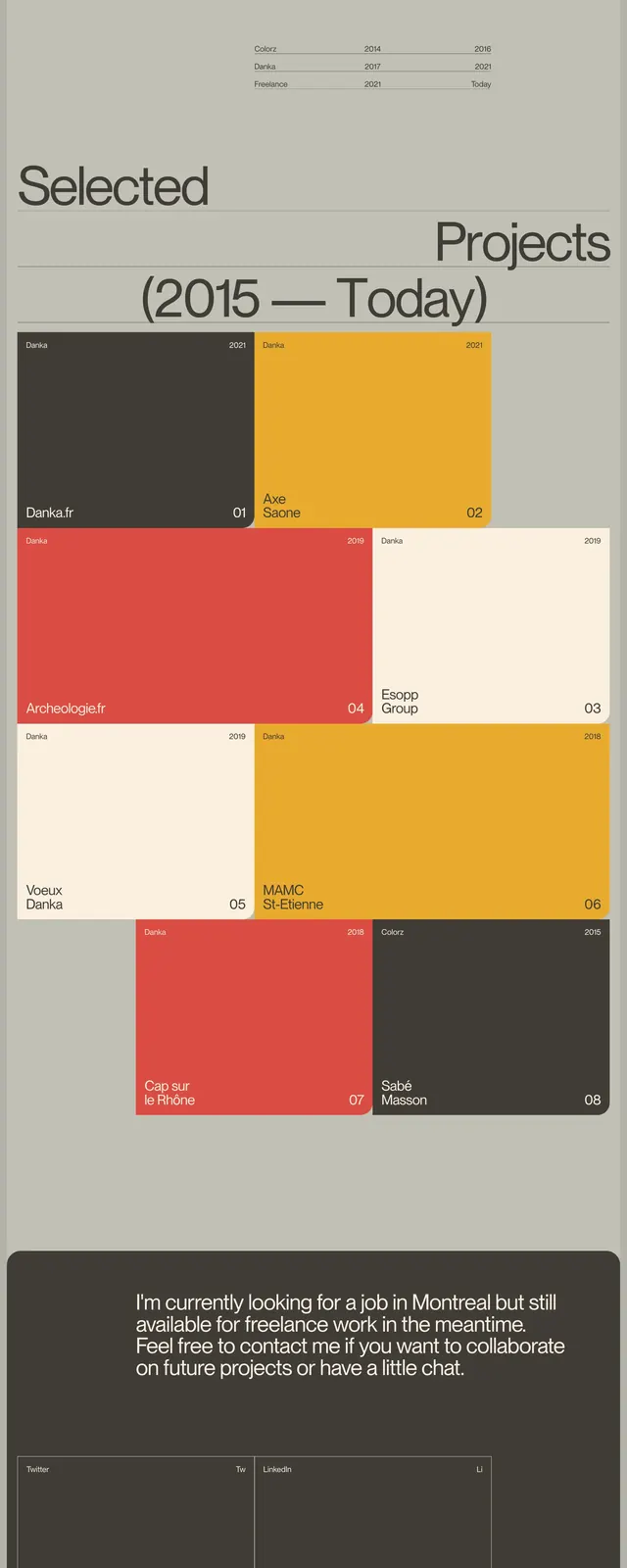
The page opens with a large editorial hero featuring the name split across the top and a centered headline announcing a French frontend developer based in Montreal. The layout uses thin divider lines, generous whitespace, and small supporting text to balance the oversized typography. Lower sections switch into a grid of large rectangular project cards in red, cream, and mustard, followed by a dark contact/footer area with outlined panels for social links and email.
Key takeaway
The design feels like a refined personal portfolio that combines magazine-like typography with a modular project grid. Strong contrast between muted canvas tones and saturated accent blocks gives the page a polished but expressive identity.
Reuse notes
Reuse the oversized serif headline treatment, thin rules, and small metadata labels for a sophisticated portfolio hero. The color-block project grid is also a strong pattern for showcasing case studies or selected work.