Preview image. Unlock full-res
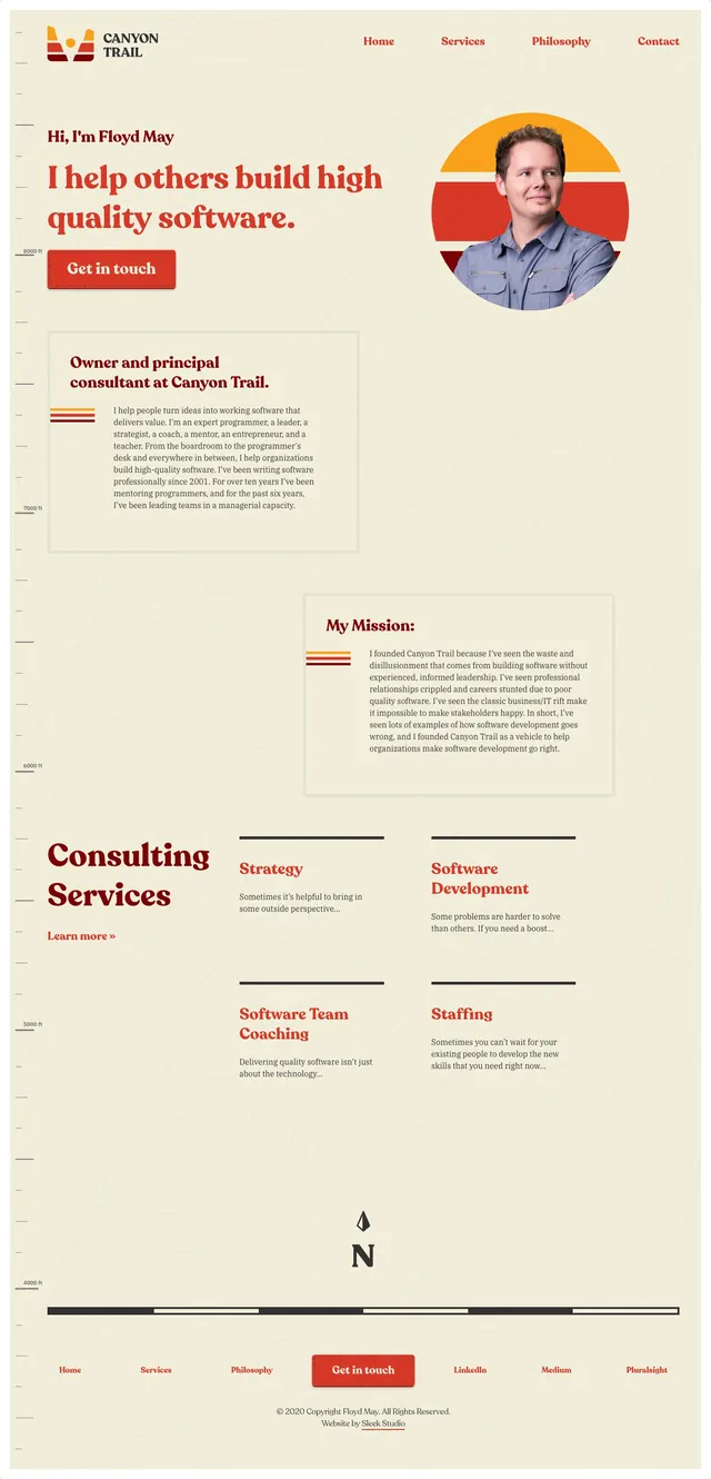
A warm, editorial personal-site landing page for Canyon Trail with a bold typographic hero, portrait imagery, and service-led content blocks on a textured cream background.
Summary
A warm, editorial personal-site landing page for Canyon Trail with a bold typographic hero, portrait imagery, and service-led content blocks on a textured cream background.
Visual description
The page uses a cream paper-like background with subtle topographic line texture and deep red accent typography. The first screen is a split hero with a large headline on the left, a red call-to-action button, and a circular portrait image on the right framed by horizontal sunset-like color bands. Lower sections continue with bordered content cards, mission statements, and consulting service blocks arranged in a loose editorial grid with strong section headings and thin divider lines.
Key takeaway
The design feels like a polished personal consulting site that blends approachable branding with a classic editorial layout. Strong serif headlines, generous spacing, and restrained accents make it suitable for a service-led expert portfolio.
Reuse notes
Reuse the split hero structure, circular portrait treatment, and warm accent palette for personal brands or consultancies. The textured background and bordered content cards are especially useful for sites that want a handcrafted but professional feel.