Preview image. Unlock full-res
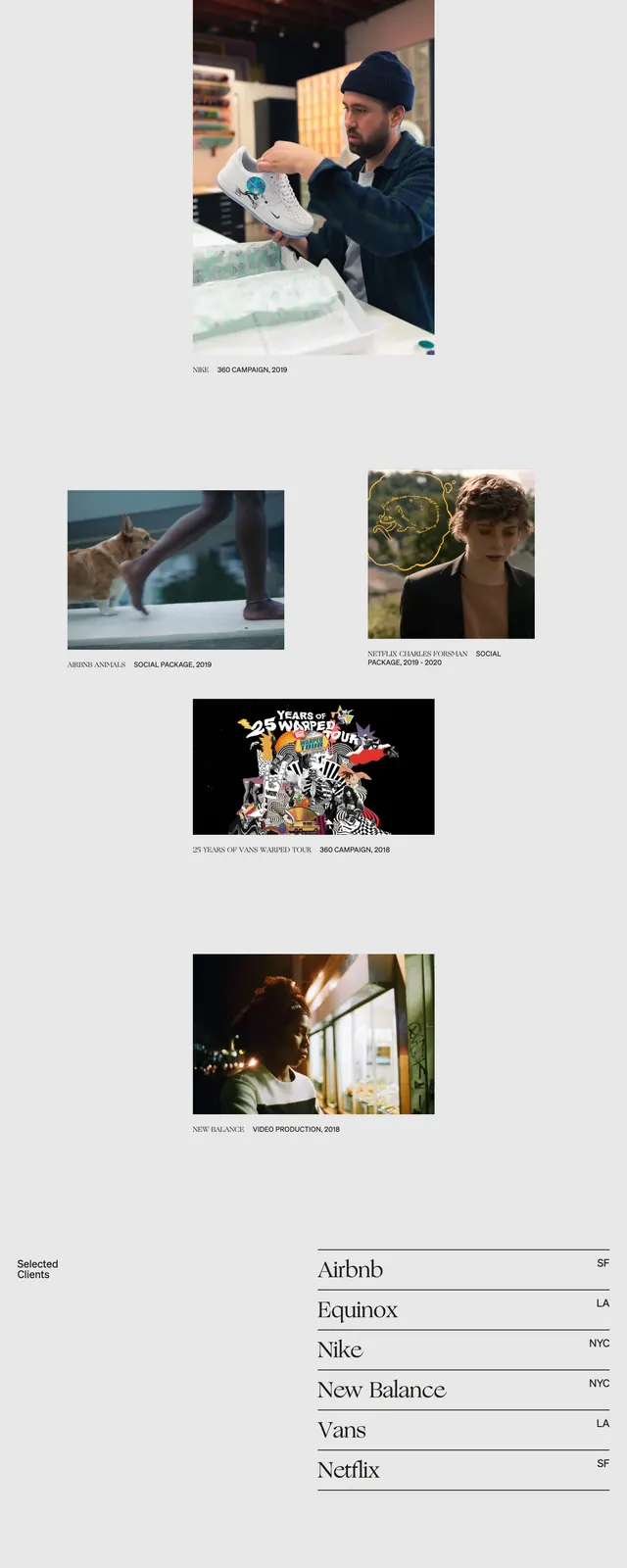
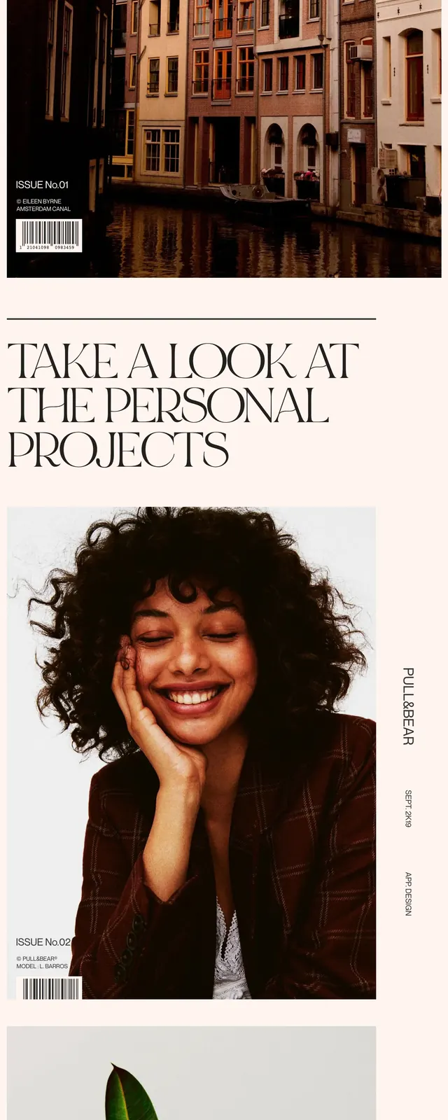
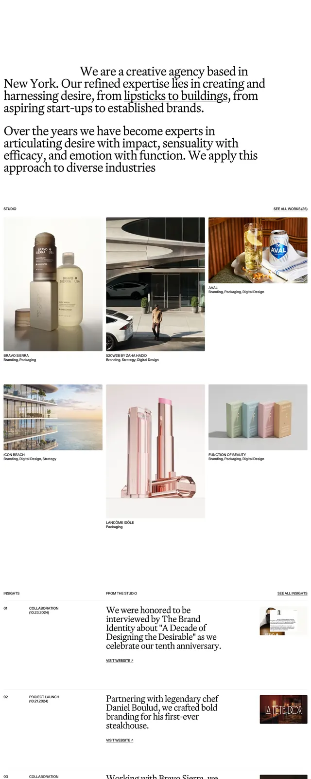
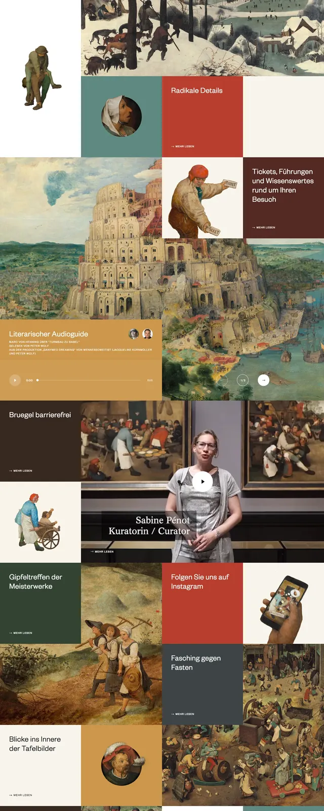
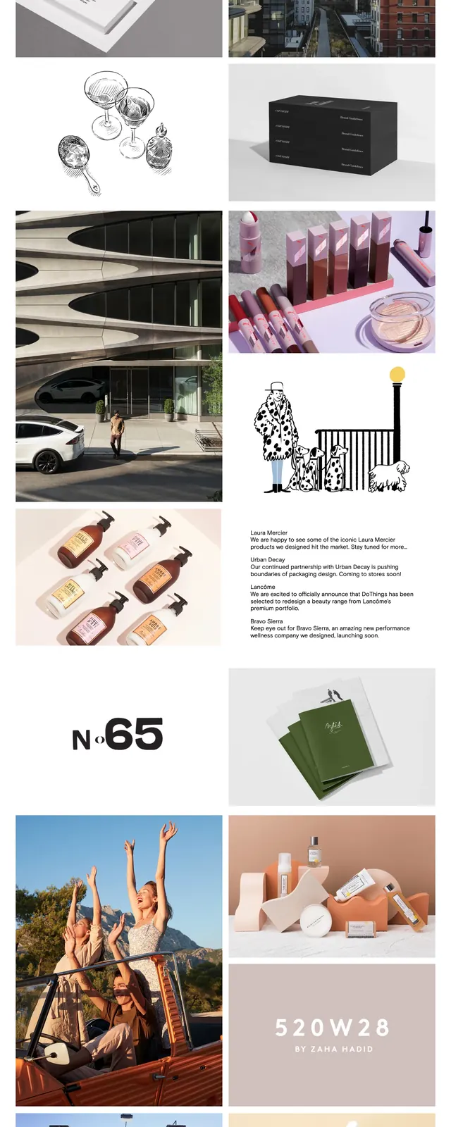
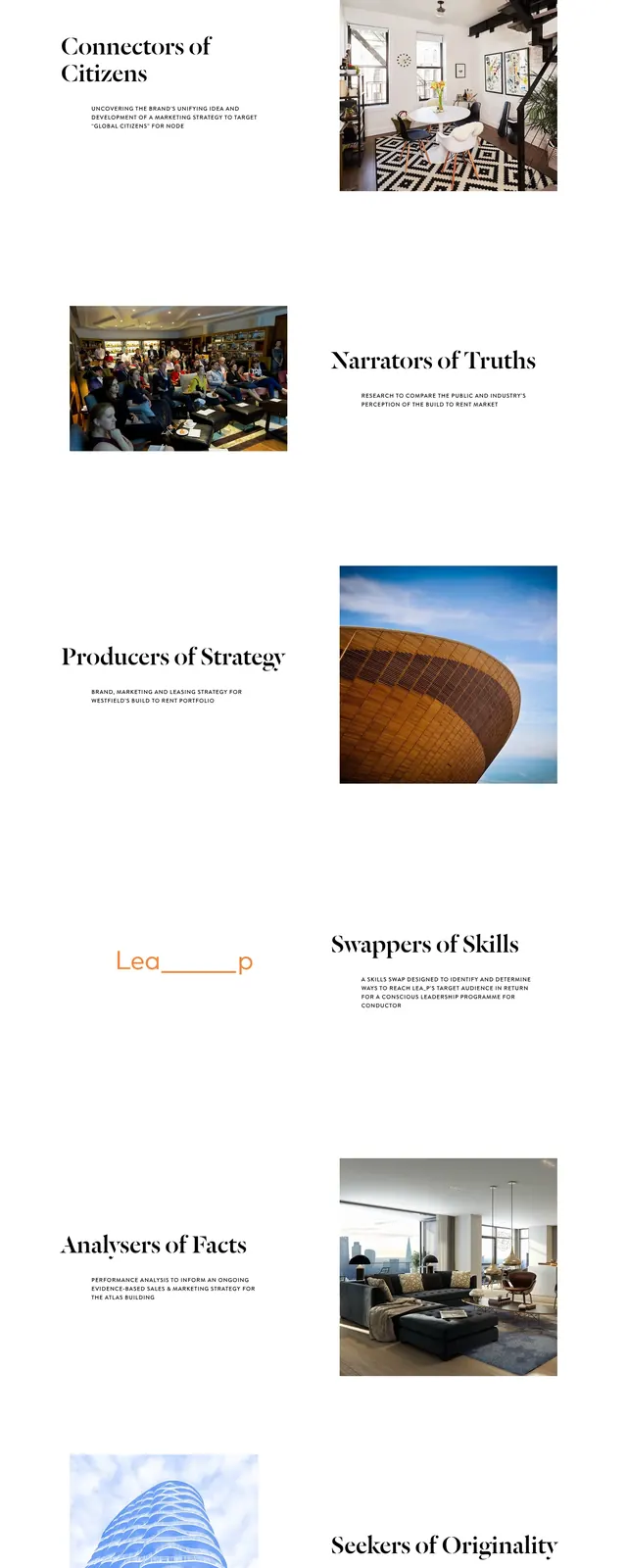
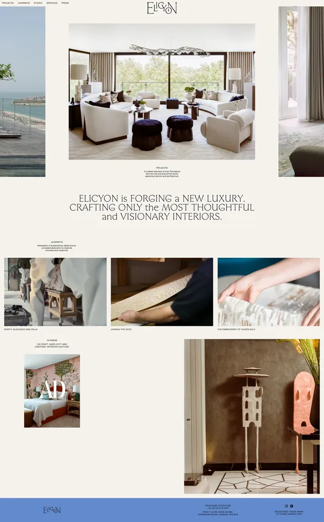
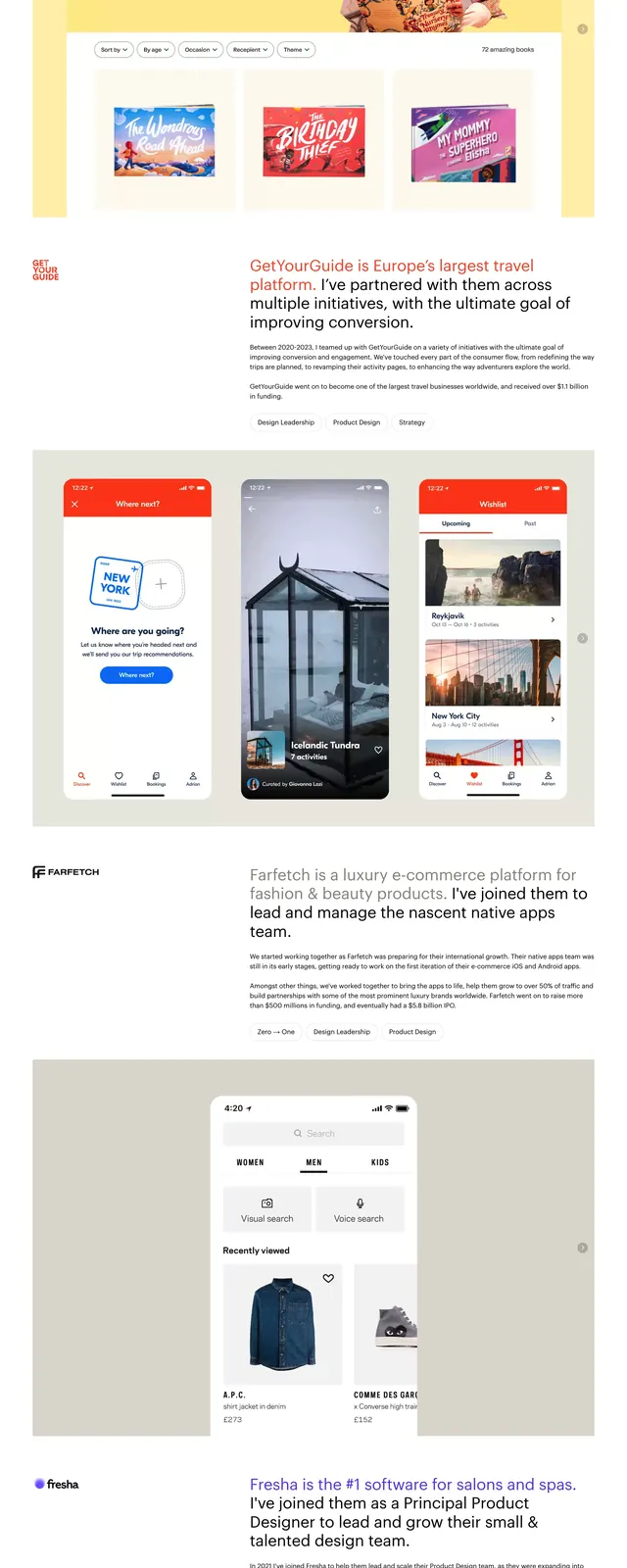
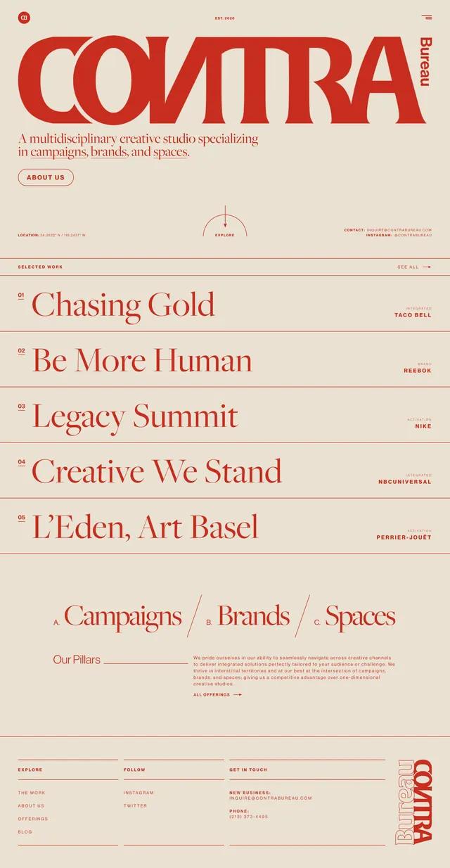
A warm, editorial agency homepage with oversized serif branding, thin line dividers, and a long list-style portfolio section.
Summary
A warm, editorial agency homepage with oversized serif branding, thin line dividers, and a long list-style portfolio section.
Visual description
The page uses a pale beige background with deep red typography and linework throughout. The top section is dominated by a massive serif wordmark, a short studio tagline, a rounded outlined button, and small utility elements like a menu icon and vertical brand name. Below, the page shifts into stacked portfolio rows with numbered project entries, thin horizontal dividers, right-aligned client labels, and repeated sections separated by wide whitespace.
Key takeaway
The strongest move is the contrast between monumental serif branding and highly restrained layout structure. Repeating thin rules, small labels, and oversized headline copy gives the page an editorial agency feel without adding visual clutter.
Reuse notes
Useful for creative studios, boutique agencies, and portfolio sites that want a refined, art-directed presence. It works best when the content can be presented as short lists of featured work, services, or pillars rather than dense product information.