Preview image. Unlock full-res
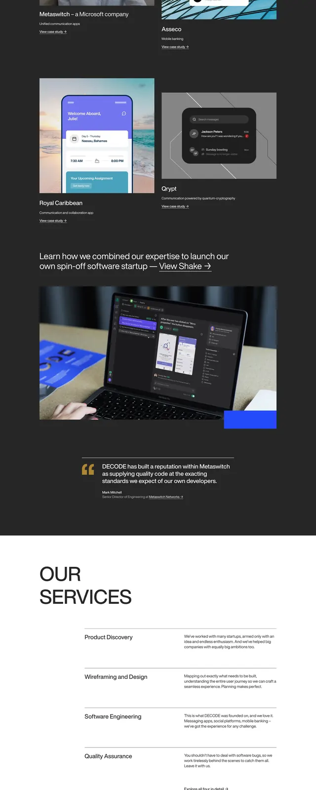
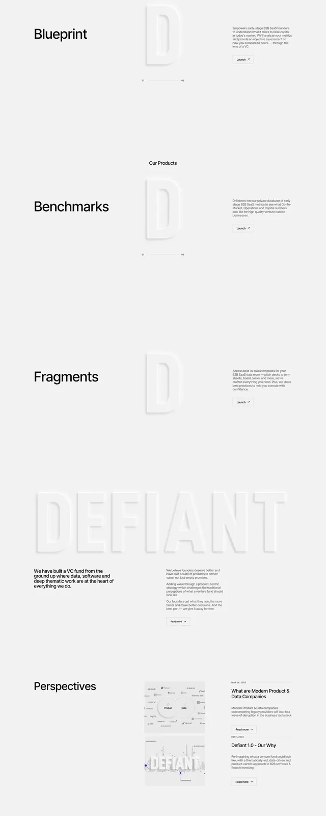
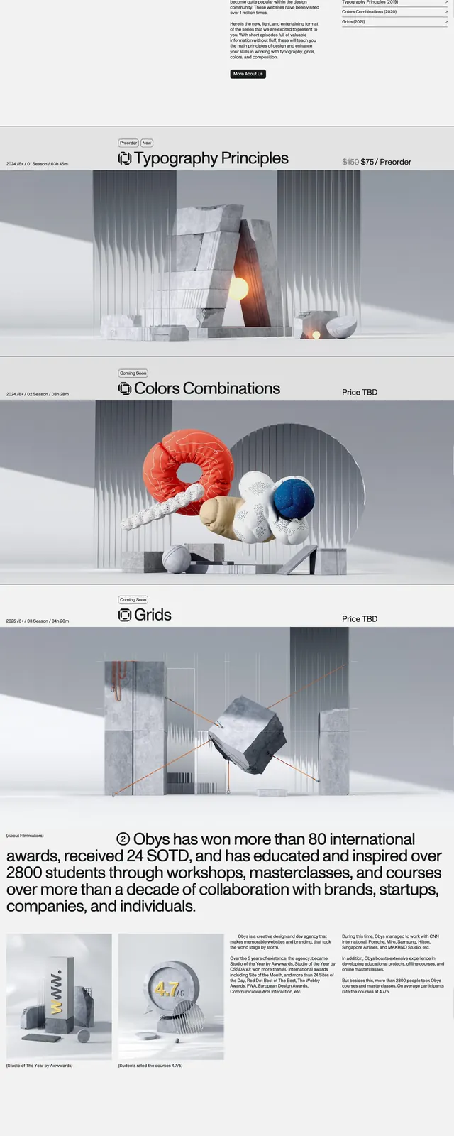
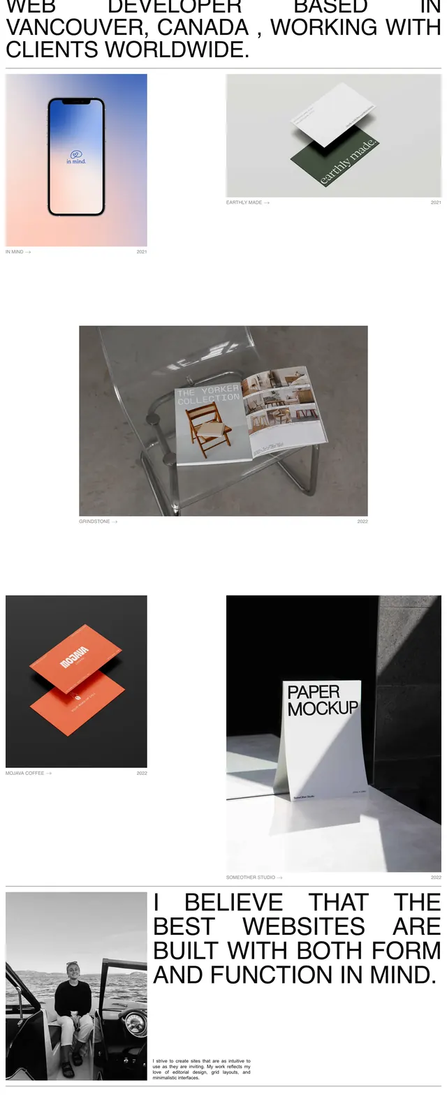
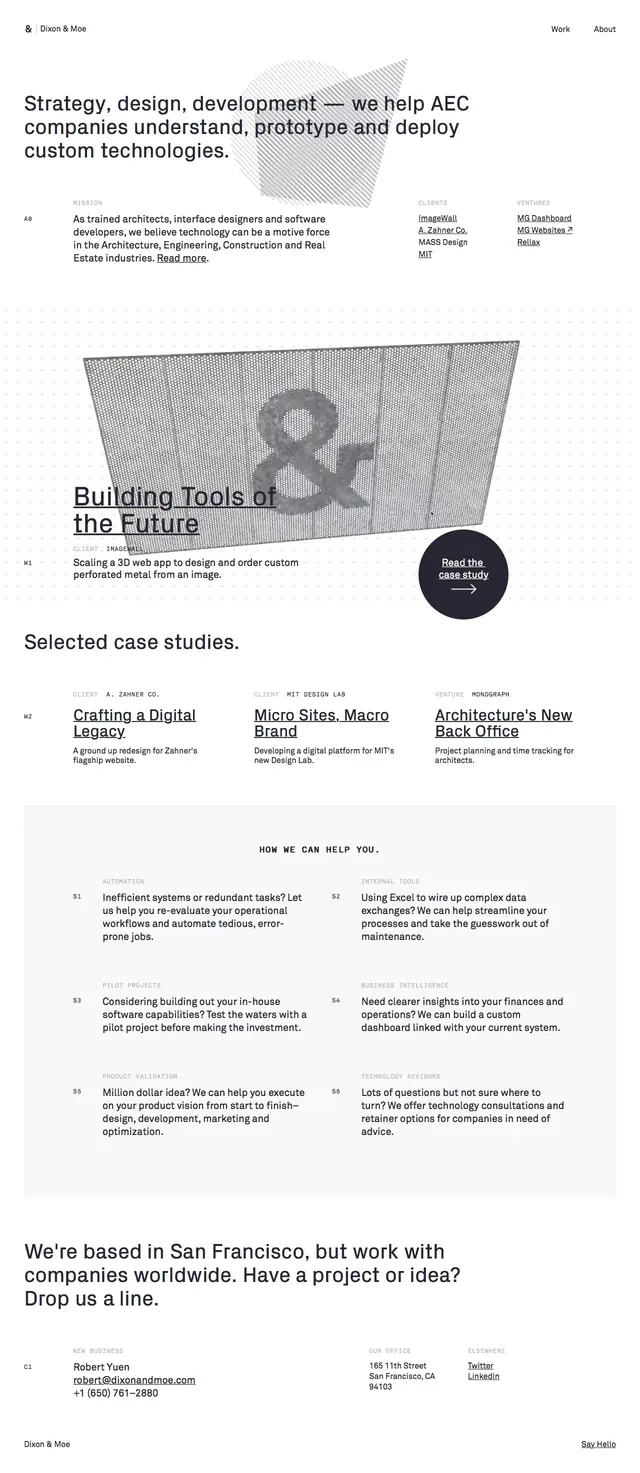
A minimalist editorial agency homepage with large typography, light monochrome styling, and structured case-study sections.
Summary
A minimalist editorial agency homepage with large typography, light monochrome styling, and structured case-study sections.
Visual description
The page uses a very light background with black typography, thin rules, and generous whitespace. The top hero pairs a large headline with a subtle geometric abstract graphic and compact navigation links. Below, oversized image-led case-study blocks repeat in a stacked layout, followed by a multi-column services section and a simple contact/footer area.
Key takeaway
The design feels like a refined Swiss-inspired agency site: restrained, legible, and highly structured. Its strongest reusable pattern is the editorial hero combined with bold case-study storytelling and sparse supporting copy.
Reuse notes
Reuse this for studios, consultancies, or B2B agencies that want a calm but confident presentation. The layout is especially effective when paired with strong project imagery, short claims, and clean grid-based content blocks.