Preview image. Unlock full-res
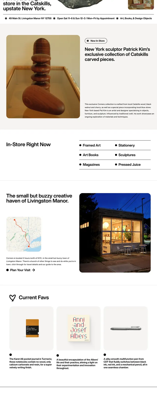
A minimalist editorial storefront page for a Catskills art and design shop, built around large product imagery, handwritten branding, and spacious black-and-white layouts.
Summary
A minimalist editorial storefront page for a Catskills art and design shop, built around large product imagery, handwritten branding, and spacious black-and-white layouts.
Visual description
The page opens with a stark white hero featuring a large bold wordmark, a handwritten tagline, and a central product-style image of a rock-like sculpture. A slim left navigation and a right-side image rail frame the hero, while short store details sit in a thin horizontal info bar beneath it. Lower sections mix a product spotlight, a simple in-store category list, a map preview, a storefront photo, and a three-column product grid with compact captions. The footer repeats the handwritten brand phrase alongside address and navigation links.
Key takeaway
The design relies on editorial spacing, oversized imagery, and a tactile handmade identity to make a small retail brand feel distinctive and curated. It is especially effective for lifestyle retail, gallery shops, and craft-led storefronts that want an understated premium feel.
Reuse notes
Reuse the structure for boutique shops by pairing a bold brand mark with one dominant hero image, then supporting it with concise store metadata and curated product blocks. The handwritten accent and thin divider lines are the main visual cues to preserve when adapting the layout.