Preview image. Unlock full-res
A bold broadband homepage built around a bright yellow hero, playful abstract shapes, and stacked information sections.
Summary
A bold broadband homepage built around a bright yellow hero, playful abstract shapes, and stacked information sections.
Visual description
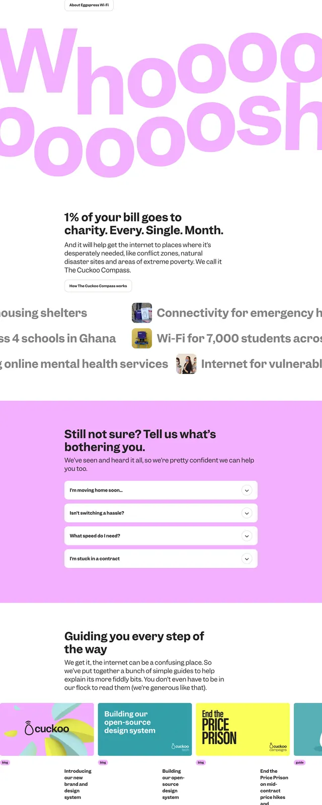
The page opens with a full-bleed hero on a saturated yellow background, featuring oversized black headline text, a postcode input, and a dark primary CTA. Large pastel purple and white organic shapes fill the right side as the main visual device. Below the hero are three feature cards, a mission-style impact section, an accordion FAQ block on a lavender background, a press/logo strip, and a second CTA area with another postcode search. The footer returns to the same yellow brand color with compact navigation and social links.
Key takeaway
The design relies on extreme color contrast, oversized typography, and soft abstract forms to make a utility product feel approachable and distinctive. The layout is structured in clear stacked sections that mix conversion-focused UI with social proof and explanatory content.
Reuse notes
Reuse the hero pattern for consumer services that need a strong conversion CTA paired with a simple input field. The abstract blob illustration and bright brand blocks are easy to adapt for a playful but trustworthy homepage system.