Preview image. Unlock full-res
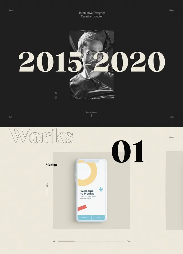
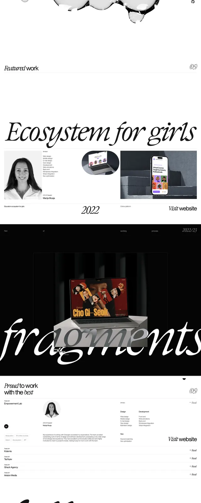
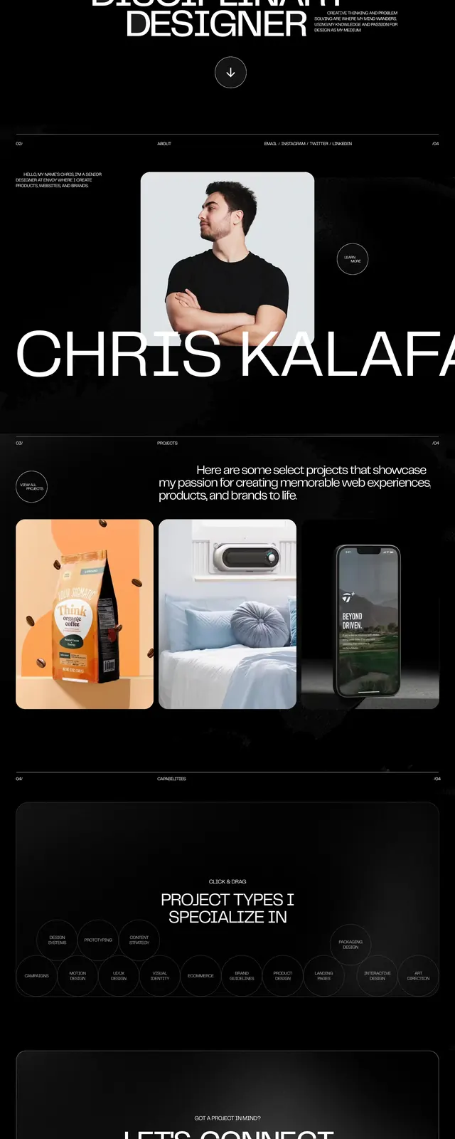
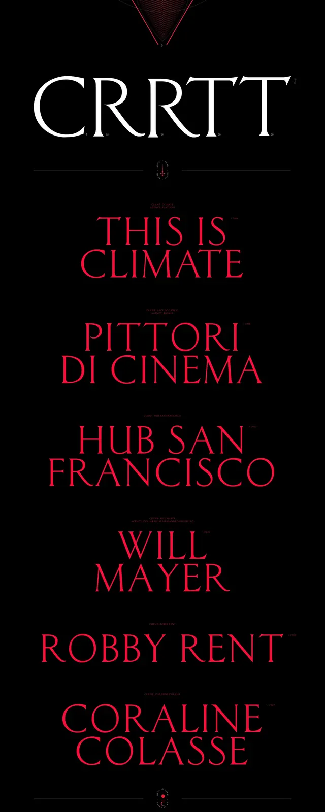
A dark, high-contrast portfolio landing page built around oversized serif typography, neon-red accents, and a central geometric triangle graphic.
Summary
A dark, high-contrast portfolio landing page built around oversized serif typography, neon-red accents, and a central geometric triangle graphic.
Visual description
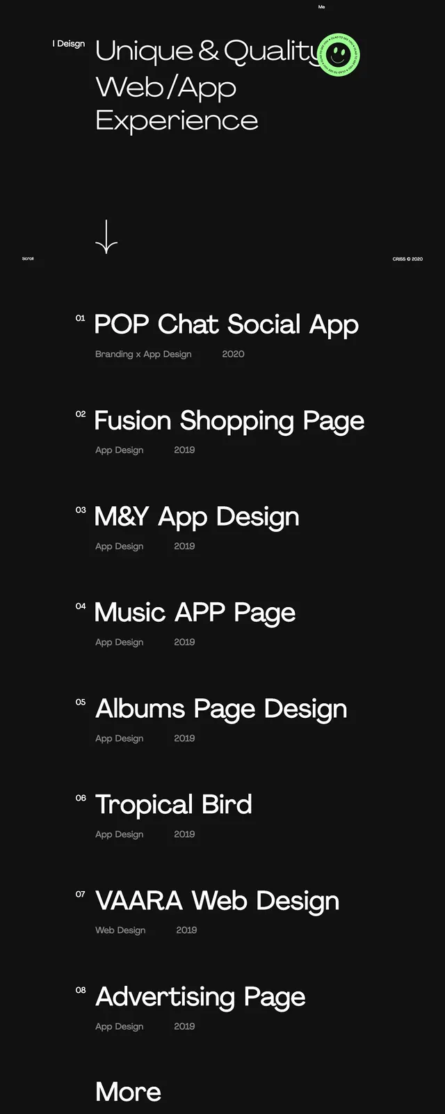
The page uses a black background with tiny top-aligned metadata and a large triangular line graphic centered in the upper half. Below it, massive serif wordmarks and project titles stack vertically with strong spacing and a bright red accent color. The lower area continues with editorial text blocks and a sparse footer-like information row, all kept very minimal and text-led. The composition feels highly structured despite the dramatic scale shifts and layered typography.
Key takeaway
The main reusable move is the contrast between microscopic navigation text and huge serif headlines on a near-empty black canvas. The centered geometric diagram adds a distinctive brand anchor without needing imagery.
Reuse notes
Use this pattern for portfolio, creative director, or studio sites that want a high-art editorial tone. It works best when the content can support large typographic statements and when the brand can sustain a very dark, minimal presentation.