Preview image. Unlock full-res
A dark, illustrated conference landing page with a large central graphic, sparse navigation, and bold event messaging.
Summary
A dark, illustrated conference landing page with a large central graphic, sparse navigation, and bold event messaging.
Visual description
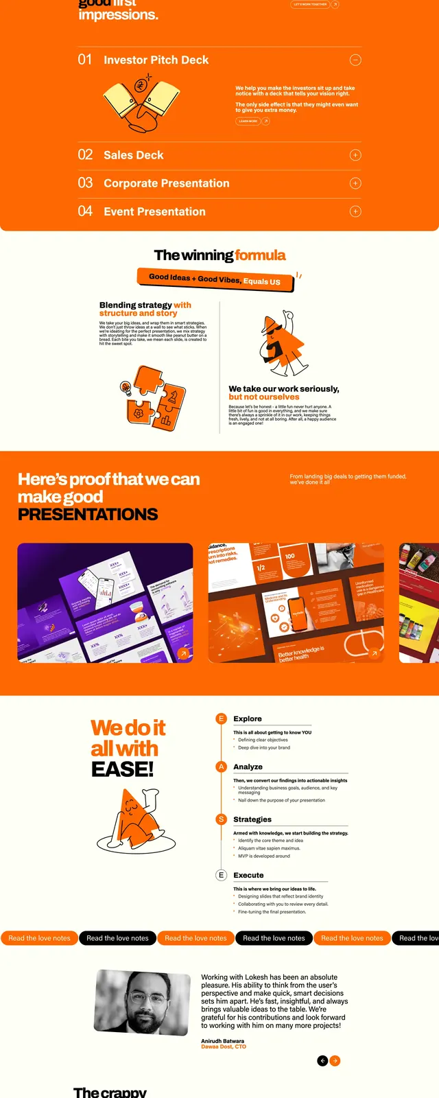
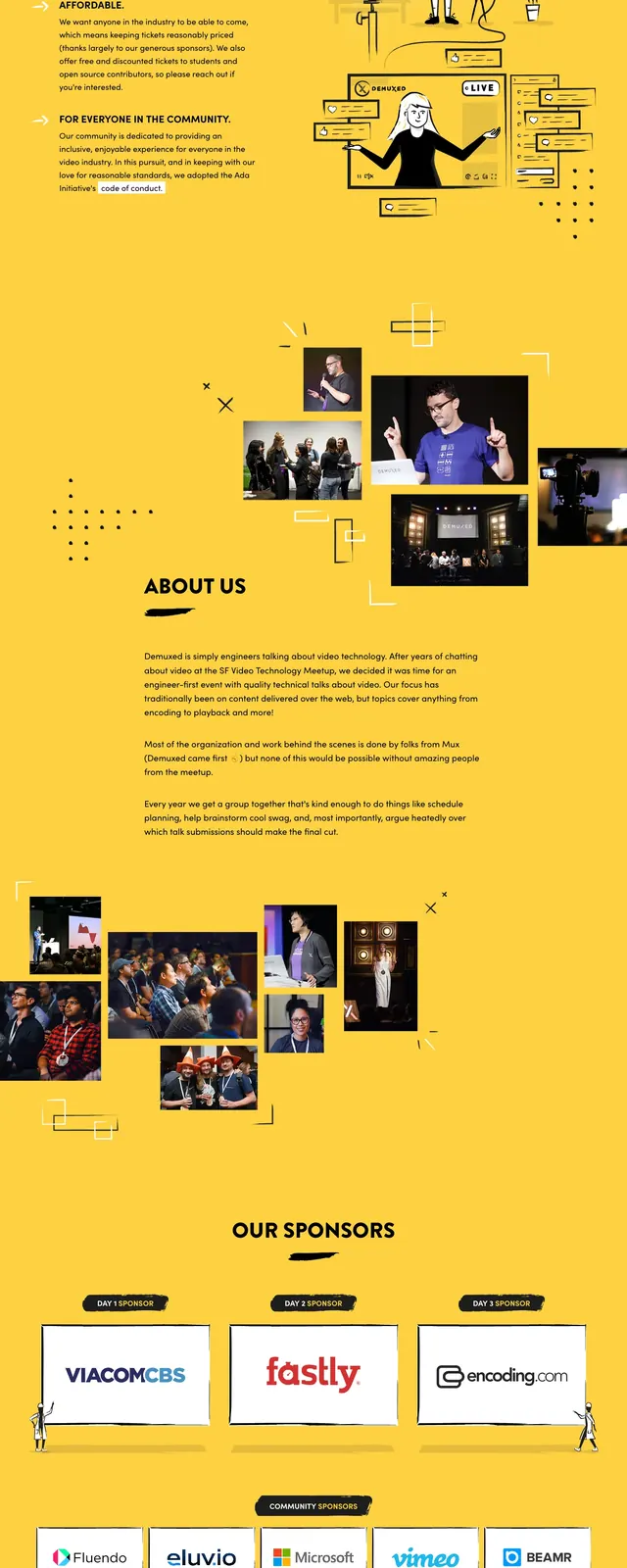
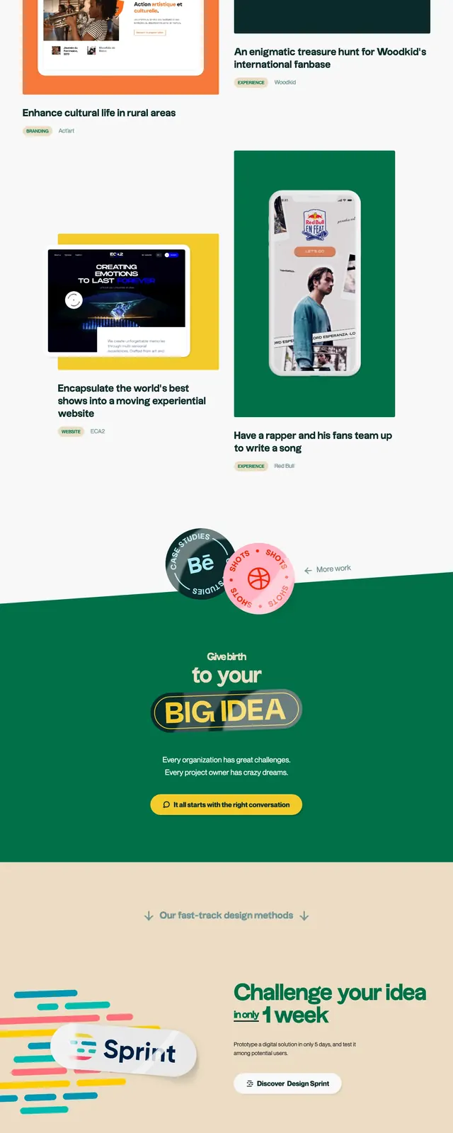
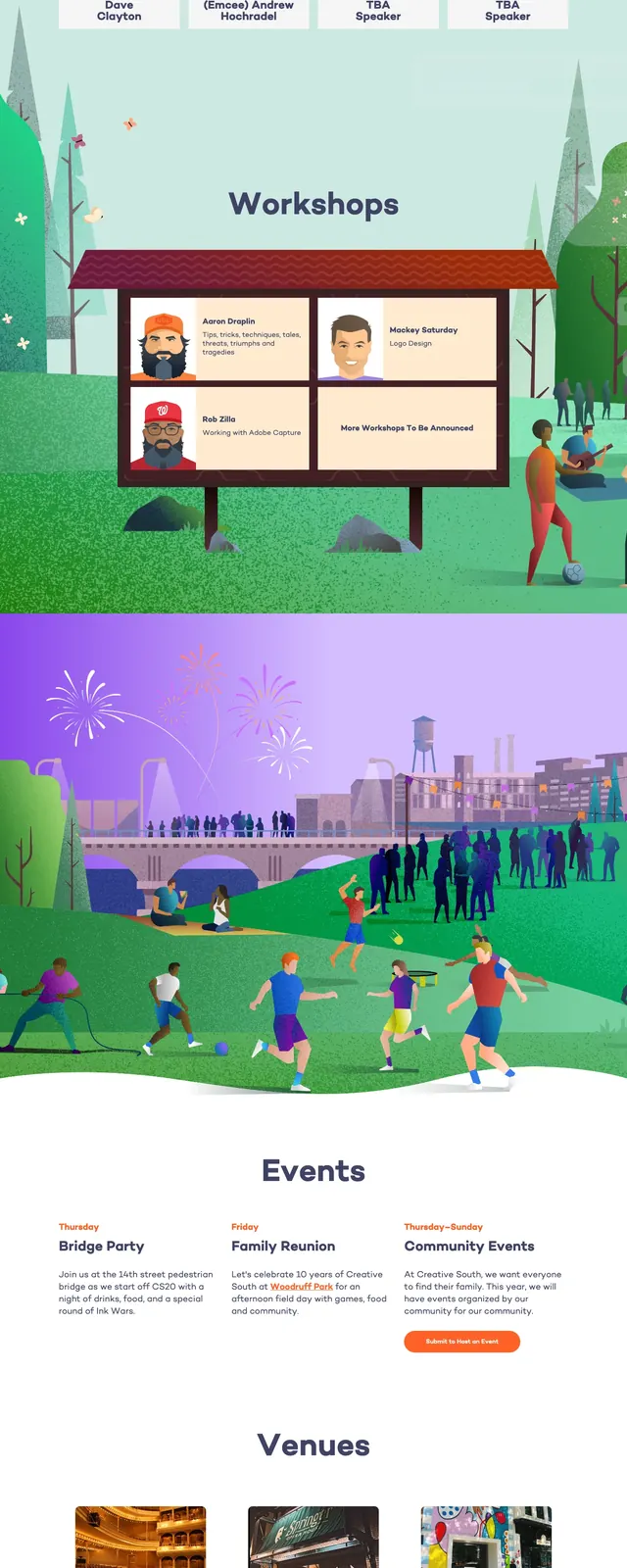
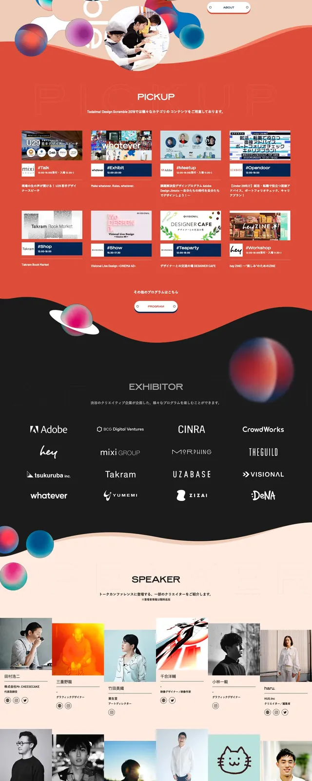
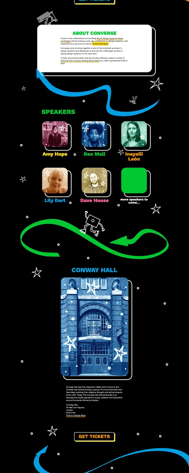
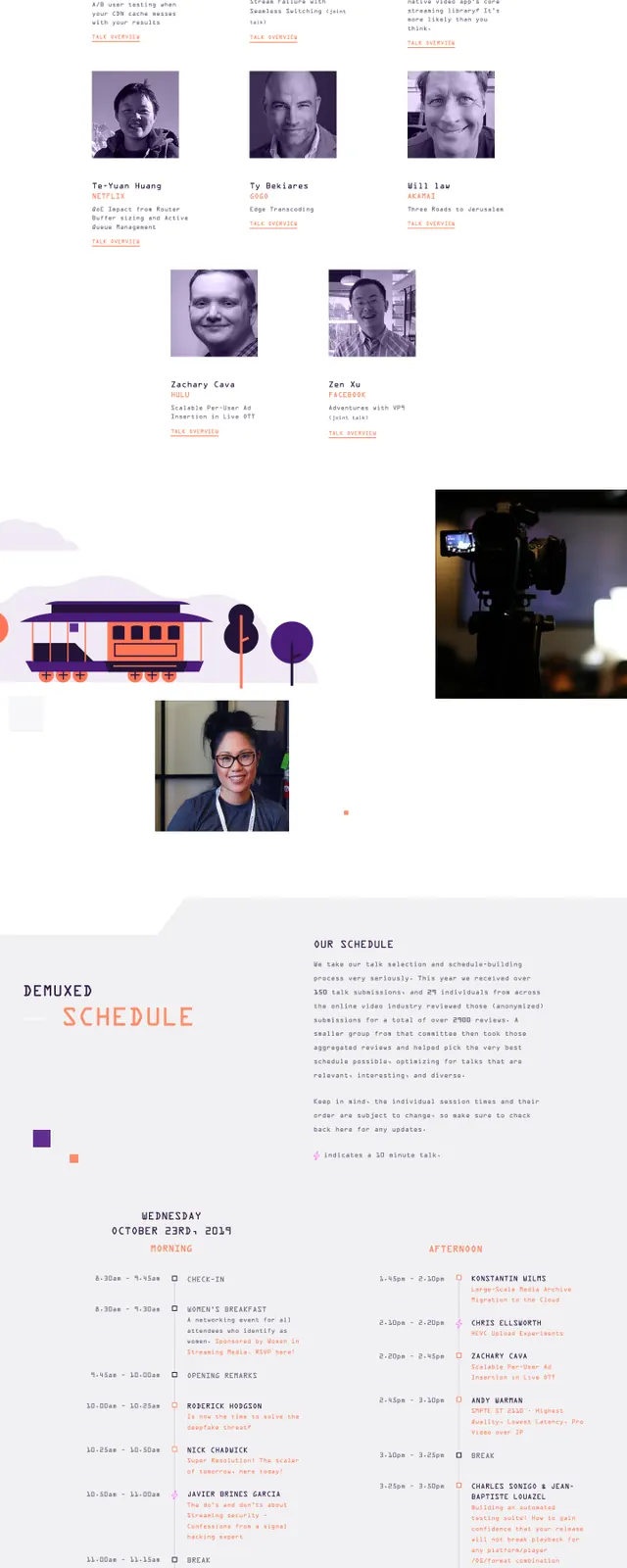
The page opens with a dark purple full-width hero featuring a large illustrated composition of video, camera, and conference-themed graphics. A compact top navigation sits above the hero with a bright accent button, while the left side uses stacked event copy and a primary call-to-action. Below the hero, the page continues into clean white sections with floating illustrations, speaker imagery, schedule copy, sponsor logos, and a simple footer block. The overall look mixes flat illustration, editorial spacing, and scattered technical motifs tied to video production and streaming.
Key takeaway
This design uses illustration-heavy storytelling to make a conference site feel distinctive and memorable while still keeping the structure clear. The strong contrast between the dark hero and the airy lower sections gives the page a curated, poster-like rhythm.
Reuse notes
Reuse this pattern for event or community landing pages that need a highly branded opening section and a structured information flow below. The illustrated hero and sparse accent CTA are especially effective when the goal is to make a technical topic feel more approachable.