Preview image. Unlock full-res
A bold conference landing page with a dark hero, geometric branding, and purple section blocks.
Summary
A bold conference landing page with a dark hero, geometric branding, and purple section blocks.
Visual description
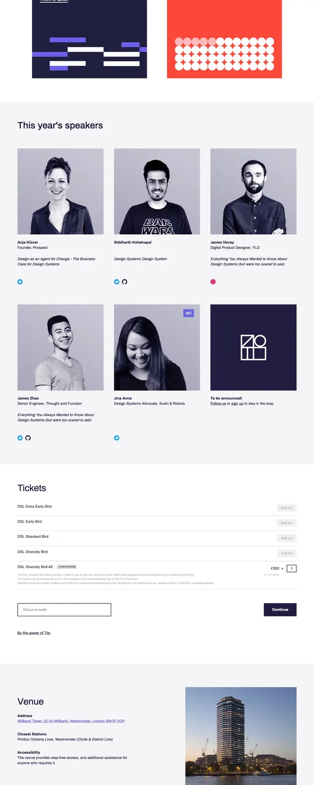
The page opens with a dark navy hero split between event copy on the left and a bold grid of geometric artwork on the right. Below it are stacked full-width content bands in purple and white, including an embedded video, speaker cards, a ticket list, and a newsletter signup area. The footer returns to the dark palette with compact navigation links and social icons. The overall composition uses strong blocks, generous spacing, and repeated square and circle motifs.
Key takeaway
This design pairs editorial spacing with a rigid geometric identity, making the event feel modern and system-oriented. The purple-and-navy palette creates strong section separation while keeping the page visually cohesive.
Reuse notes
Reuse the split hero with a prominent CTA and a branded geometric illustration panel for immediate identity. The stacked section rhythm, especially the purple callout band and simple ticket/newsletter modules, adapts well to conference and nonprofit event pages.