Preview image. Unlock full-res
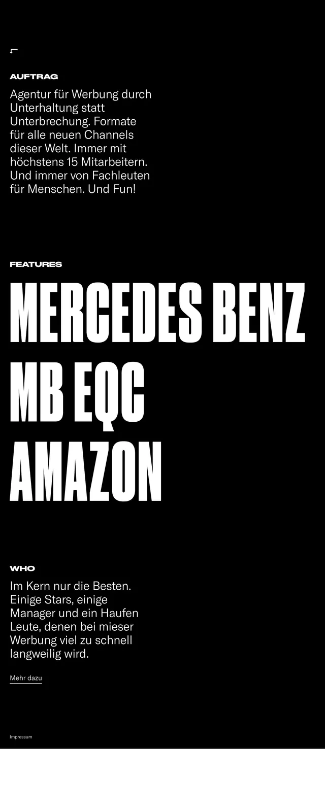
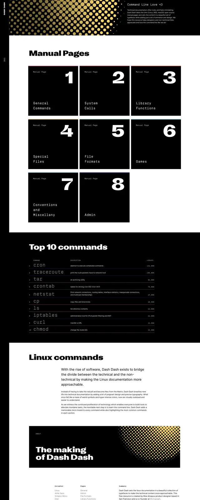
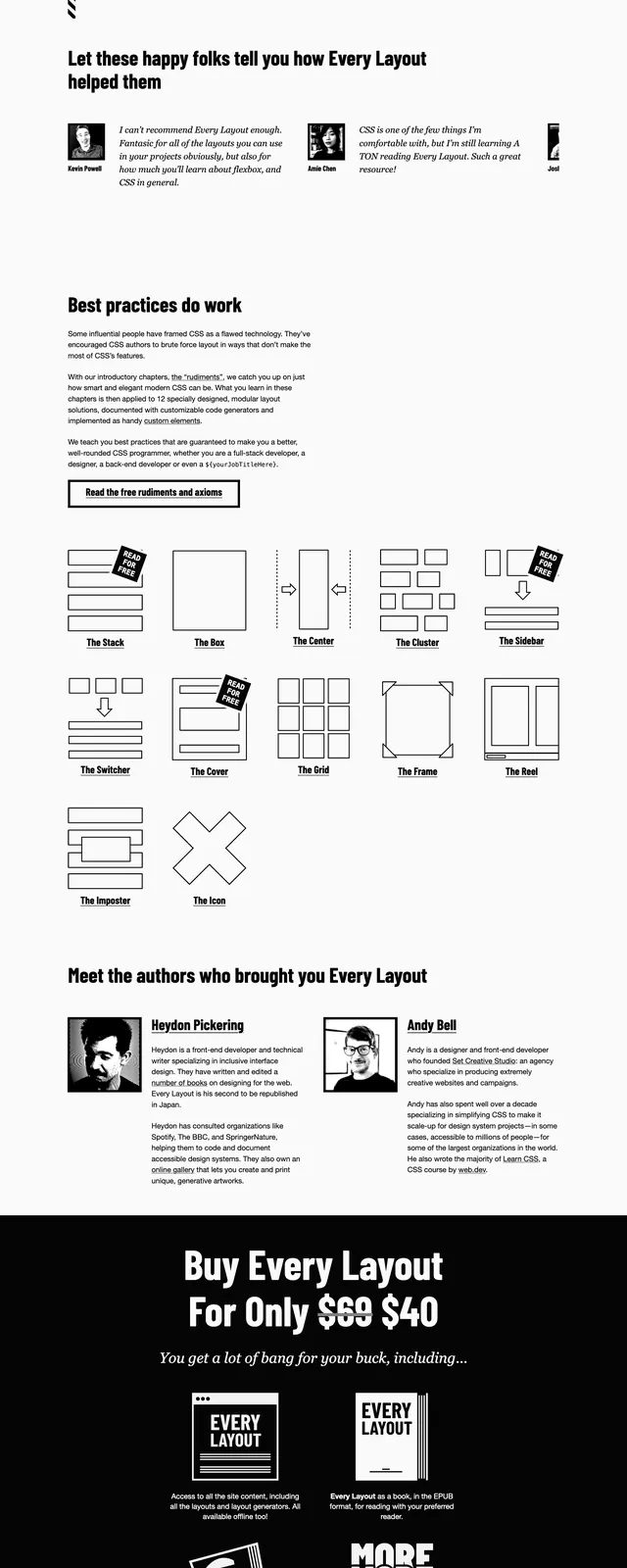
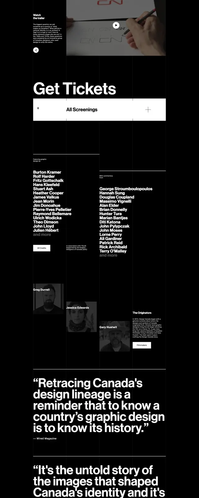
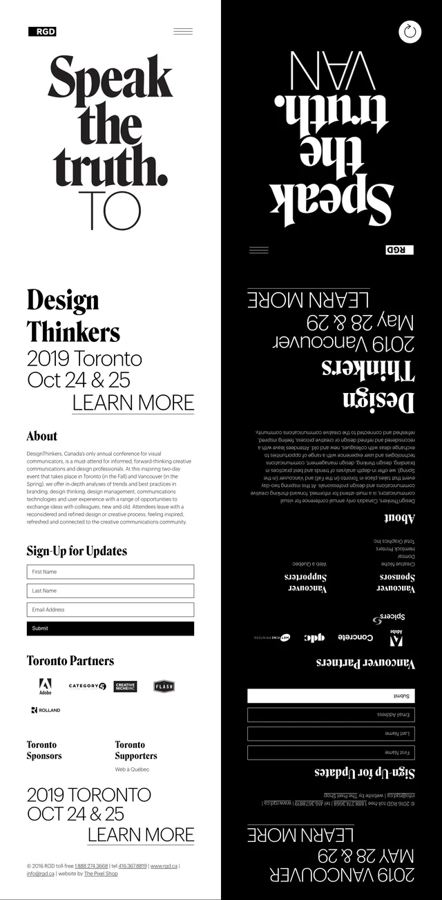
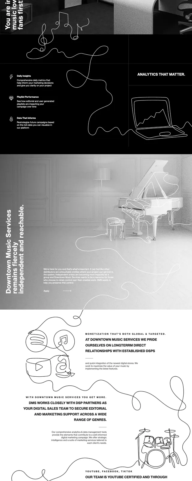
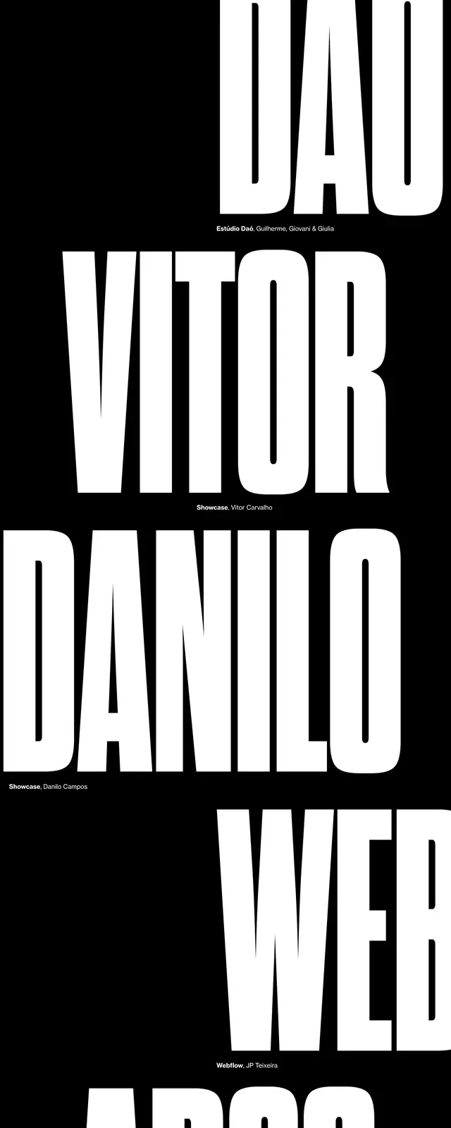
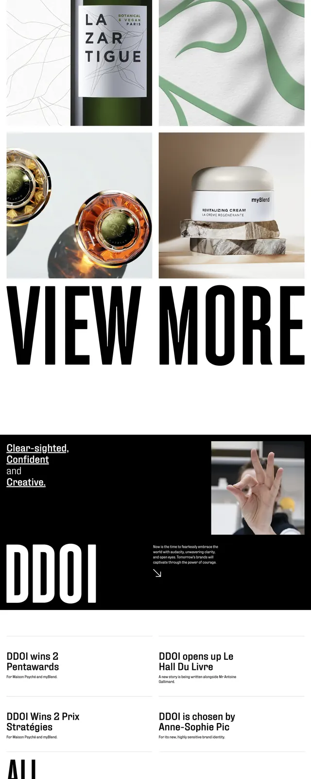
A stark black-and-white conference landing page with oversized display typography, editorial layouts, and stacked poster-style speaker cards.
Summary
A stark black-and-white conference landing page with oversized display typography, editorial layouts, and stacked poster-style speaker cards.
Visual description
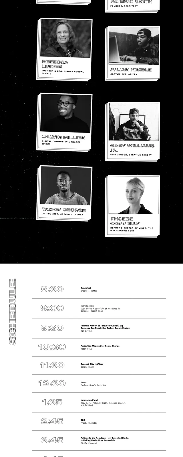
The page opens with a full-bleed black hero featuring a large layered typographic graphic and minimal top navigation. Below it, white space separates a bold event intro from a section of overlapping speaker cards arranged like printed posters on a dark background. Further down, the layout shifts into a simple schedule strip and a prominent ticket-style CTA block with sponsor logos in the footer area.
Key takeaway
The design leans on high-contrast monochrome styling, oversized type, and collage-like card compositions to create a strong editorial conference identity. It feels deliberate and print-inspired while still functioning as a modern event landing page.
Reuse notes
Use this pattern for conference or event pages that need a dramatic first impression and clear hierarchy. The stacked poster cards and ticket-style CTA are especially reusable for speaker showcases and conversion-focused landing sections.