Preview image. Unlock full-res
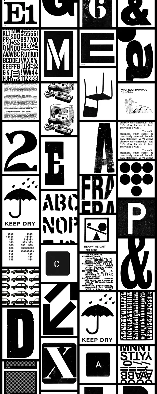
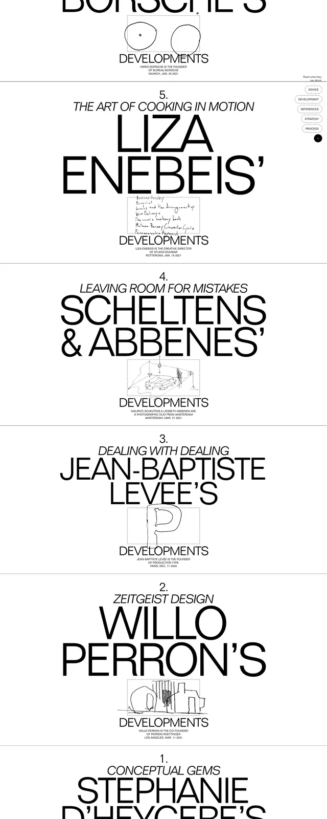
A monochrome, poster-like stacked gallery of oversized typography and sketch inserts promoting different design \"developments\".
Summary
A monochrome, poster-like stacked gallery of oversized typography and sketch inserts promoting different design "developments".
Visual description
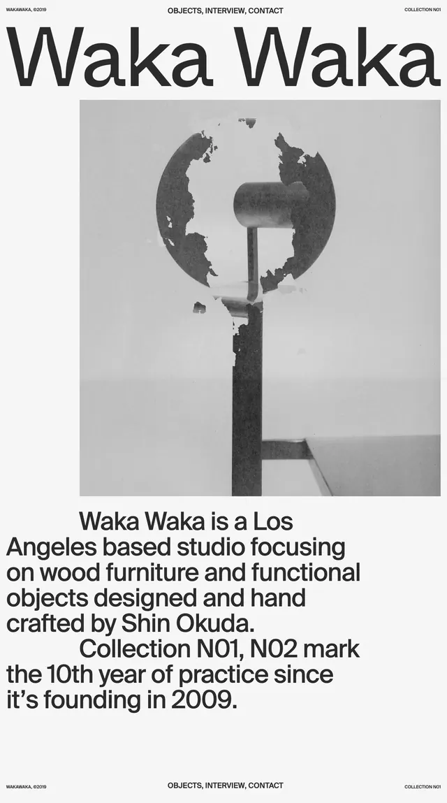
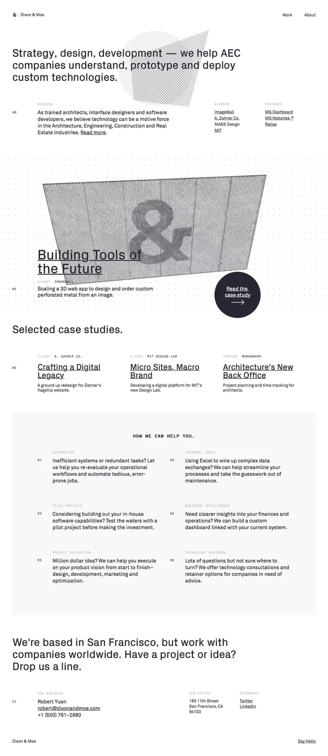
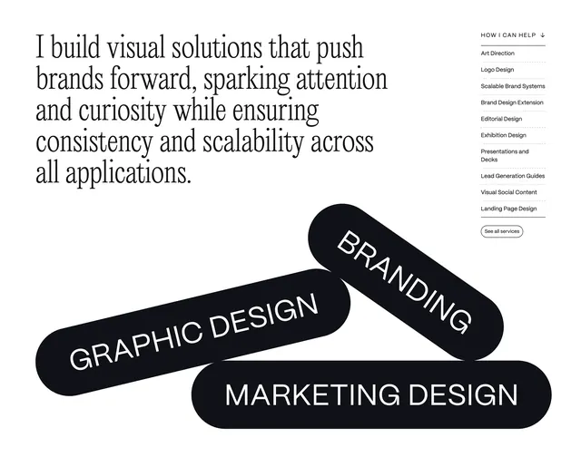
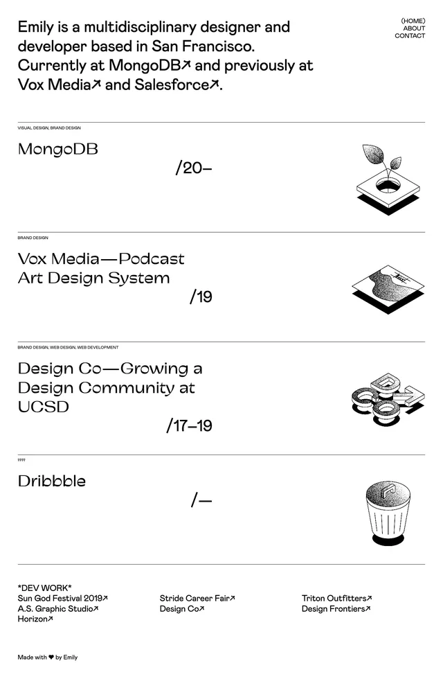
The screenshot shows a tall, white page broken into stacked horizontal slices, each centered around huge black typography and a small caption or sketch underneath. The composition is almost entirely monochrome, with thin divider lines between sections and lots of open space around the type. Several slices include small hand-drawn diagrams or doodles framed like thumbnails, reinforcing an editorial, concept-board feel. The visible brand name is Developments, repeated across the page as a label under different featured names.
Key takeaway
The main reusable move is the stark typographic hierarchy: oversized all-caps naming with minimal supporting copy and a small visual anchor beneath. The repeated centered composition makes each slice feel like a curated poster while still fitting into one long-scrolling page.
Reuse notes
Use this pattern for portfolio index pages, editorial collections, or inspiration galleries where the type itself is the hero. It works best with black-and-white imagery or sketches and loses impact if the supporting visuals become too large or colorful.