Preview image. Unlock full-res
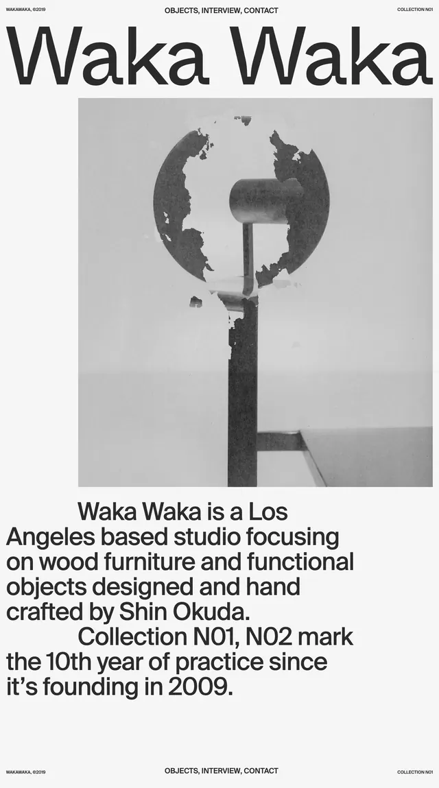
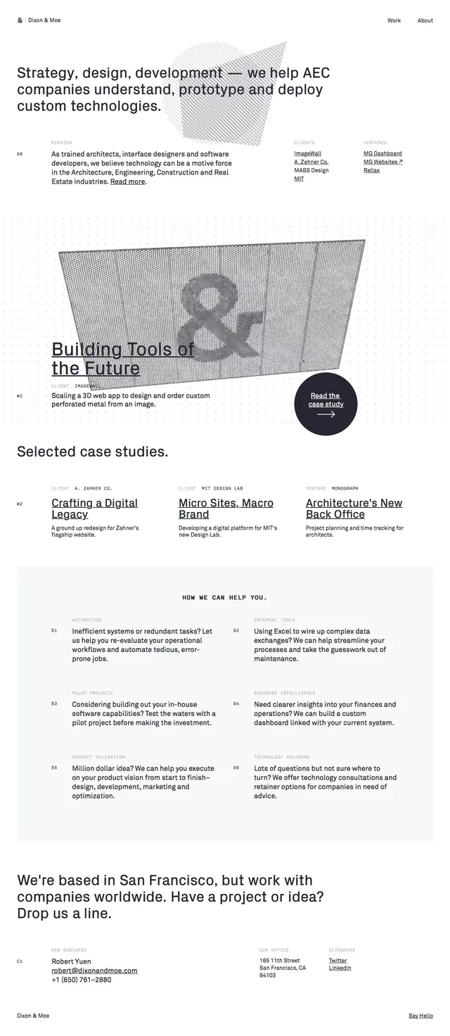
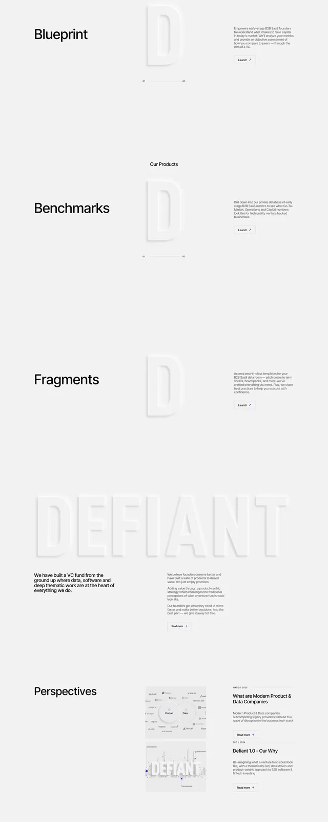
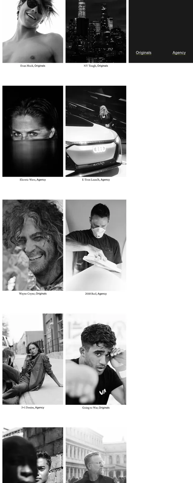
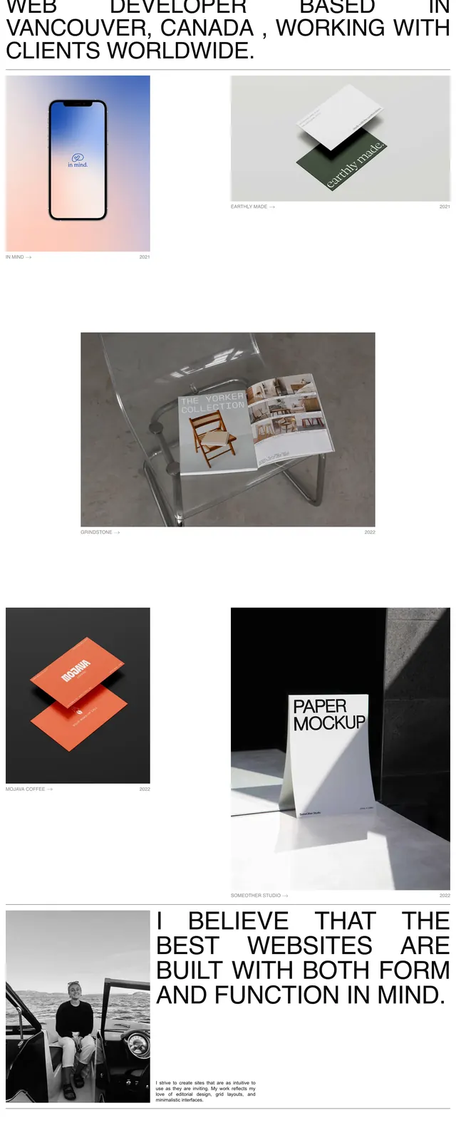
A minimalist personal portfolio homepage with oversized all-caps editorial typography and a grid of project thumbnails.
Summary
A minimalist personal portfolio homepage with oversized all-caps editorial typography and a grid of project thumbnails.
Visual description
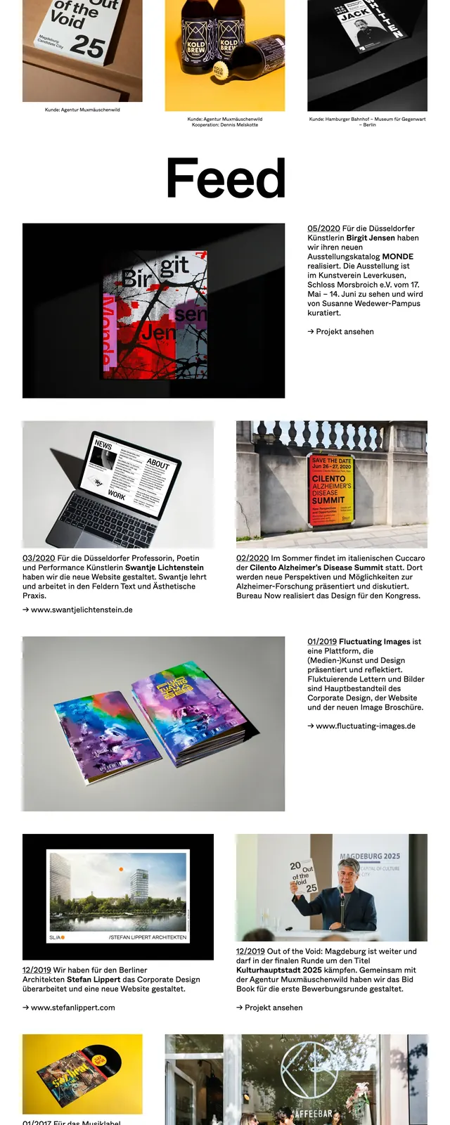
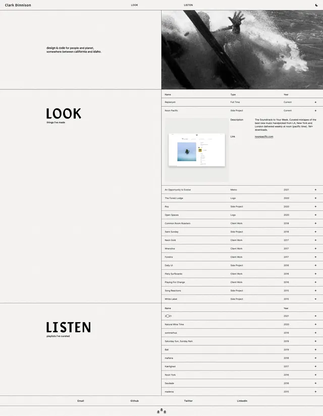
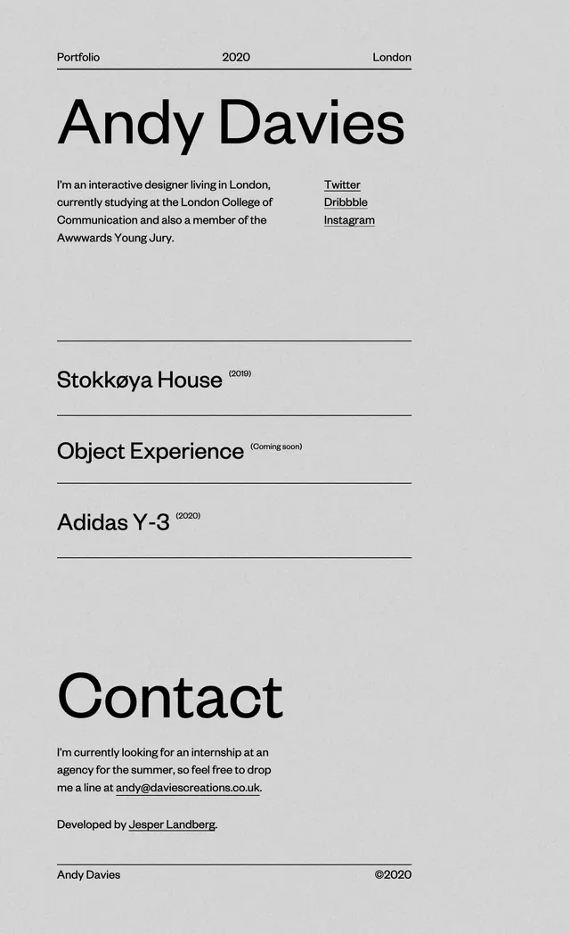
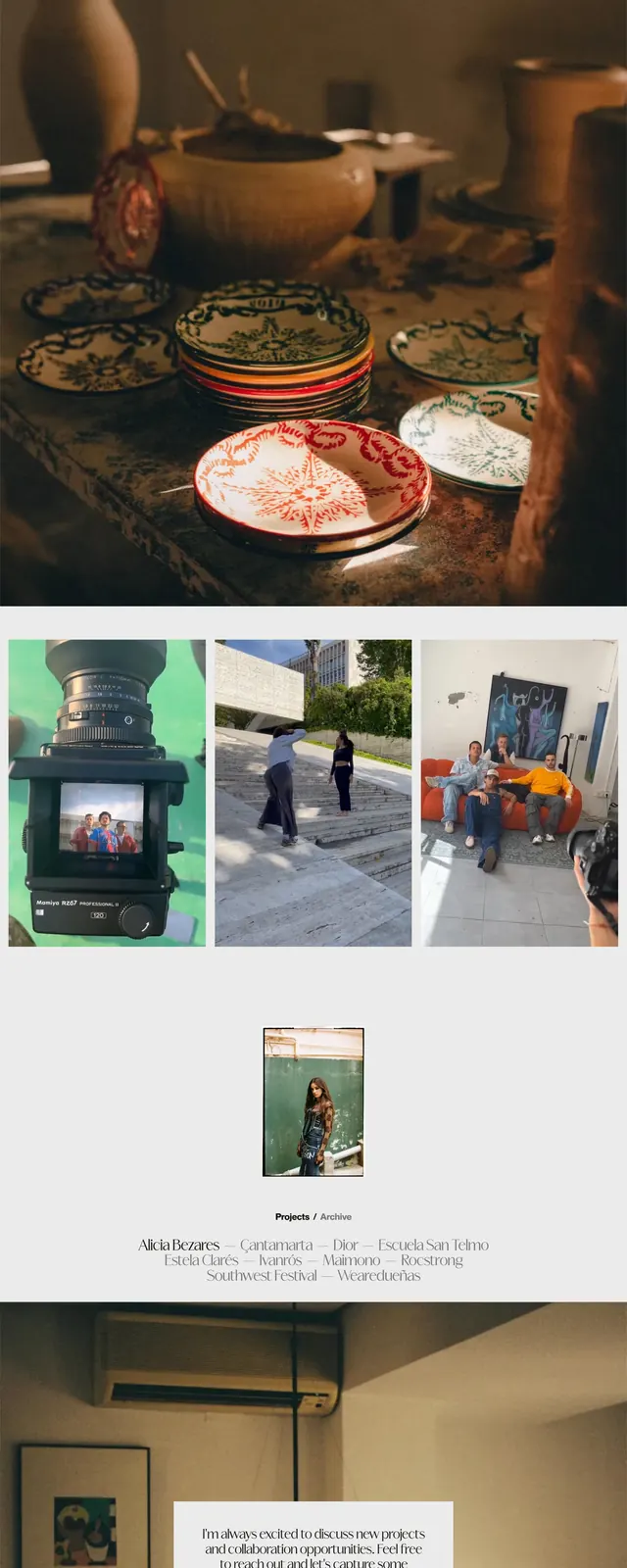
The page opens with a very large all-caps headline introducing Christina Kosik as a designer and web developer, with a small top navigation and plenty of white space. Below the intro, project thumbnails are arranged in a loose two-column layout with captions and year labels, mixing portrait and landscape images. Farther down, a large black-and-white personal photo sits beside another oversized statement in the same condensed editorial type. The page ends with a simple contact footer and sparse links.
Key takeaway
The strongest move is the combination of oversized editorial typography with generous white space and a restrained image grid. It feels like a portfolio that treats each project as a gallery object rather than a standard case-study card.
Reuse notes
Useful for personal portfolios, creative studios, and designer homepages that want a refined editorial tone. Reuse the large statement type and sparse navigation, but keep the project imagery strong enough to carry the layout.