Preview image. Unlock full-res
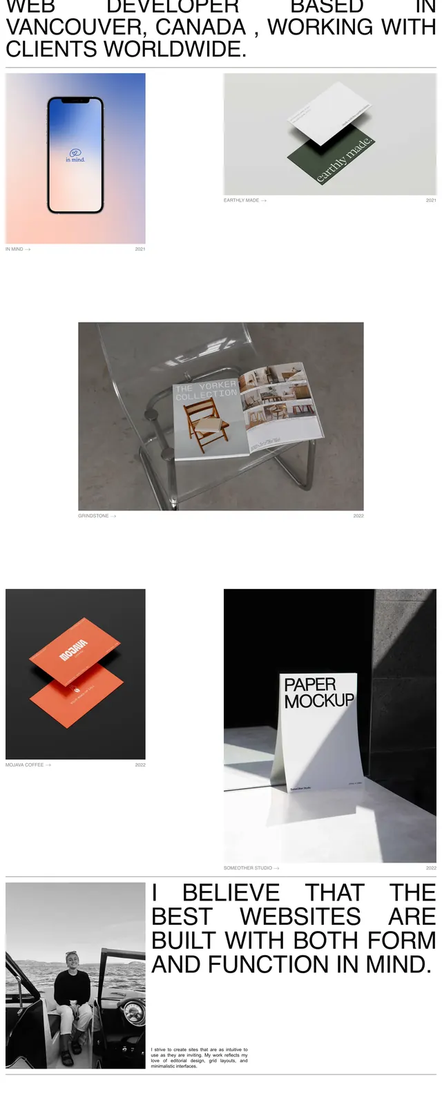
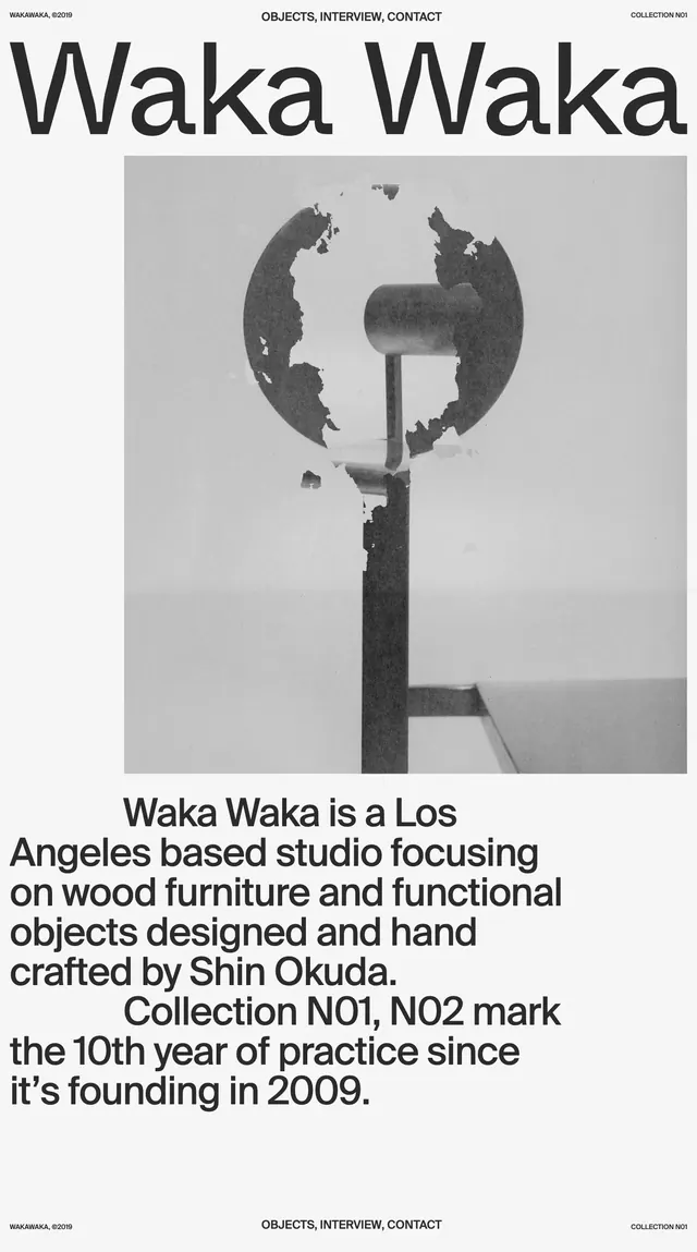
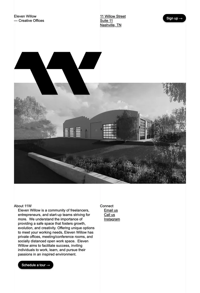
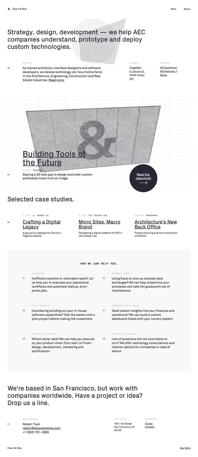
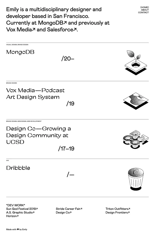
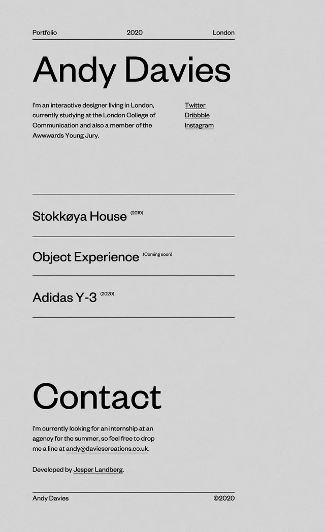
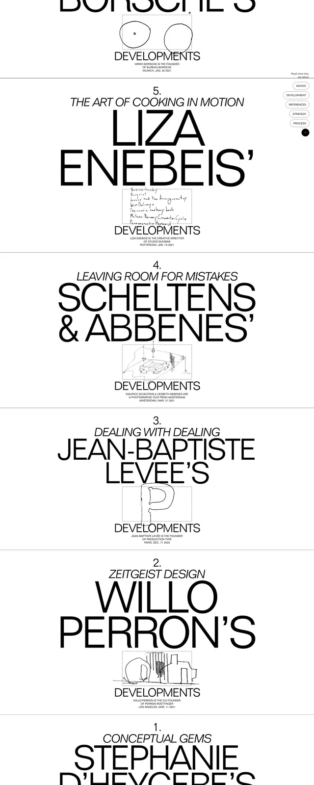
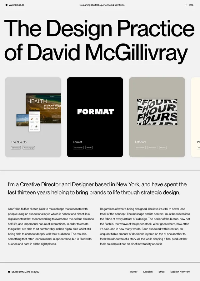
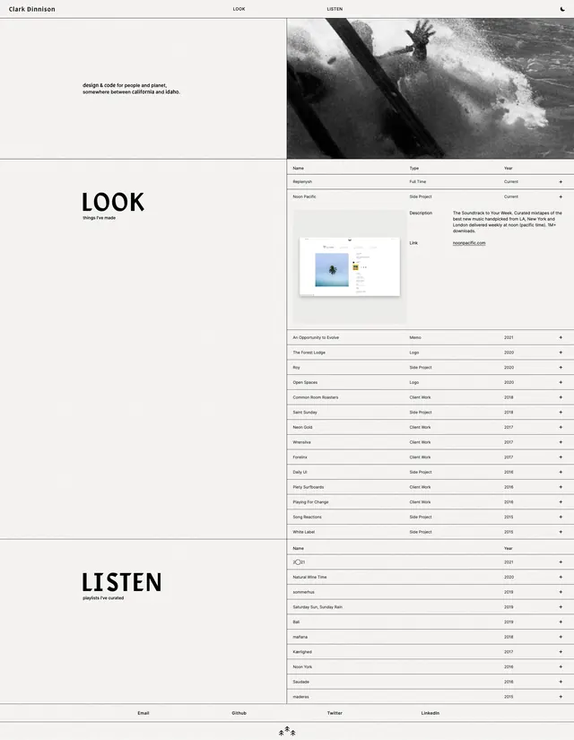
Minimal monochrome portfolio site with a split hero, bold section labels, and dense project listings in a grid-like layout.
Summary
Minimal monochrome portfolio site with a split hero, bold section labels, and dense project listings in a grid-like layout.
Visual description
The page uses a pale off-white background with thin divider lines and a strict two-column structure. The top area pairs a small wordmark and navigation with a large black-and-white surf image on the right, while the left side holds a short intro statement. Below, oversized section titles like LOOK and LISTEN anchor long rows of project and playlist entries formatted like a table with columns for name, type, and year. The overall composition is sparse, with lots of negative space and small, restrained text outside the large headings.
Key takeaway
A strong split-layout portfolio can feel premium by combining oversized section labels with very fine grid rules and compact tabular content. The monochrome treatment keeps even a long, content-heavy page feeling calm and disciplined.
Reuse notes
Useful for personal portfolios, studios, or creative CV sites that need to present work and links in a highly structured way. It works best when the content itself is strong and the design should stay quiet enough to let imagery and listing density carry the page.