Preview image. Unlock full-res
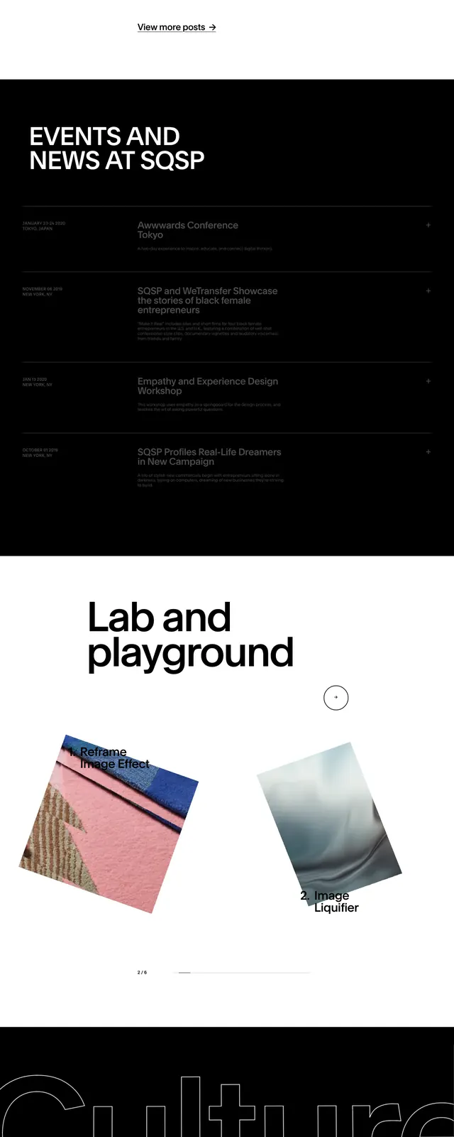
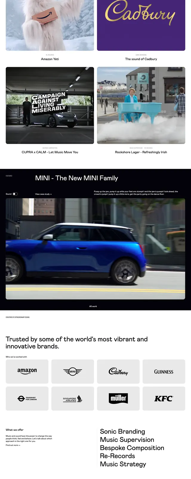
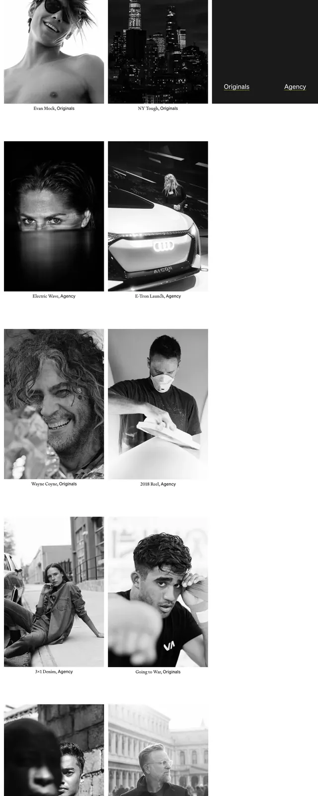
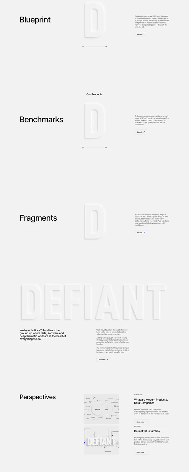
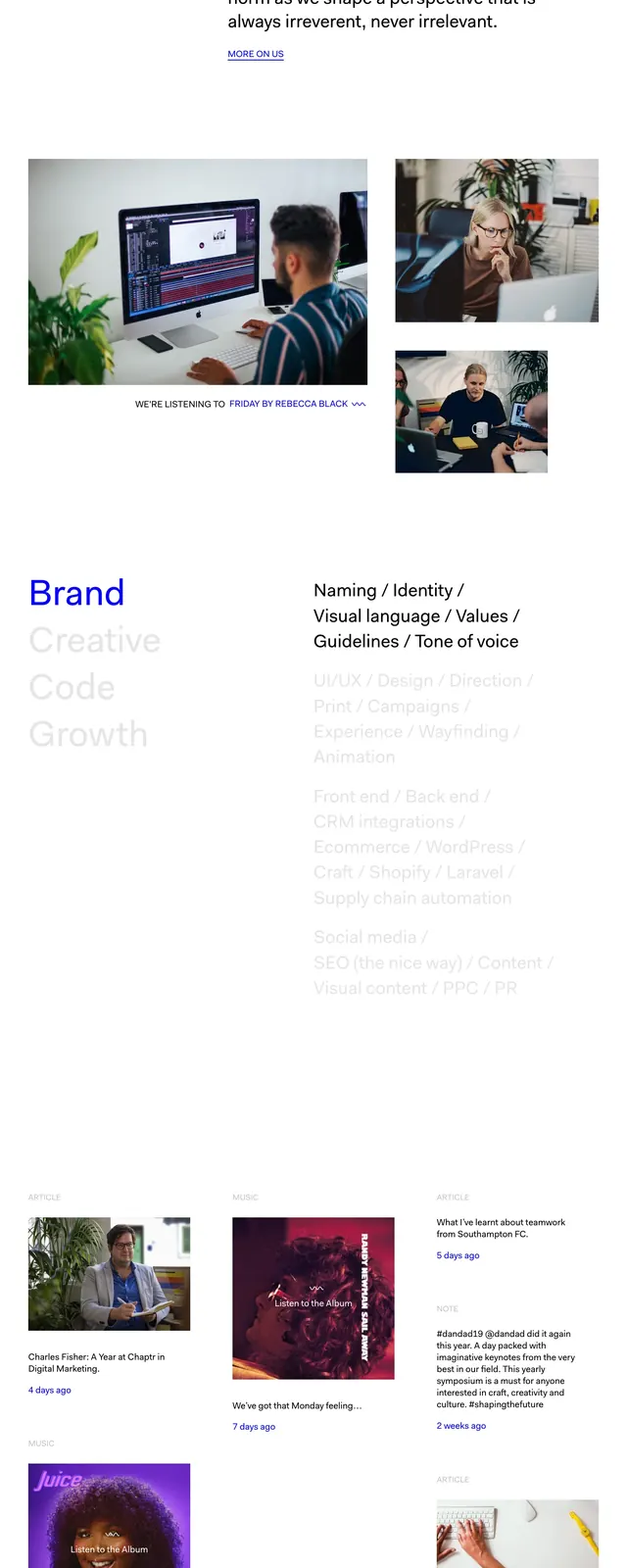
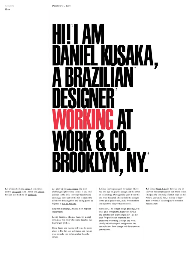
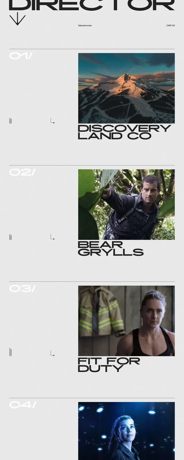
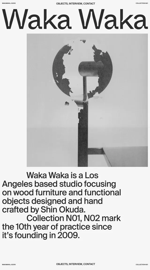
A minimalist agency homepage with a giant custom wordmark, sparse navigation, and a masonry-style grid of project and editorial cards.
Summary
A minimalist agency homepage with a giant custom wordmark, sparse navigation, and a masonry-style grid of project and editorial cards.
Visual description
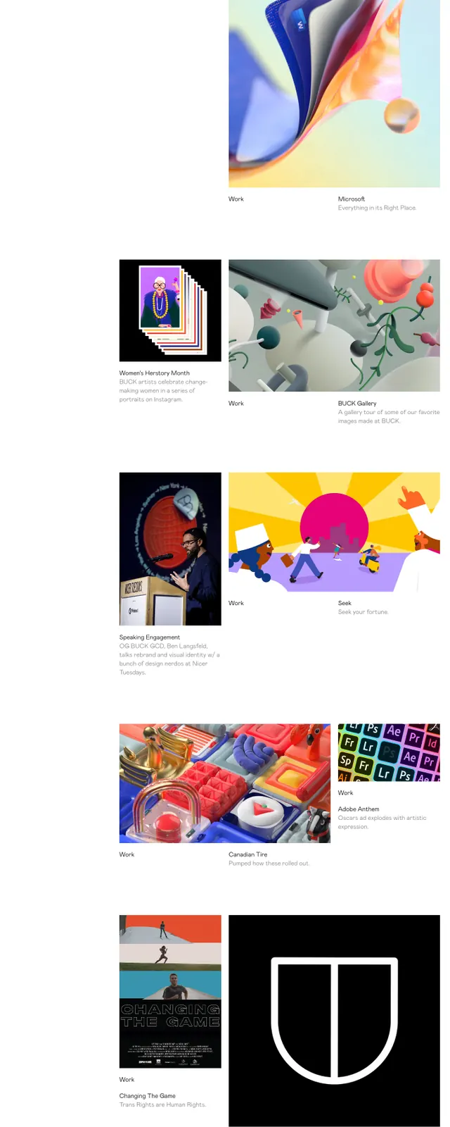
The page opens on a white background with an oversized black outlined BUCK wordmark spanning the top of the screen. A small vertical navigation sits on the left, while a short company description is placed near the center beneath the logo. Lower sections stack a series of project cards and image tiles in an asymmetric grid, mixing large thumbnails, short captions, and lots of white space. The footer ends with three city/time blocks laid out across a muted gray-green band.
Key takeaway
The strongest pattern is the combination of a dominant custom logotype with a very quiet editorial grid below it. The layout relies on whitespace, thin typography, and image-first cards to keep the page feeling curated and design-led.
Reuse notes
Useful for agency, studio, or portfolio homepages that need to feel refined without heavy UI chrome. The structure works best when the content is visually rich enough to support an image-led grid.