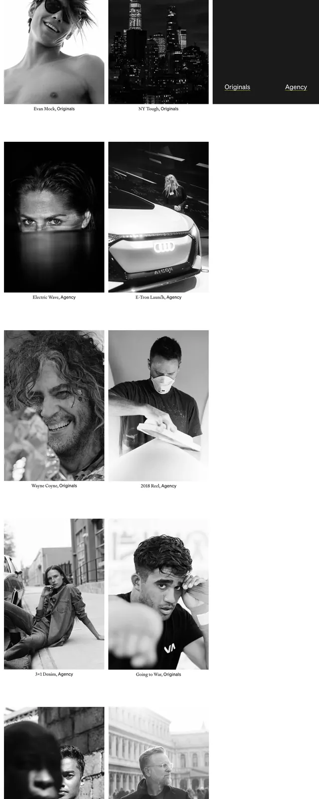
Preview image. Unlock full-res
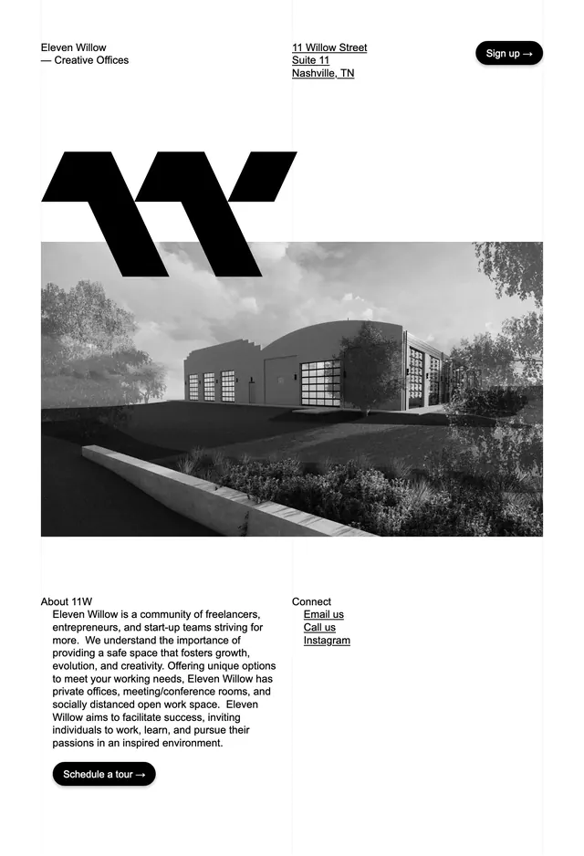
A minimalist monochrome landing page for a creative office space with strong typography, large imagery, and sparse navigation.
Summary
A minimalist monochrome landing page for a creative office space with strong typography, large imagery, and sparse navigation.
Visual description
The page uses a clean white background with small, understated navigation text at the top and a compact pill-shaped call-to-action button. A bold abstract black logo sits above two stacked grayscale architectural images that dominate the middle of the page. The lower section switches to a simple two-column layout with an about paragraph on the left and contact links on the right.
Key takeaway
The design relies on restraint, contrast, and high-quality imagery to make a premium creative workspace feel refined and credible. The composition is easy to scan and gives the hero strong brand presence without visual clutter.
Reuse notes
This pattern works well for studio, property, or hospitality brands that want an editorial feel and a premium but approachable tone. Reuse the sparse header, oversized hero imagery, and minimal CTA treatment for a polished landing-page introduction.