Preview image. Unlock full-res
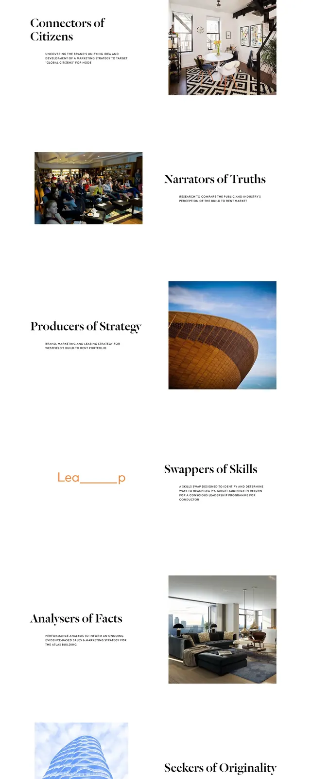
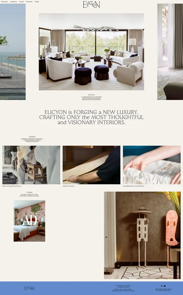
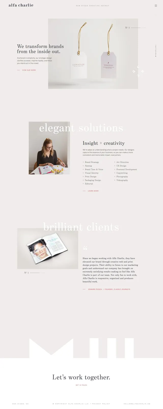
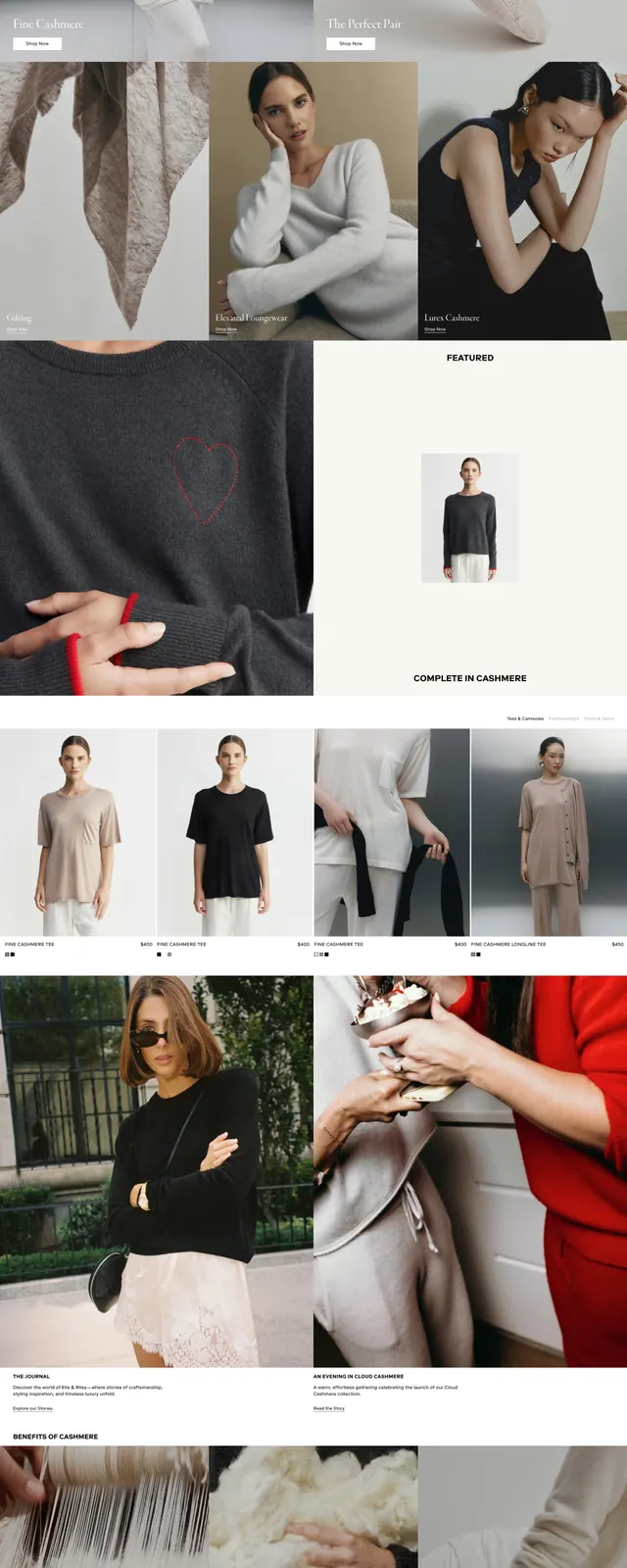
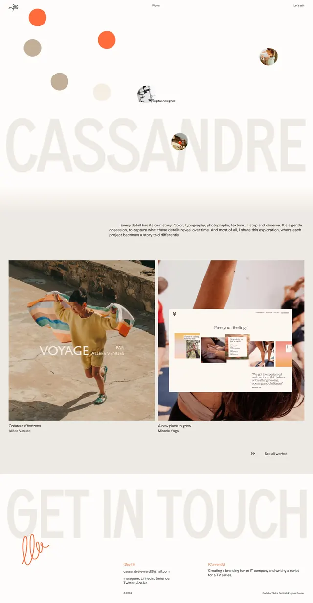
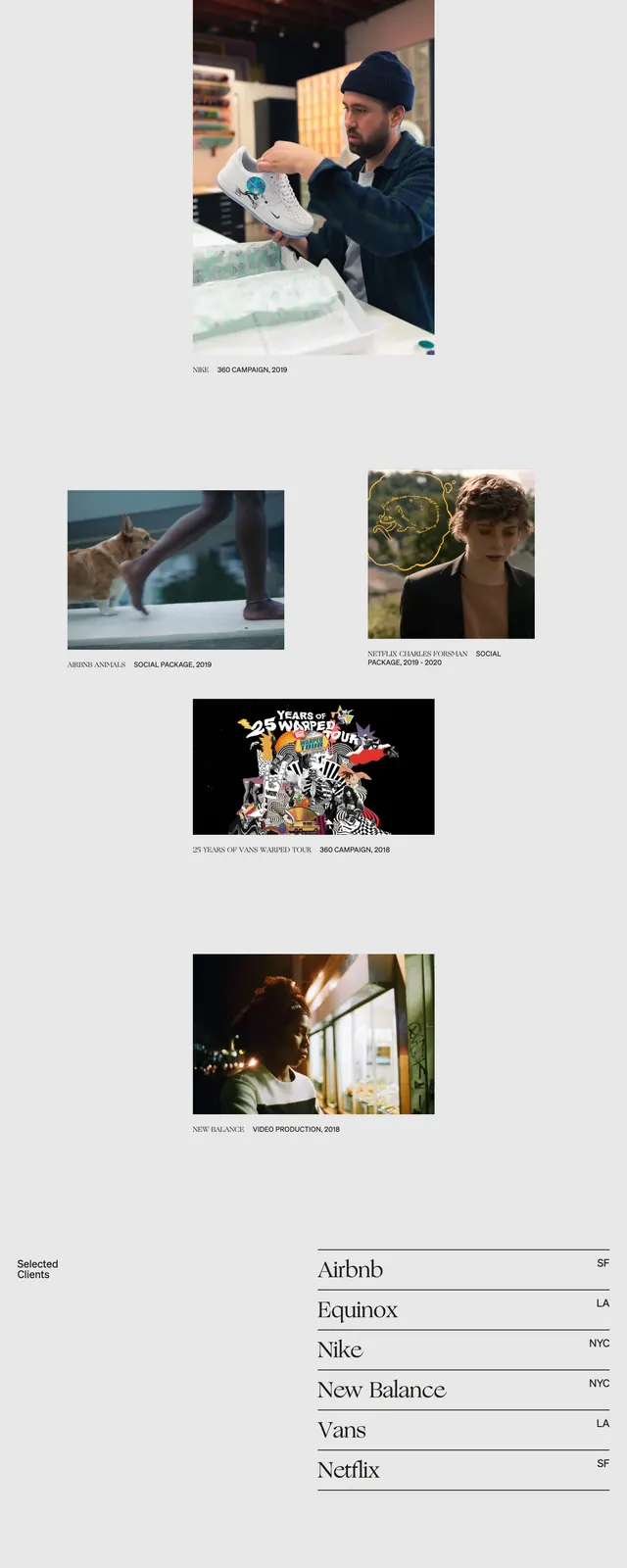
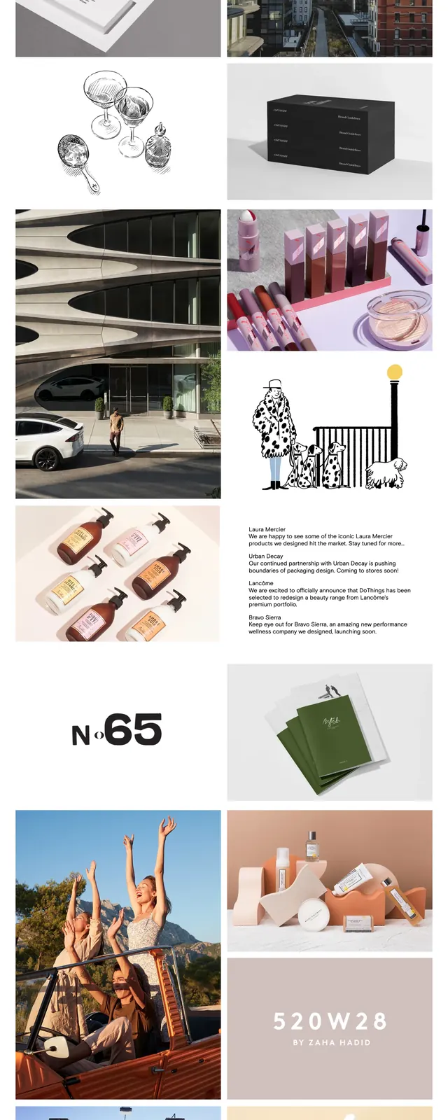
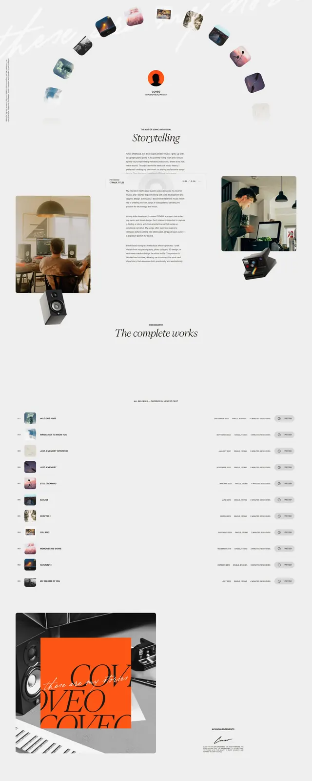
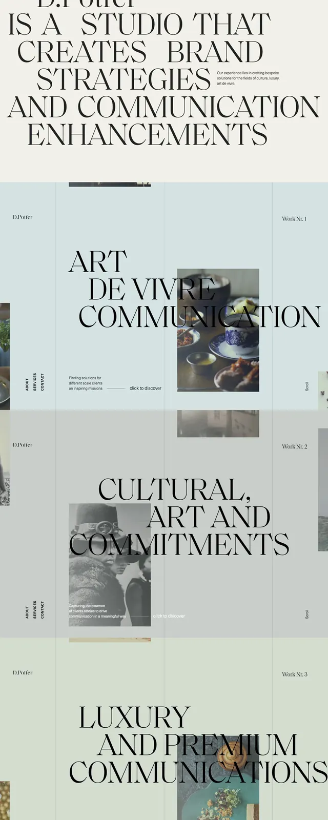
A full-page studio website with oversized serif headlines, pale muted panels, and a grid of image-led work sections.
Summary
A full-page studio website with oversized serif headlines, pale muted panels, and a grid of image-led work sections.
Visual description
The page uses a warm off-white and pale blue-green palette with large black serif typography dominating each section. The top slice is a hero with the brand name and a giant multi-line statement, followed by stacked portfolio/work sections separated by wide horizontal bands. Small vertical nav text, work labels, and short captions sit beside loosely arranged photography blocks and image tiles. The overall composition feels airy, editorial, and highly spaced, with content aligned to a faint grid.
Key takeaway
The main reusable idea is the combination of monumental serif headlines with a restrained, pastel-toned grid and small supporting labels. It creates a premium studio feel without relying on heavy UI chrome.
Reuse notes
Use this approach for creative agencies, fashion, art direction, or luxury brand sites where the work itself should feel curated. It works best when you have strong imagery and short copy, and less well for dense product or conversion-focused pages.