Preview image. Unlock full-res
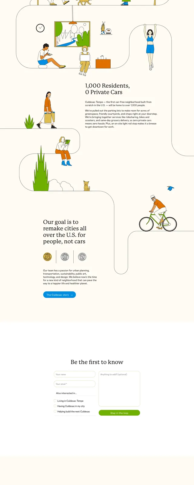
A calm, editorial-style nonprofit landing page for grief support with a warm hero, illustrated family scene, and stacked info sections.
Summary
A calm, editorial-style nonprofit landing page for grief support with a warm hero, illustrated family scene, and stacked info sections.
Visual description
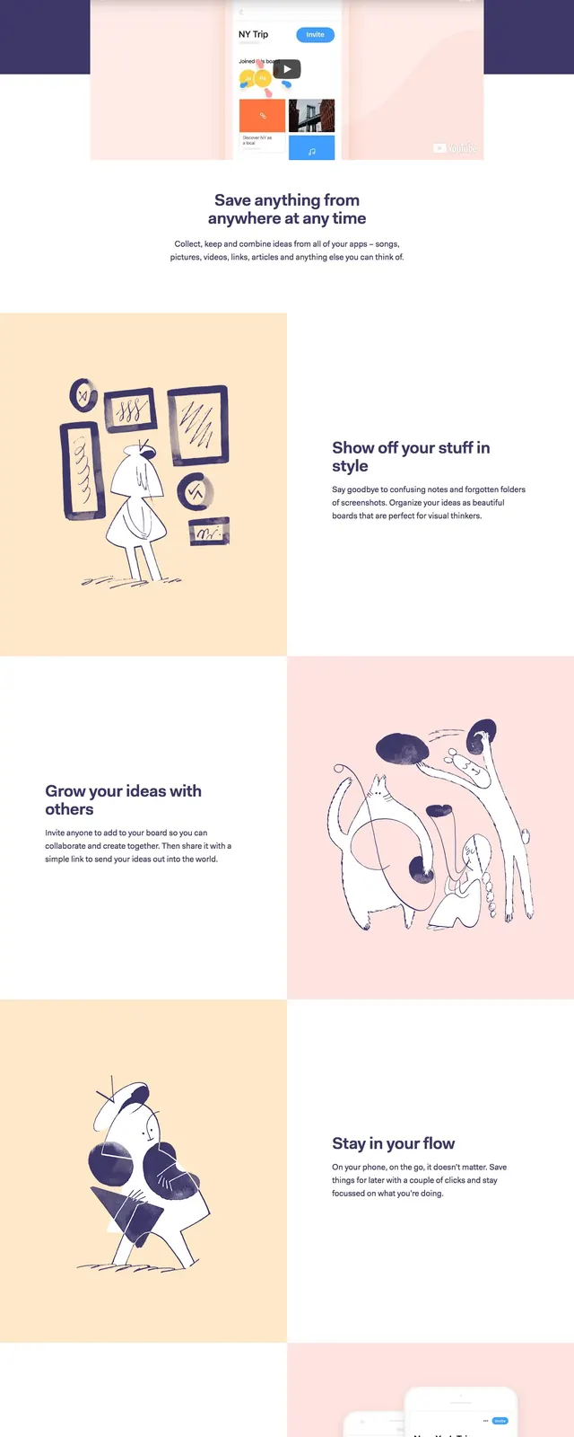
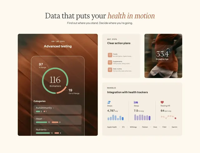
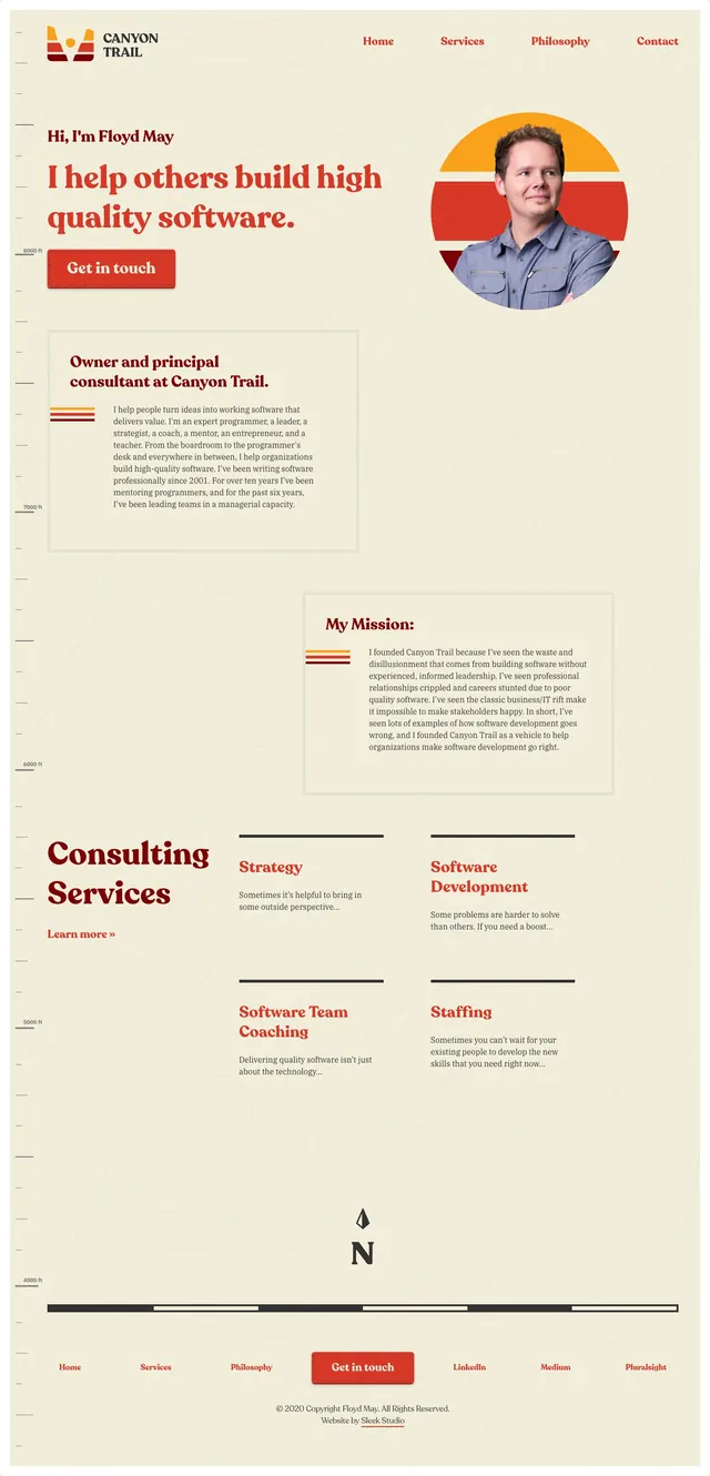
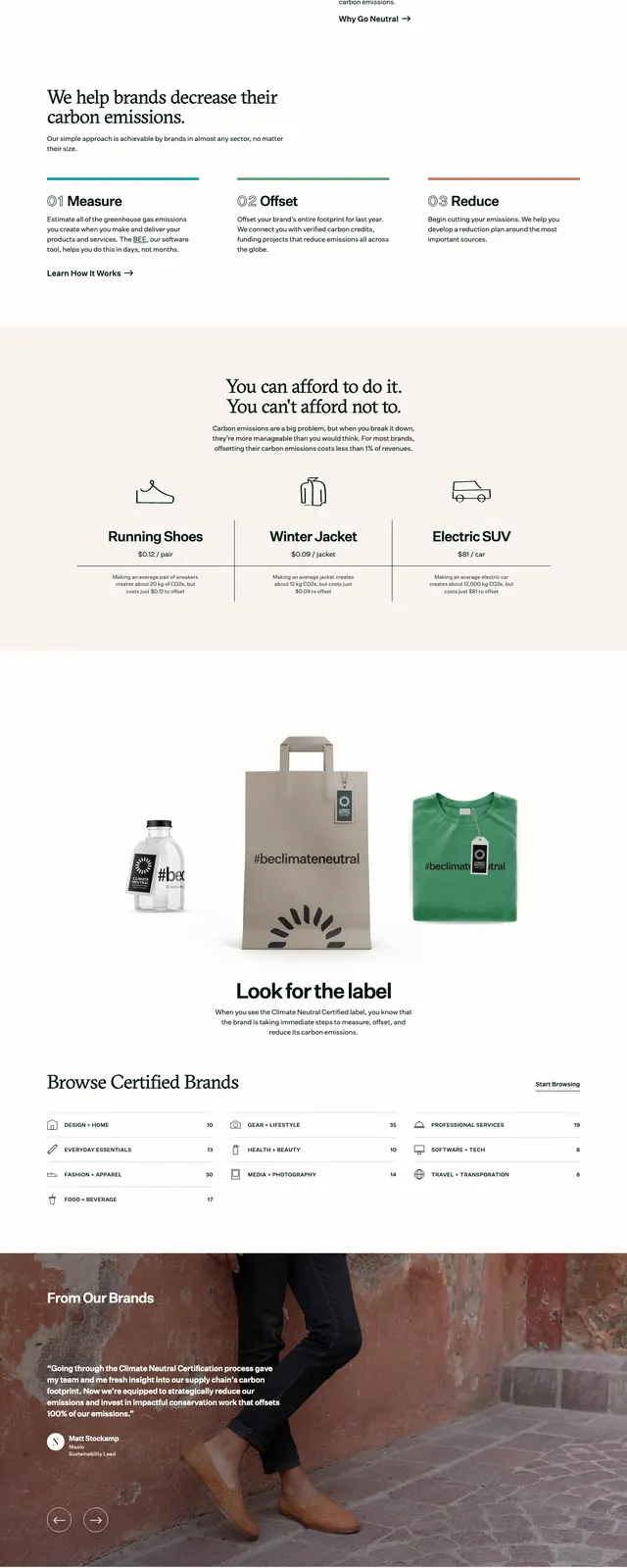
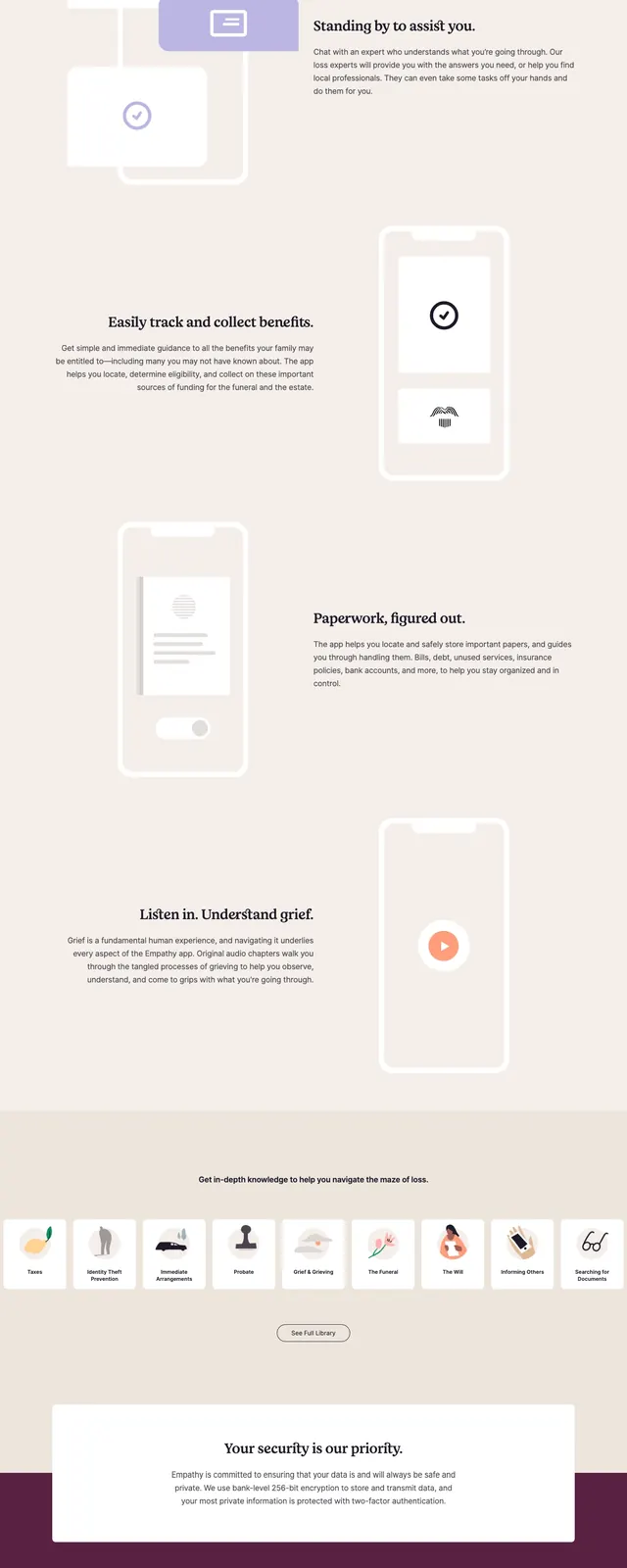
The page opens with a soft beige hero area, a small top navigation, a large serif headline, supporting copy, and a phone-number input paired with a dark call-to-action button. On the right is a flat illustrated family scene with muted clothing colors and simple landscape shapes. Below, a white centered card introduces the product, followed by a warm yellow process section, pale feature blocks with phone mockups, a dark pricing/CTA band, and a clean footer. The overall composition uses generous spacing, rounded cards, and restrained contrast.
Key takeaway
The strongest move is the contrast between the gentle illustrated hero and the highly structured, card-based information blocks below. The serif headline and soft palette make the page feel human and supportive rather than corporate.
Reuse notes
Reuse this pattern for emotionally sensitive consumer or nonprofit products that need trust and calm. It works best when paired with simple CTAs, soft illustrations, and short explanatory sections instead of dense feature grids.