Preview image. Unlock full-res
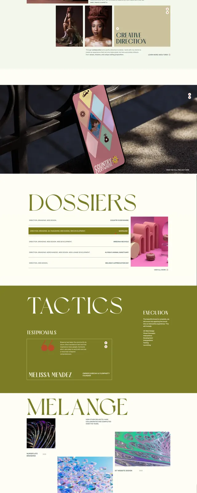
A soft editorial landing page with muted green, beige, and blush panels, serif headlines, and stacked case-study sections.
Summary
A soft editorial landing page with muted green, beige, and blush panels, serif headlines, and stacked case-study sections.
Visual description
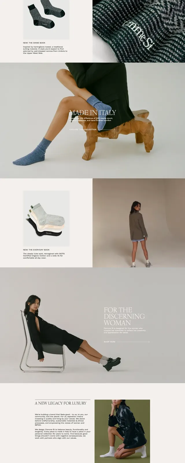
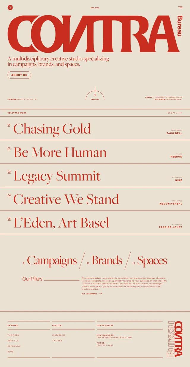
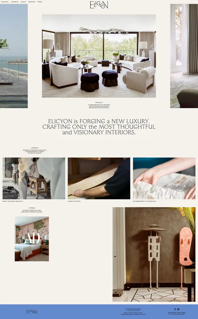
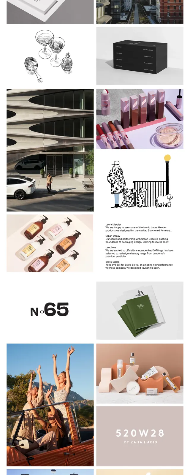
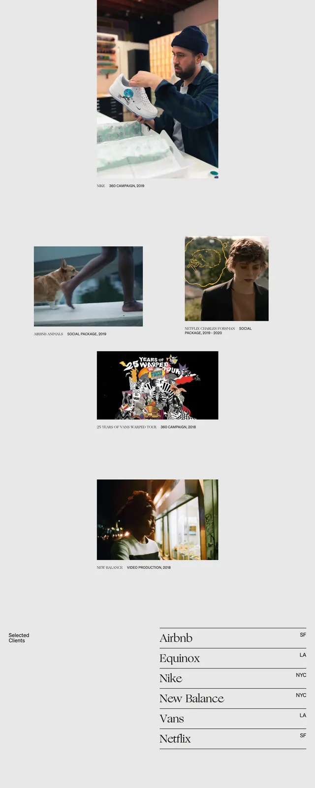
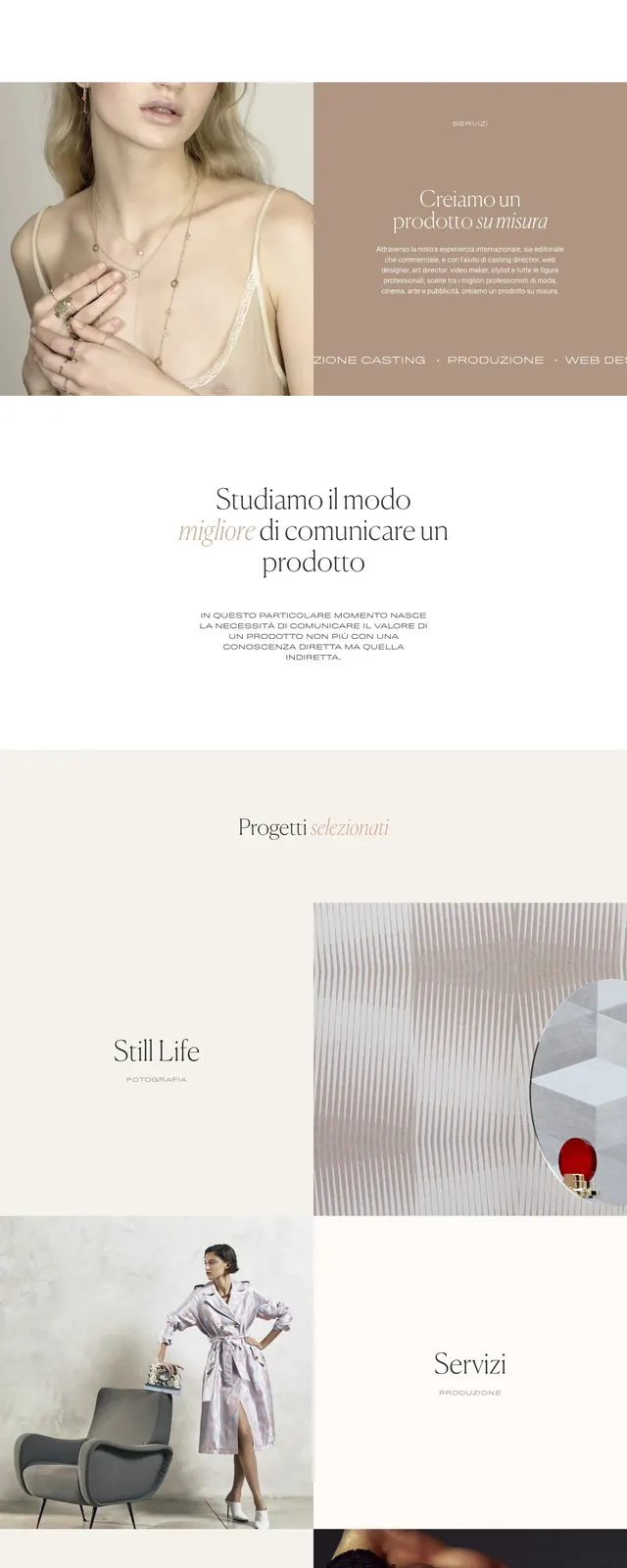
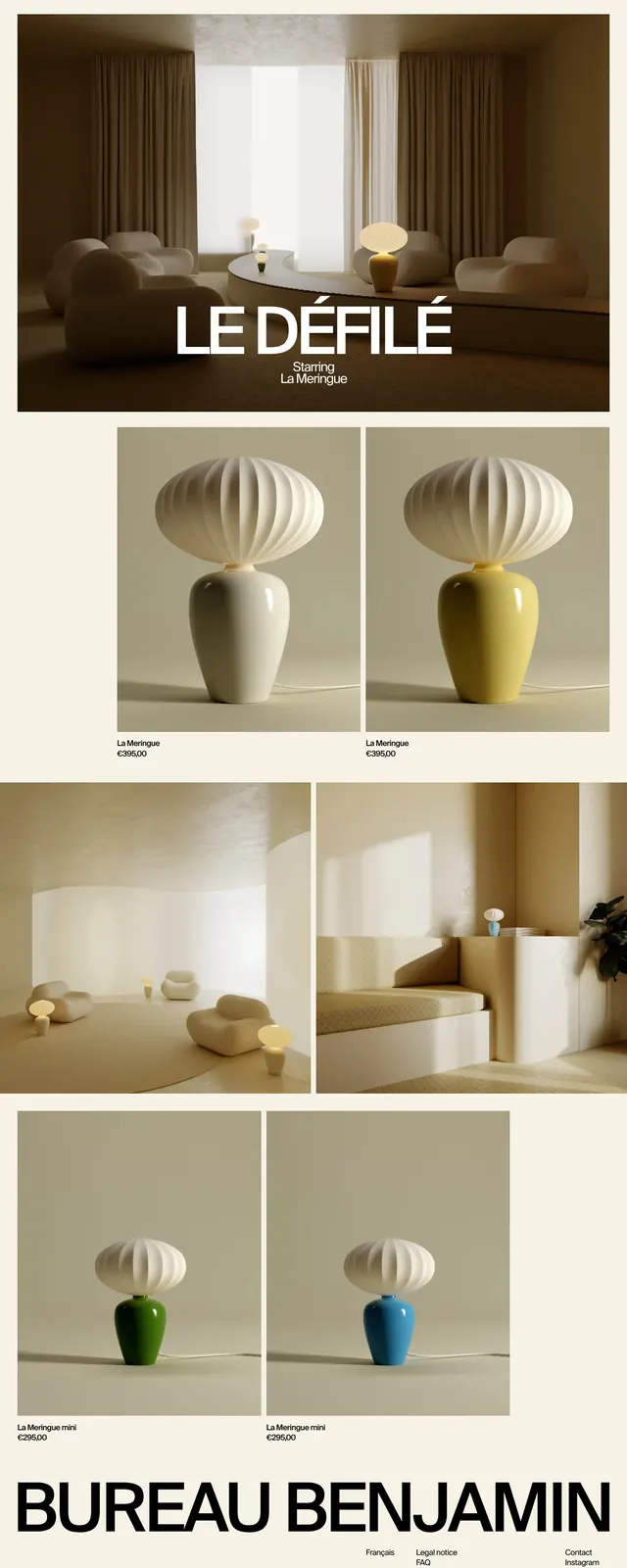
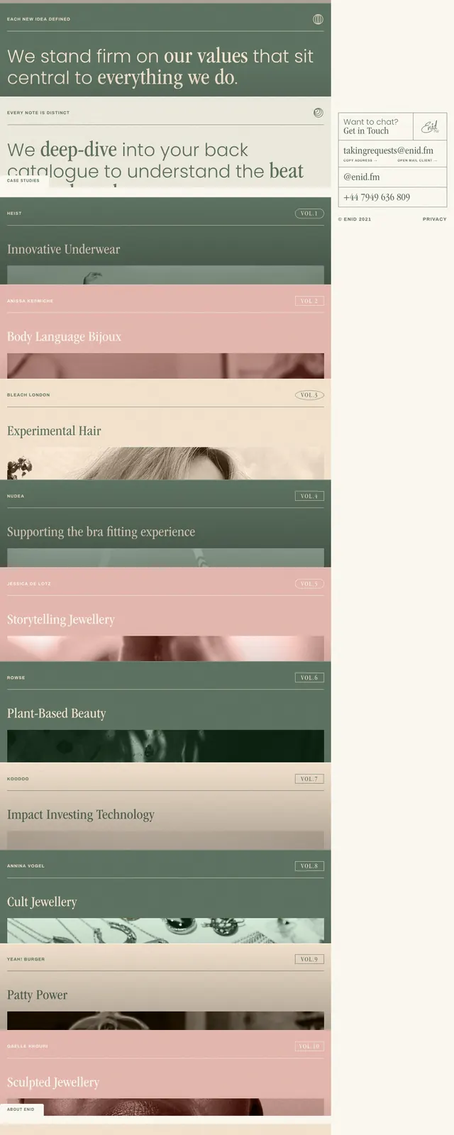
The page uses a restrained editorial layout with a narrow right sidebar and a wide content column filled with large stacked panels. Headlines are set in a serif typeface with small all-caps labels and thin dividing lines, while the palette alternates between sage green, cream, and dusty pink. The visible sections feature case-study style blocks with title text, volume tags, and cropped imagery. The overall composition feels like a premium studio portfolio with a magazine-like rhythm.
Key takeaway
The design relies on strong typographic hierarchy, generous spacing, and alternating muted color bands to make each section feel distinct while staying cohesive. It is a useful reference for creative agency or portfolio sites that want an understated but distinctive editorial voice.
Reuse notes
Reuse the stacked sectional rhythm, small label system, and soft color blocking to organize long-form portfolio content. The narrow contact/sidebar treatment can also work well for persistent brand info on a desktop landing page.