Preview image. Unlock full-res
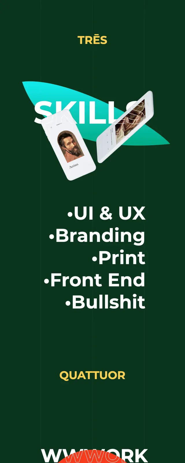
A dark green portfolio landing page uses a centered circular motif, oversized typography, and minimal copy to present services and contact details.
Summary
A dark green portfolio landing page uses a centered circular motif, oversized typography, and minimal copy to present services and contact details.
Visual description
The page is built on a deep green background with faint vertical guides and a centered circular emblem that wraps the words around a desert image. Large white service labels appear in a stacked list across the middle slice, with a bold orange circle and contact-focused call to action in the lower slice. Small supporting text is placed sparsely near the edges, reinforcing a clean editorial composition. The overall look is highly graphic, with strong contrast and lots of negative space.
Key takeaway
Use a single dominant circular graphic as the brand centerpiece, then support it with oversized service messaging and minimal edge-aligned utility text. The section feels memorable because the layout is simple, but the typography and shapes do most of the visual work.
Reuse notes
This pattern works well for portfolio and creative-agency hero sections where personality matters more than explanation. Reuse the stacked service list and prominent contact CTA to keep the page scannable while maintaining a strong visual identity.