Preview image. Unlock full-res
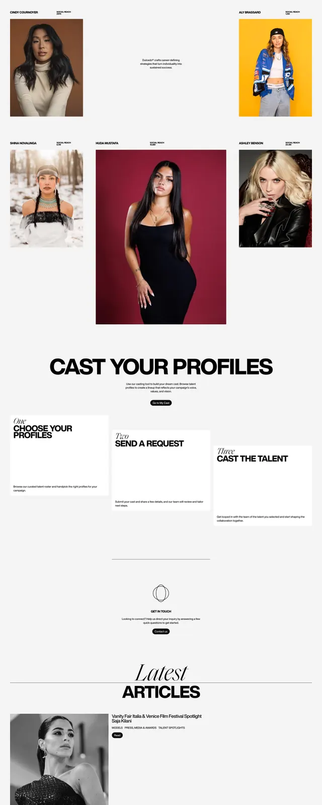
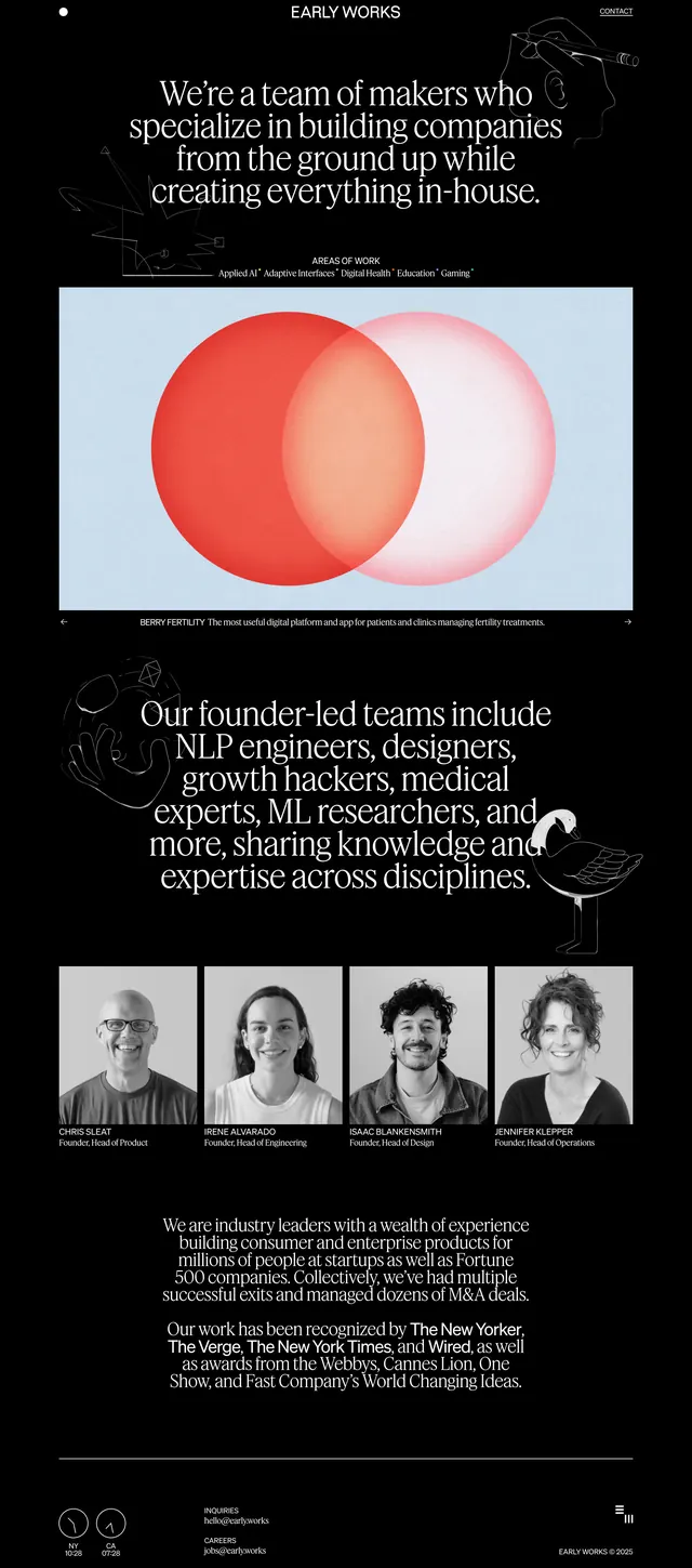
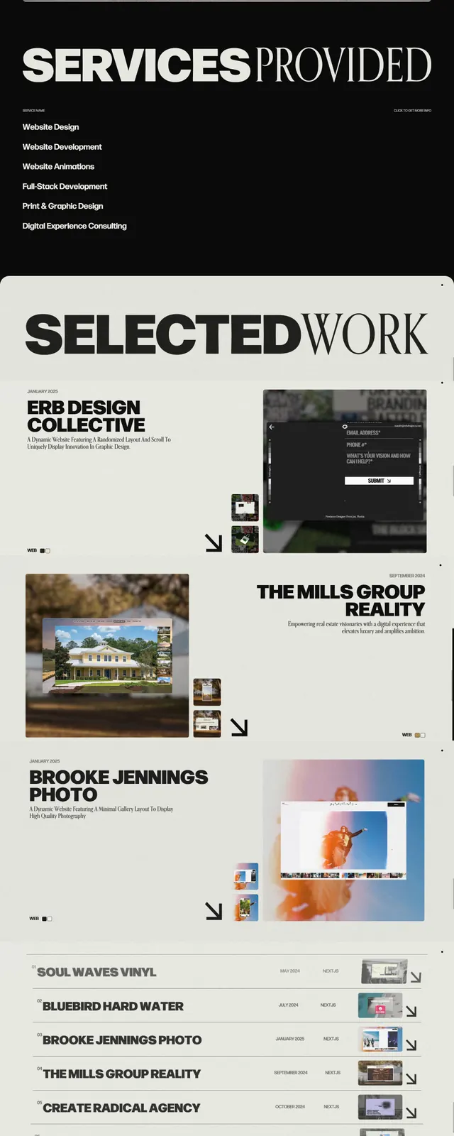
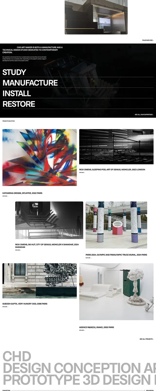
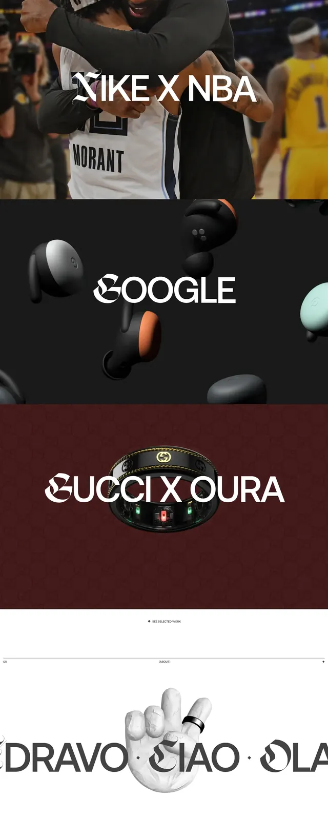
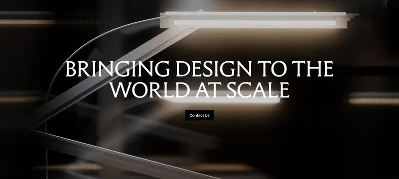
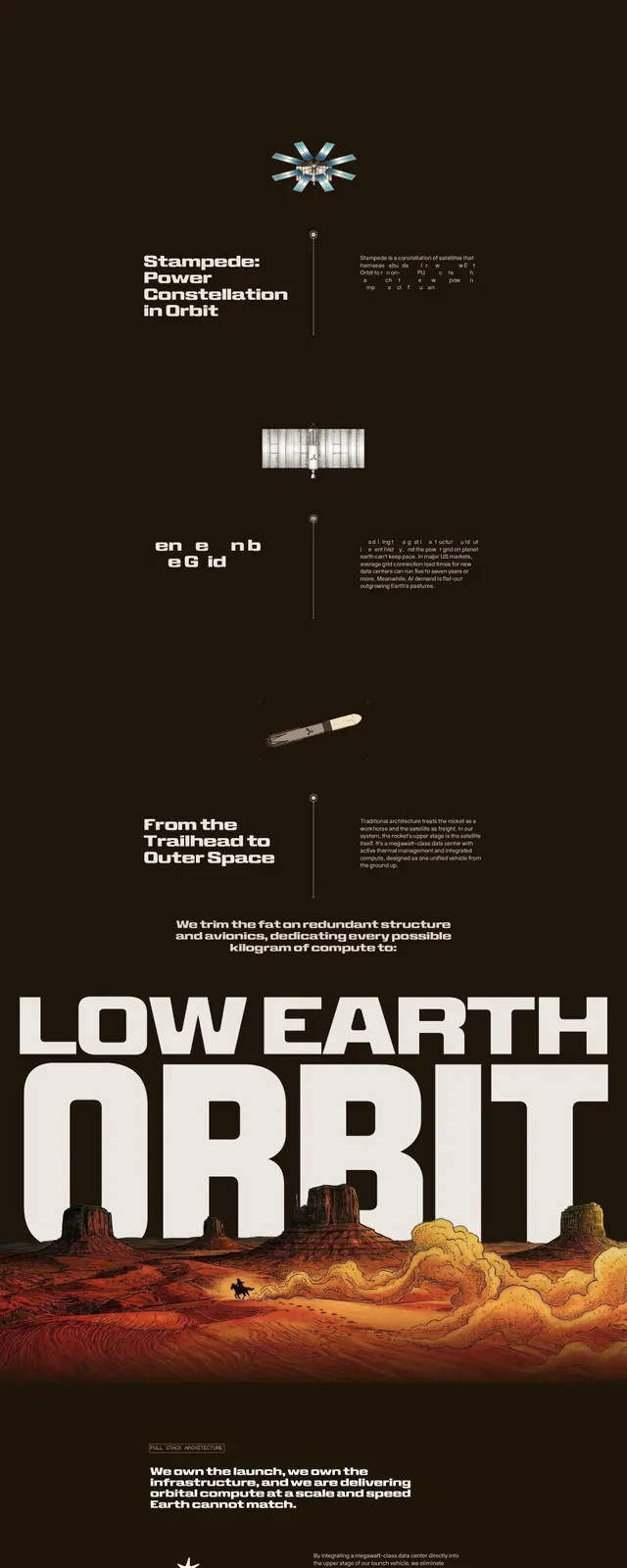
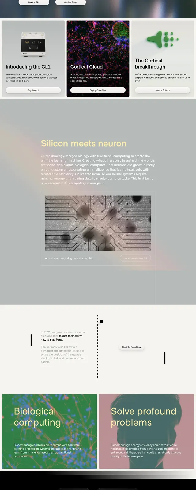
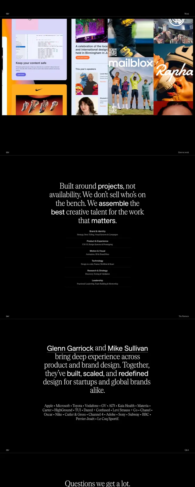
A high-contrast, typography-driven agency landing page featuring bold oversized headings and a dark aesthetic.
Summary
A high-contrast, typography-driven agency landing page featuring bold oversized headings and a dark aesthetic.
Visual description
The page uses a deep black background with stark white oversized serif typography for the brand name and headings. A gallery section features a grid of colorful project thumbnails that contrast sharply against the dark theme. The footer includes a unique set of minimalist clock icons representing different time zones.
Key takeaway
The use of extreme scale in typography creates a strong visual hierarchy and a luxury editorial feel.
Reuse notes
Ideal for creative agencies wanting to emphasize authority and minimalism. The high-contrast dark mode is effective for making portfolio imagery pop.