Preview image. Unlock full-res
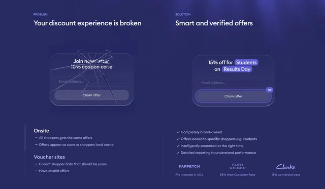
Dark two-column problem-versus-solution comparison contrasting a shattered newsletter form against a clean verified-offer form with proof logos.
Summary
A dark indigo problem-versus-solution comparison: the left column frames a broken discount experience with a shattered-glass newsletter form, the right column shows a clean, targeted verified-offer form backed by brand logos and conversion stats.
Visual description
Deep indigo background with a faint top-right glow, split into two columns by a thin vertical rule. The left column is labeled "PROBLEM" with a white headline "Your discount experience is broken", a translucent newsletter form mockup ("Join newsletter 10% coupon code", email field, "Claim offer" button) overlaid with cracked-glass fracture lines, and two grouped dash-bulleted lists ("Onsite", "Voucher sites") underneath. The right column is labeled "SOLUTION" with "Smart and verified offers", a crisp glowing form ("15% off for Students on Results Day" with highlighted pill tokens, email field, an active "Claim offer" button showing a "112" counter), a four-item checkmark list of benefits, and a bottom row of three muted brand logos (Farfetch, Kurt Geiger, Clarks) each paired with a conversion stat.
Key takeaway
Visualizing the "before" state as a literal shattered-glass form against an identical-but-pristine "after" form, making the problem and solution legible at a glance with the same UI element. The right column's proof logos with per-brand stats turn the solution side into instant credibility.
Reuse notes
Effective for products positioned against a broken status quo, especially ecommerce and conversion tooling. The broken-glass treatment is memorable but specific; reserve it for genuine before/after contrasts. Built for dark mode, with the indigo glow and translucent forms carrying the mood.
More comparison sections
See all











More like this

Keep what you find
A free account saves references to boards and can send you a weekly email of picks based on what you save.
To see every result, go Pro.