Preview image. Unlock full-res
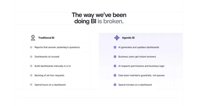
A two-column comparison with a two-tone headline that sets a greyed, crossed-out "Traditional BI" list against a purple, checked "Agentic BI" list on a faintly tinted panel.
Summary
A clean two-column comparison whose two-tone headline ("The way we've been doing BI is broken.") frames a greyed, crossed-out "Traditional BI" list beside a purple, checkmarked "Agentic BI" list lifted on a faint tinted panel.
Visual description
White background with faint dotted gridlines. A centered headline splits color: near-black "The way we've been doing BI" and grey "is broken." Two aligned five-row columns sit below. The left "Traditional BI" column uses grey circular X icons (reports that answer yesterday's questions, dashboards sit unused, build dashboards manually, backlog of ad-hoc requests, spend hours on a dashboard). The right "Agentic BI" column uses filled purple check icons on a subtly purple-tinted panel (AI generates dashboards, business users get instant answers, AI respects permissions, data team maintains guardrails, spend minutes on a dashboard). Each row pairs one-to-one.
Key takeaway
The faint tinted panel behind only the "good" column, so the eye settles there without any heavy borders. Pairing rows one-to-one (hours versus minutes) makes the upgrade legible at a glance, and the two-tone headline encodes the thesis in the type itself.
Reuse notes
Use when reframing a familiar workflow as outdated. Keep both columns to equal, parallel rows so the comparison reads as fair. The purple tint is doing the emphasis, so it needs a light background; verify the grey X column stays legible rather than looking disabled.