Preview image. Unlock full-res
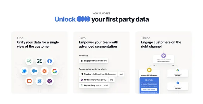
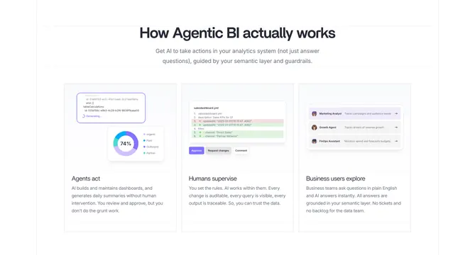
A clean three-column "how it works" where each step is illustrated by a real product UI fragment (a generating query, a YAML diff with approve controls, and agent rows).
Summary
A three-step explainer where each step is carried by a small, realistic product UI mockup rather than an icon, walking from agents acting, to humans supervising, to business users exploring.
Visual description
White background, centered bold heading ("How Agentic BI actually works") and two lines of sub-copy. Three equal columns, each with a UI fragment on top and a label plus paragraph below. Step one ("Agents act") shows a generating-query snippet and a purple donut chart reading 74%. Step two ("Humans supervise") shows a salesdashboard.yml diff with red and green changed lines and Approve, Request changes, and Comment buttons. Step three ("Business users explore") shows three agent rows (Marketing Analyst, Growth Agent, FinOps Assistant) each with an avatar and an arrow. Faint gridlines frame the row.
Key takeaway
Illustrating each step with an actual slice of the product UI instead of a generic icon, so "how it works" doubles as a product demo. The diff-with-approve mockup is a smart way to show a human-in-the-loop story concretely.
Reuse notes
Strong for technical products where the UI itself is the proof. Needs polished, legible mockups since they carry each column; at smaller widths the fine text in the diff and chart will be the first to break, so design a simplified fallback. Pairs well above a deeper feature section.