Preview image. Unlock full-res
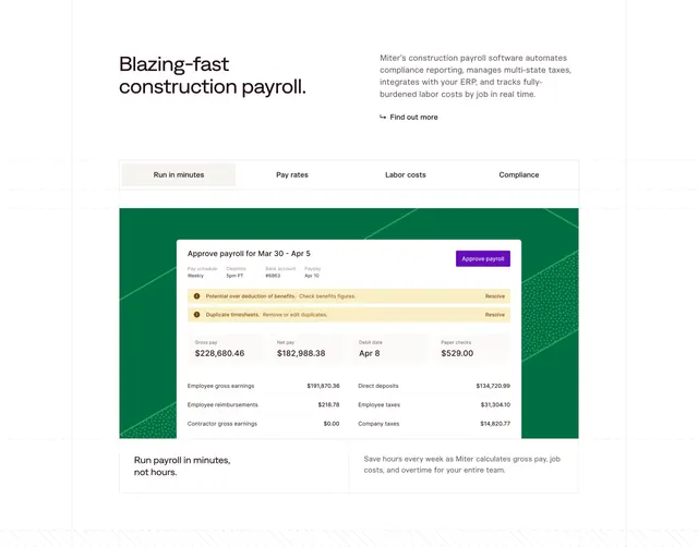
A light feature section that introduces a tabbed payroll demo with a large, realistic approve-payroll UI on a brand-green panel.
Summary
A light feature block led by a bold headline and a four-tab switcher, anchored by a large, realistic payroll-approval UI floated on a brand-green panel.
Visual description
White background with faint dashed guide lines. A bold two-line heading sits left with a paragraph and a "Find out more" link to its right. Below, four tabs (run in minutes, pay rates, labor costs, compliance) sit above a saturated green panel that frames a detailed product mockup: an "Approve payroll" card with pay-schedule meta, two amber warning rows with "Resolve" links, four headline figures (gross pay, net pay, debit date, paper checks), and an earnings and deductions breakdown. A short caption pair sits beneath ("Run payroll in minutes, not hours").
Key takeaway
Letting a single high-fidelity product screen carry the feature, framed by a bold brand color so the otherwise plain section gains identity. The amber warning rows make the UI feel real and show the product catching problems, not just displaying data.
Reuse notes
Best when one core workflow is your strongest proof and you have a polished UI to show. The green frame is the brand moment, so keep the rest of the section neutral. Tabs imply each one swaps the mockup, so plan a screen per tab.