Preview image. Unlock full-res
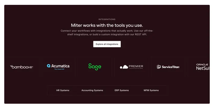
A dark, contained integrations panel that centers the pitch and one CTA, then lines partner logos in bordered cells above HR, accounting, ERP, and WFM category labels.
Summary
A dark, single-panel integrations section: a centered eyebrow, headline, supporting line, and one white CTA, above a row of partner logos in bordered cells and a strip of system-category labels.
Visual description
A large rounded panel in very dark maroon-black. Centered at top: a small grey "Integrations" eyebrow, a white headline ("Miter works with the tools you use."), two lines of muted copy mentioning off-the-shelf integrations and a REST API, and a white pill "Explore all integrations" button. Below, a single horizontal row of partner logos (BambooHR, Acumatica, Sage, Premier, ServiceTitan, Oracle NetSuite) each inside a faint bordered cell, with the last cell cut off at the edge to imply more. A lower bordered strip lists category labels: HR Systems, Accounting Systems, ERP Systems, WFM Systems.
Key takeaway
Grouping integrations by system category (HR, Accounting, ERP, WFM) so buyers immediately see their own stack is covered, not just a wall of logos. The bordered cells and one contained dark panel keep a long logo set feeling organized, and a single CTA routes the curious to the full list.
Reuse notes
Good for B2B products whose buyers care about specific systems of record. Real, recognizable logos do the trust work, so keep them monochrome on dark for cohesion. The cut-off last cell signals scroll or "more"; make sure that is an intentional affordance and not just a crop.
More integrations sections
See all











More like this
Keep what you find
A free account saves references to boards and can send you a weekly email of picks based on what you save.
To see every result, go Pro.