Preview image. Unlock full-res
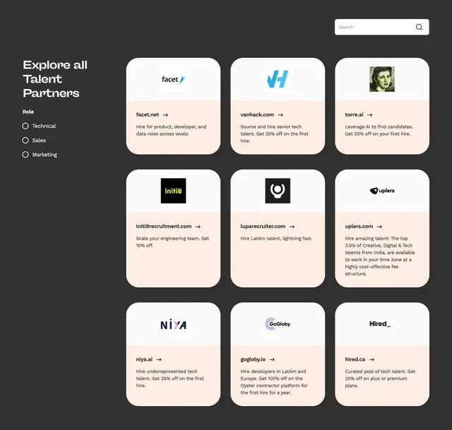
Dark partner directory with role filters, search, and a three-column grid of logo cards with promo copy.
Summary
A filterable talent-partner directory on charcoal with a left role sidebar, top-right search, and a nine-card grid pairing partner logos with short offer copy.
Visual description
Dark charcoal background frames the section. Left column holds a large white headline "Explore all Talent Partners" and a "Role" filter group with outlined radio circles for Technical, Sales, and Marketing. Top right sits a white pill search bar with gray placeholder text and a magnifying glass icon. The main area is a three-by-three grid of rounded cards. Each card splits vertically: white top half centers a partner logo, peach-cream bottom half shows a bold domain link with arrow, then a short black description often citing a hiring discount. Partners shown include facet.net, vanhack.com, torre.ai, initi8recruitment.com, luparecruiter.com, uplers.com, niya.ai, gogloby.io, and hired.ca.
Key takeaway
The two-tone card split keeps logos clean on white while promos read as editorial footnotes on warm cream. Pairing directory filters with per-partner discount copy turns a logo wall into a shoppable marketplace.
Reuse notes
Strong for partner programs, integrations marketplaces, or vendor directories where each tile needs a short pitch. Needs consistent logo sizing and real partner assets. Dark background makes white search and cards pop; light themes would need a different contrast recipe.