Preview image. Unlock full-res
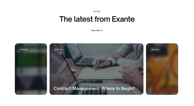
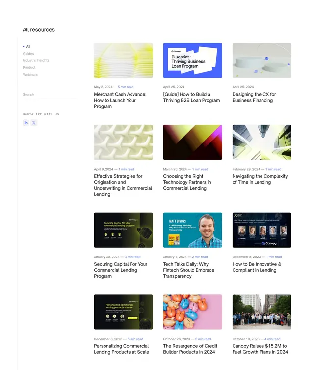
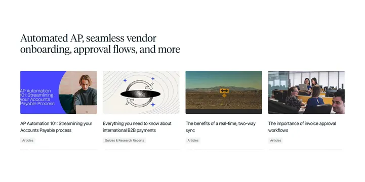
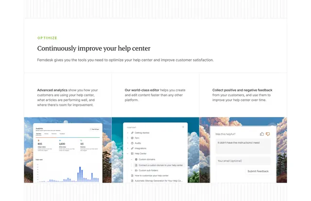
Light resources block with a plain heading and two unequal article cards, one with gradient icon tiles, the other with a chart mockup.
Summary
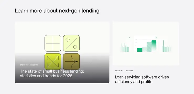
A light resources section that sets a plain heading over two unequal article cards: a wide left card with a 2x2 grid of gradient icon tiles fading into a dark photo-like gradient, and a narrower right card with a green chart mockup. The asymmetric two-card split with distinct visual treatments is the defining move.
Visual description
Light grey background. A dark sans-serif heading "Learn more about next-gen lending." sits top-left. Below, two cards of unequal width. The left, wider card shows a 2x2 grid of rounded tiles containing line-drawn math and arrow symbols, each tile in a different yellow-to-olive gradient; the card's lower half fades into a dark grey gradient over which a small-caps "INDUSTRY INSIGHTS" kicker and the title "The state of small business lending: statistics and trends for 2025" appear in white. The right, narrower card has a light face with a green-toned bar-and-line chart UI mockup floating inside; below the card sits a dark "INDUSTRY INSIGHTS" kicker and the title "Loan servicing software drives efficiency and profits".
Key takeaway
Giving two resource cards deliberately different artwork (abstract gradient icon grid vs. a product chart mockup) so a two-item list still feels varied. The small-caps kicker plus title pattern keeps both cards labeled consistently despite their different visuals.
Reuse notes
Good for blog or insights teasers on fintech and B2B SaaS pages where only a couple of featured articles are surfaced. The asymmetric widths need intentional content (a flagship piece plus a secondary). Light palette with a single green accent; reuse the kicker label to tie mismatched card art together.