Preview image. Unlock full-res
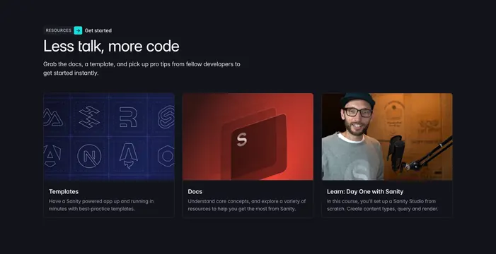
Dark three-column resources section with a serif headline and cards topped by distinct cover images.
Summary
A dark resources block that pairs an oversized serif headline with three equal cards, each capped by a strongly differentiated cover image. The defining move is using three completely different image treatments (line-art grid, red product render, warm photo) to signal three different resource types.
Visual description
Near-black background. Top left carries a small boxed "RESOURCES" eyebrow next to a teal arrow chip and a "Get started" label, then an oversized serif headline "Less talk, more code" and two lines of muted sub-copy. Below sit three cards in a row, each with a tall cover image and a bold title plus two lines of body. The first image is a blueprint-style grid of dotted logo icons on deep blue, the second a glowing red abstract product render with an "S" mark, the third a warm-lit photo of a person at a microphone. Cards have subtle rounded borders and generous internal padding.
Key takeaway
Differentiating card types by image style rather than by label: line-art versus render versus photo instantly reads as templates versus docs versus course. The teal arrow chip beside the eyebrow adds one spot of brand color into an otherwise restrained dark layout.
Reuse notes
Good for a docs or learning hub that mixes resource formats. Works best when you genuinely have three distinct content types to visually separate. The serif headline gives a dark technical product an editorial, less generic feel.