Preview image. Unlock full-res
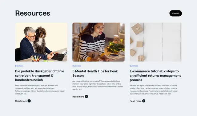
Light three-column blog resource grid with photo thumbnails, a Business category label, article titles, and Read more links.
Summary
A light resources section presenting three blog articles as a clean photo-led card grid, each with a category tag, headline, excerpt, and Read more link. The defining trait is the straightforward editorial three-up with a single View all escape hatch.
Visual description
A bold black "Resources" heading sits top-left with a black pill "View all" button at top-right. Below, three equal cards each open with a rounded landscape photo (a man with a dog at a laptop, a woman working at a kitchen table, and a flat-lay of parcels on white). Under each image is a small blue "Business" category label, a bold multi-line article title, a few lines of muted excerpt text, and a "Read more" link paired with a small dark circular arrow icon. One article title appears in German, the others in English.
Key takeaway
The clean photo-first blog grid where a small colored category label sorts content and a single View all keeps the section from growing. Consistent image crop and the repeated arrow link give the three cards a tidy rhythm.
Reuse notes
A dependable pattern for a blog or resource teaser near the footer of a marketing site. Lives or dies on consistent, good-quality thumbnails; mismatched crops break the grid. Pairs well with a quieter section above it since the photos already add visual weight.
More resources sections
See all

More like this

Keep what you find
A free account saves references to boards and can send you a weekly email of picks based on what you save.
To see every result, go Pro.