Preview image. Unlock full-res
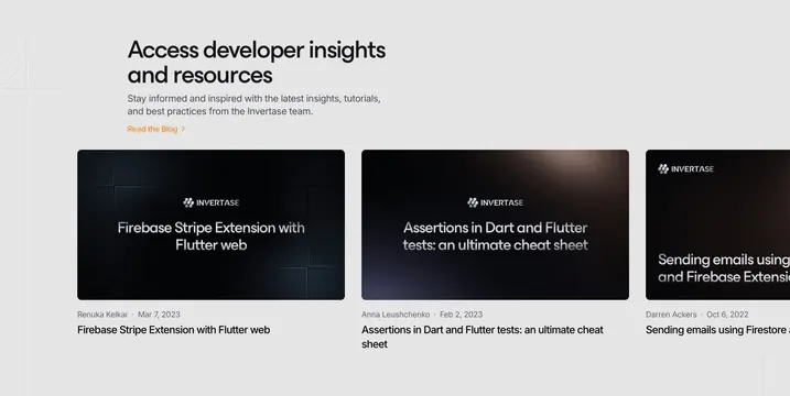
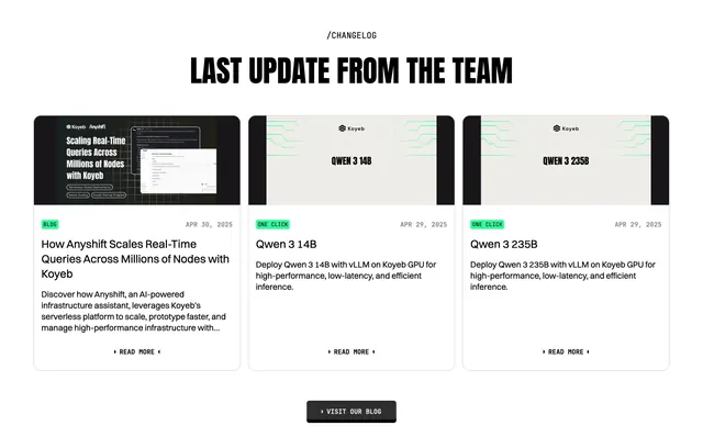
Light resources block with a condensed all-caps heading and three changelog cards, each with a dark thumbnail, category badge, date, title, and read-more link.
Summary
A light resources section that surfaces the latest changelog and blog posts as three equal cards, each with a dark thumbnail, a colored category badge, a date, a title, and a read-more link.
Visual description
On a white background, a small centered "/Changelog" monospace label sits above an oversized condensed all-caps heading, "Last update from the team". Below, three equal-width cards line up in a row. Each card has a dark rounded thumbnail at the top: the first shows a "Scaling Real-Time Queries Across Millions of Nodes with Koyeb" blog graphic with a screenshot inset, the other two show centered "Qwen 3 14B" and "Qwen 3 235B" labels on a circuit-line background. Under each thumbnail, a small badge (green "BLOG" or "ONE CLICK") sits left with a monospace date right (Apr 30 2025, Apr 29 2025). A dark post title follows, then muted body copy, and a "Read more" link with chevrons. A centered dark "Visit our blog" button with chevrons closes the section.
Key takeaway
Pulling changelog or release posts into a three-card resources block keeps a marketing page feeling current and active. The category badge plus date on each card lets a visitor scan recency and type at a glance.
Reuse notes
Use to surface a feed of recent posts, releases, or one-click deploys on a landing page. Cards expect consistent thumbnail treatment; the dark graphics here unify them. Three across needs a wide viewport. Works on light; the green badges and condensed heading tie it to the Koyeb system.