Preview image. Unlock full-res
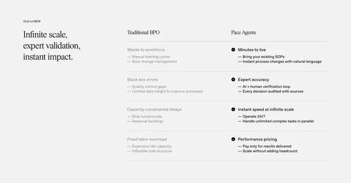
A quiet, editorial two-column comparison with a serif headline on the left and a muted "traditional" list set against an active branded list on the right.
Summary
An understated, editorial comparison: a three-line serif headline anchors the left, while two stacked columns contrast a greyed-out "Traditional BPO" against an active, check-marked "Pace Agents" list.
Visual description
Light warm-grey background, generous whitespace. Left third holds a large serif headline ("Infinite scale, expert validation, instant impact."). The right two-thirds is a two-column list with four aligned rows. The "Traditional BPO" column is entirely muted grey (Weeks to workforce, Black box errors, Capacity-constrained delays, Fixed labor overhead), each with two faint sub-bullets. The "Pace Agents" column repeats the rhythm in near-black with a small dark check icon per row (Minutes to live, Expert accuracy, Instant speed at infinite scale, Performance pricing) and crisp sub-bullets. Thin hairline rules separate rows.
Key takeaway
Using pure type weight and color (muted grey versus near-black) to carry the comparison, with no boxes or panels at all. The serif headline plus sans body gives it an editorial, premium calm that suits high-trust B2B. Parallel row structure makes the two sides instantly scannable.
Reuse notes
Reach for this when you want comparison without aggression, and when your brand leans editorial and premium. Relies on disciplined parallel phrasing across both columns. The muted-versus-active contrast needs a light background to read; test the grey column for legibility before shipping.
More comparison sections
See all











More like this






Keep what you find
A free account saves references to boards and can send you a weekly email of picks based on what you save.
To see every result, go Pro.