Preview image. Unlock full-res
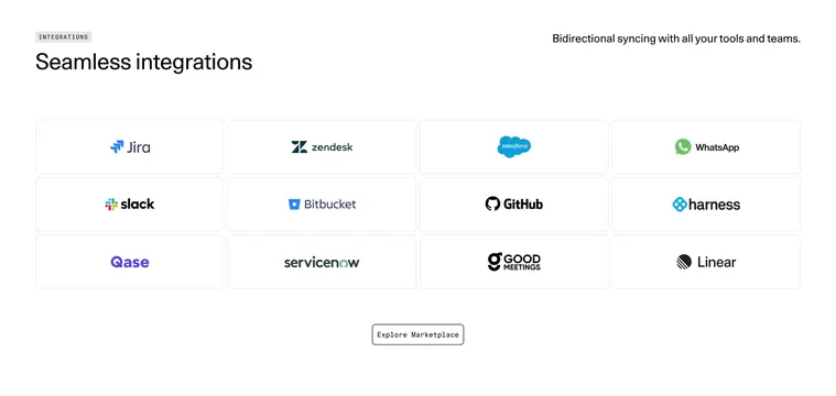
Light integrations section with a 4-column grid of bordered logo cards under a large heading, capped by a single outlined CTA.
Summary
A clean, light integrations section presenting a tidy 4-by-3 grid of bordered logo tiles under an oversized heading, with a single outlined marketplace button below.
Visual description
At the top left a small gray "INTEGRATIONS" eyebrow pill sits above an oversized black heading "Seamless integrations." A supporting line, "Bidirectional syncing with all your tools and teams," is right-aligned in the top right corner. Below sits a four-column, three-row grid of equal rectangular cards with thin rounded borders, each centered on a full-color partner logo (Jira, Zendesk, Salesforce, WhatsApp; Slack, Bitbucket, GitHub, harness; Qase, ServiceNow, Good Meetings, Linear). Generous white gutters separate the tiles. Centered beneath the grid is a small pill button with a thin border and monospaced "Explore Marketplace" label. Everything sits on a flat near-white background.
Key takeaway
The split header that anchors the big title at top-left while pushing the descriptive sentence to the top-right corner, plus the discipline of one uniform bordered tile per logo so a dozen brands read as an even, calm grid. The monospaced outlined CTA adds a quiet technical accent.
Reuse notes
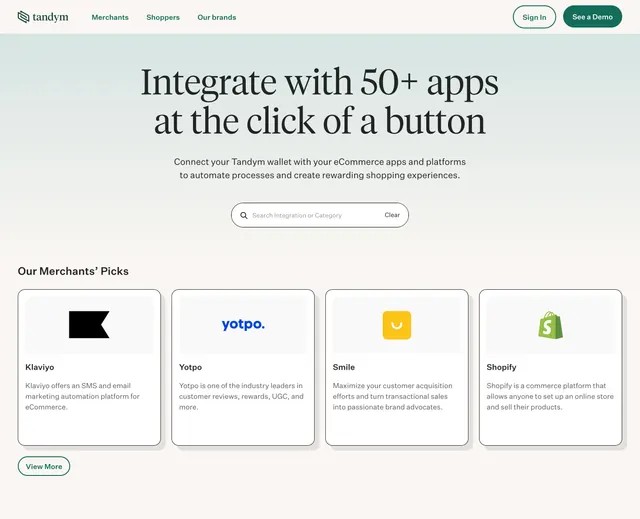
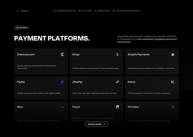
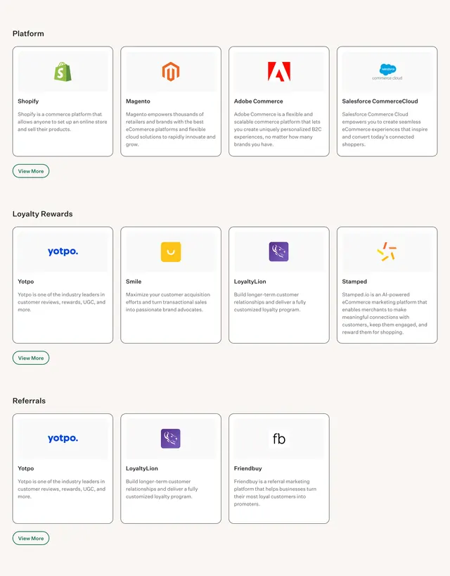
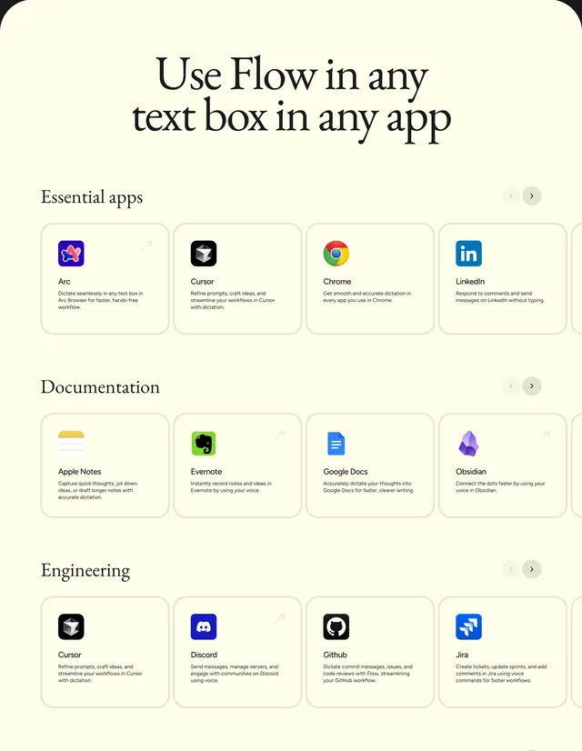
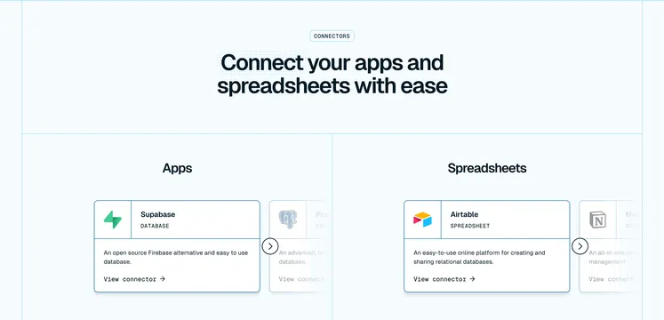
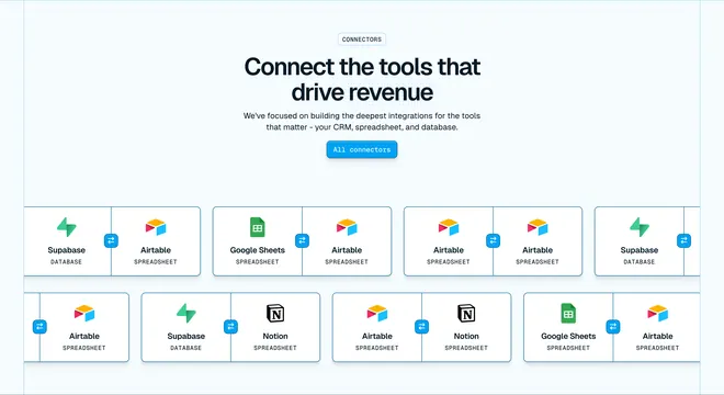
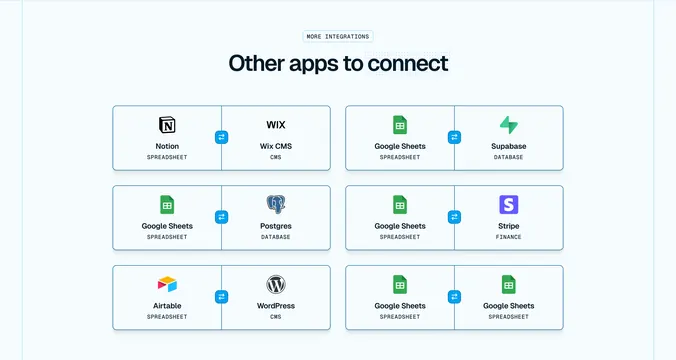
Reach for this when a product's selling point is its breadth of integrations and the logos are recognizable. Works best with full-color logos on white so each tile reads instantly. Keep tile sizes identical; mismatched logo weights are the main risk in a grid this even.
More integrations sections
See all





More like this




Keep what you find
A free account saves references to boards and can send you a weekly email of picks based on what you save.
To see every result, go Pro.