Preview image. Unlock full-res
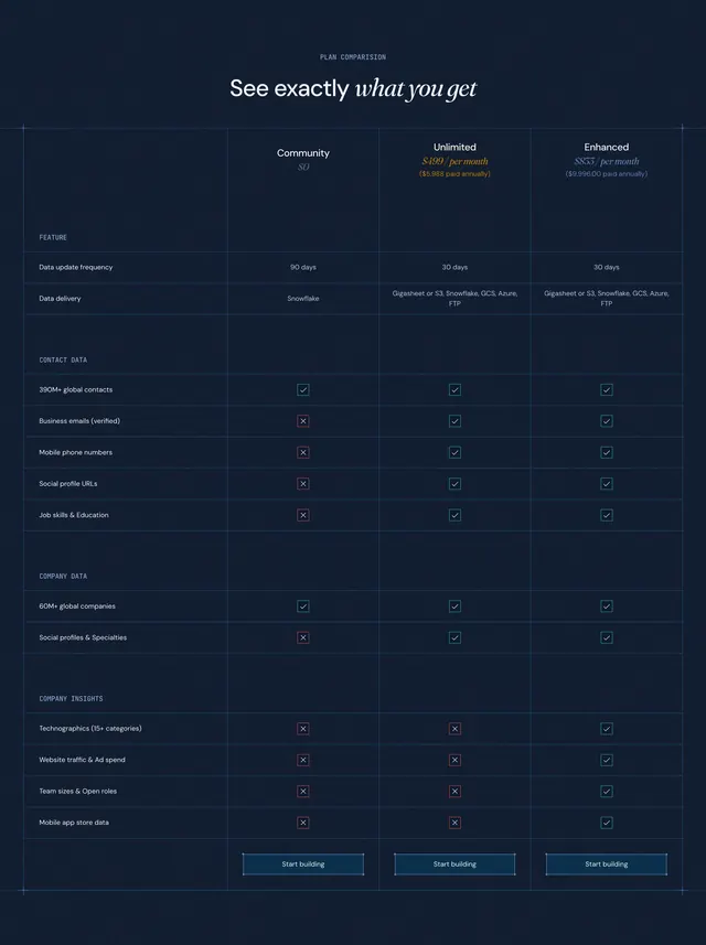
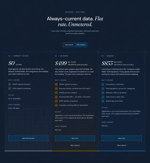
Dark three-column plan comparison table with grouped feature rows, check and X marks, and tier pricing headers on a blueprint grid.
Summary
Dark three-column plan comparison table with grouped feature rows, check and X marks, and tier pricing headers on a blueprint grid.
Visual description
Deep navy section with faint blueprint grid lines and small crosshair marks at column intersections. A PLAN COMPARISON eyebrow sits above a large headline See exactly what you get with what you get in italic serif. Three tier columns header the table: Community at $0, Unlimited at $499 per month in gold italic, and Enhanced at $833 per month in teal italic, each with annual totals below. Rows group under small caps labels FEATURE, CONTACT DATA, COMPANY DATA, and COMPANY INSIGHTS. Cells show teal checkmarks or red X icons beside values like 90-day vs 30-day refresh, delivery destinations, and insight fields exclusive to Enhanced. Thin blue dividers separate rows; each column ends with a dark Start building button with a light border.
Key takeaway
Grouping rows by data category turns a dense SaaS matrix into something scannable without losing detail. Color-coded tier prices and opposing check/X glyphs make upgrade paths obvious at a glance. Blueprint crosshairs on a comparison table signal engineering rigor instead of marketing fluff.
Reuse notes
Strong for B2B data or infrastructure products with multiple tiers and many boolean features. Works when each row is a true differentiator, not filler. Needs horizontal space for three columns; mobile likely stacks or scrolls horizontally.
More pricing table sections
See all


More like this



Keep what you find
A free account saves references to boards and can send you a weekly email of picks based on what you save.
To see every result, go Pro.