Preview image. Unlock full-res
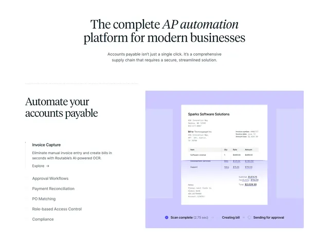
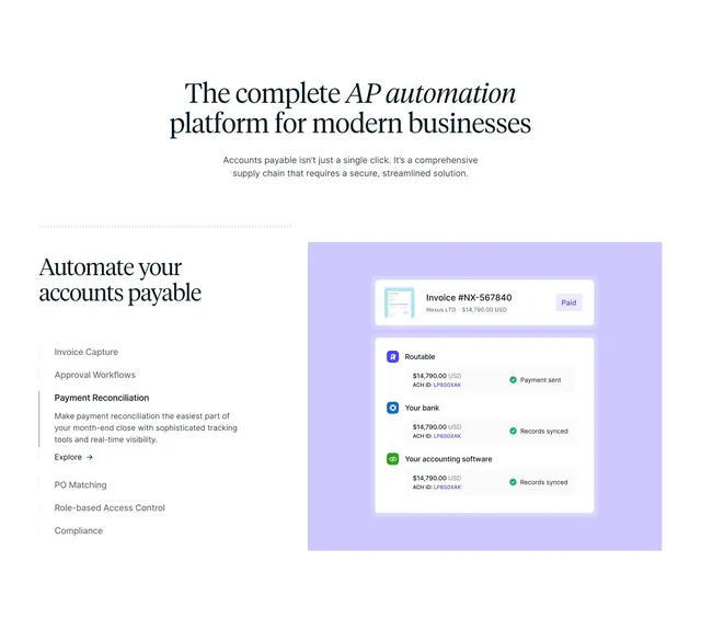
Light feature-detail with a centered serif headline above a split of a vertical feature tab list and a lavender-framed invoice mockup with a progress bar.
Summary
A light feature-detail section that opens with a centered serif headline, then splits into a vertical list of feature tabs on the left and a lavender-framed invoice product mockup on the right. The editorial serif type plus the tabbed feature switcher driving a product screenshot define it.
Visual description
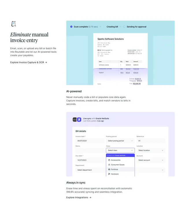
A centered two-line serif headline "The complete AP automation platform for modern businesses" (with "AP automation" in italic) tops a short centered sub-line. Below, a thin dotted rule introduces the split body. The left column shows a serif sub-heading "Automate your accounts payable", then a vertical tab list: the active "Invoice Capture" tab has bold title, a sentence of description, and an "Explore" arrow link, while the inactive tabs below (Approval Workflows, Payment Reconciliation, PO Matching, Role-based Access Control, Compliance) are greyed with a left guide bar. The right column is a large pale-lavender rounded panel containing a white invoice document mockup (Sparks Software Solutions, line items, totals) and a bottom progress strip reading "Scan complete (2.75 sec)" then "Creating bill" then "Sending for approval".
Key takeaway
Pairing an editorial serif headline with a businesslike tabbed feature list gives a dry AP-automation topic a more premium, considered voice. The vertical tab list where only the active item expands (description plus Explore link) keeps the feature switcher compact while the lavender-framed mockup carries the visual. The in-mockup progress steps narrate the workflow without extra copy.
Reuse notes
Good for fintech or B2B SaaS that needs to explain several features against one evolving product view. Relies on a clean, legible product mockup; the soft lavender frame keeps it from feeling clinical. The serif-plus-italic headline suits a refined brand; on narrow screens the tab list should stack above the mockup.
More feature detail sections
See all

More like this




Keep what you find
A free account saves references to boards and can send you a weekly email of picks based on what you save.
To see every result, go Pro.