Preview image. Unlock full-res
Light features section with a five-tab product selector above a split text-and-mockup detail panel.
Summary
A tabbed features section where a row of five proxy-product tabs switches the panel below between a left-side feature pitch and a right-side product mockup. The active tab drives a full split detail view.
Visual description
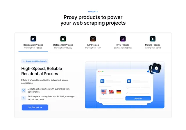
A centered blue eyebrow label PRODUCTS sits above a two-line dark headline about proxy products for web scraping. Below, a large rounded outlined container holds a top tab bar of five products, each with a small colorful app-style icon, a name, and a starting price (Residential, Datacenter, ISP, IPv6, Mobile Proxies). The first tab is active, marked by a blue underline. Under a divider, the panel splits: the left half has a small Guaranteed High Speeds pill, a two-line heading High-Speed, Reliable Residential Proxies, a short paragraph, two icon-led benefit bullets, and a filled blue Get Started button with arrow. The right half shows a stylized browser-window mockup on a blue gradient tile, with country flags, input rows rendered as gray placeholders, and a blue Generate button, plus a small floating brand icon badge.
Key takeaway
Letting one tab control both the copy and the visual at once, so each product gets a tailored headline, benefit list, and matching mockup inside a single contained component. The priced icon-tabs double as a quick product menu and a price comparison.
Reuse notes
Well-suited to a multi-product lineup where each offering needs its own short pitch and screenshot. The contained card with an internal tab bar keeps the whole feature explorer in one tidy block. Needs a distinct mockup per tab to feel worthwhile; with only one product it would be overbuilt.